← All 50 books
Book 5 of 50 · Free
Model Evaluation: Accuracy, Precision, Recall
20,007 words · 17 chapters · illustrated
Book 5 of 50 · Free
20,007 words · 17 chapters · illustrated
Book 5 of 10 — AstolixGen Learning Series (Detailed Edition) · For researcher and publication students
A model that has not been measured properly is not a result — it is a guess. This book teaches you how to measure machine learning models honestly and convincingly. You will learn what accuracy, precision, and recall really mean, why the famous "99% accuracy" claim is often meaningless, how to read a confusion matrix like a diagnostic report, and how to design an evaluation plan that reviewers trust. Everything is explained with small, hand-computable examples so you can follow every number yourself.
Learning objectives: - Explain why evaluation is the core of any ML research claim - Compute accuracy, precision, recall, and F1 score by hand from a confusion matrix - Read a confusion matrix and diagnose what a model gets wrong - Describe what a ROC curve and AUC score mean, and when they mislead - Compute MAE, RMSE, and R-squared for regression problems - Design a k-fold cross-validation setup, including stratified folds - Explain why a single train/test split is not enough evidence - Apply basic statistical significance tests when comparing two models - Choose the right metrics for imbalanced data and rare events - Perform error analysis by slicing results into meaningful groups - Read results sections in papers critically and spot weak evaluation - Write a complete, pre-registered evaluation plan for your own project
| Concept | Definition (one line) | Example | Use in research |
|---|---|---|---|
| Accuracy | Fraction of all predictions that are correct | 95 of 100 predictions right = 95% | First-line metric in balanced classification papers |
| Precision | Of predicted positives, fraction truly positive | 8 of 10 flagged emails are spam | Report when false alarms are costly |
| Recall (sensitivity) | Of actual positives, fraction found | Found 8 of 10 sick patients | Report when missing a case is costly |
| F1 score | Harmonic mean of precision and recall | P=0.8, R=0.6 → F1=0.69 | Single summary metric under imbalance |
| True positive (TP) | Correctly predicted positive case | Sick patient flagged sick | Count in confusion matrix |
| False positive (FP) | Negative case wrongly flagged positive | Healthy patient flagged sick | Cost of false alarms |
| True negative (TN) | Correctly predicted negative case | Healthy patient cleared | Count in confusion matrix |
| False negative (FN) | Positive case wrongly missed | Sick patient cleared | Cost of misses |
| Confusion matrix | Table of TP, FP, TN, FN | 2×2 table for a classifier | Diagnose exactly where errors happen |
| Specificity | Fraction of actual negatives correctly cleared | 95 of 100 healthy cleared | Complement to recall in medical papers |
| ROC curve | Plots recall vs false-positive rate across thresholds | Curve hugging top-left = good | Threshold-independent classifier comparison |
| AUC | Area under the ROC curve (0–1) | 0.9 = strong separator | Common single-number ranking metric |
| Decision threshold | Score cutoff that turns scores into yes/no | Flag if score > 0.5 | Tune it; never accept the default blindly |
| Precision-recall curve | Precision vs recall across thresholds | Better than ROC under heavy imbalance | Fraud/rare-disease evaluation |
| MAE | Mean absolute prediction error | Off by 2 units on average | Robust regression error in original units |
| RMSE | Root of mean squared error | Heavily penalizes big misses | Regression where large errors hurt most |
| R-squared | Fraction of target variance explained | 0.85 = 85% explained | Report alongside error for context |
| Train/validation/test split | Data divided for fitting, tuning, final check | 60/20/20 | Prevents self-deception about performance |
| Cross-validation | Rotate which part of data tests the model | 5-fold: test each fifth once | Stable estimate on small datasets |
| Stratified sampling | Keep class ratios in every fold/split | Each fold has same sick rate | Required for imbalanced classes |
| Overfitting | Great on training data, poor on new data | 99% train, 70% test | The failure evaluation must catch |
| Data leakage | Test information sneaks into training | Scaling before splitting | Invalidates results; reviewers check for it |
| Generalization | Performance on unseen data | Test-set score | The only number that counts as a claim |
| Baseline | Simple reference model to beat | "Predict the majority class" | Proves your model adds value |
| Statistical significance | Difference unlikely due to chance | p < 0.05 on paired test | Decides if Model A truly beats Model B |
| Balanced accuracy | Mean of recall on each class | 0.5 + 0.9 → 0.7 | Fair accuracy under imbalance |
| Matthews correlation | Correlation between truth and prediction | 1 = perfect, 0 = random | Strong single metric for 2-class imbalance |
| Error analysis | Manual study of the model's mistakes | 40% of errors are blurry images | Turns a metric into insight and next steps |
| Ablation study | Remove parts of the model, re-measure | Dropping feature X costs 3% F1 | Shows which ideas actually matter |
| Pre-registration | Fix metrics and plan before running | "We will report F1 on the test set" | Protects you from cherry-picking |
Roadmap of the chapters. Chapters 1–2 set the stakes: evaluation is the evidence behind every claim, and accuracy alone can lie. Chapters 3–5 build the classification toolkit: precision, recall, and F1 (Chapter 3), the confusion matrix (Chapter 4), and ROC/AUC (Chapter 5). Chapter 6 covers regression metrics (MAE, RMSE, R-squared). Chapter 7 explains how to estimate performance reliably with cross-validation, and Chapter 8 adds the statistics needed to compare models fairly. Chapter 9 specializes in imbalanced data and rare events. Chapter 10 goes beyond numbers into error analysis. Chapter 11 teaches you to read other papers' results critically, and Chapter 12 brings everything together into an evaluation plan you can pre-register for your own thesis or paper.
Every machine learning project produces two things: a model and a claim about the model. The claim sounds like "my model detects crop disease with 94% accuracy" or "this predictor cuts forecasting error by 20%". The model itself — the code, the weights, the architecture — is only half the work. The other half is the evidence that the claim is true. That evidence comes from evaluation.
Here is a hard truth about research: reviewers, supervisors, and readers almost never judge your paper by how clever your model is. They judge it by whether they believe your measurements. A simple logistic regression with careful, honest evaluation is a stronger paper than a complex neural network with sloppy evaluation. The model is the idea; evaluation is what makes the idea science.
Think of it like medicine. A pharmaceutical company can invent a promising drug, but nobody prescribes it until clinical trials measure whether it works. The trial design — who is tested, what is compared, how results are reported — is what makes the drug trustworthy. In machine learning, your evaluation plan is your clinical trial. A weak plan means your results cannot be trusted, no matter how interesting the model is.
The most common beginner mistake is reporting how well the model did on the data it learned from. This is called training accuracy or training error, and it tells you almost nothing about whether the model works.
Why? Because a model can simply memorize. Imagine a student who is given the exam questions in advance and memorizes the answers. A perfect score tells you nothing about what the student actually learned. A machine learning model with enough capacity can memorize every training example perfectly — 100% training accuracy — and still fail completely on new data. This is overfitting, and it is the reason evaluation must always happen on data the model has never seen: the test set.
Worked example. You train a classifier on 500 labeled images and test it two ways:
The 98% is the model remembering. The 71% is the model thinking. Only the 71% is a research result. If you reported 98%, you would be publishing a memorization score, not a capability. Every time you see a suspiciously high accuracy in a paper, ask: was this measured on held-out data?
Most MS and PhD projects in applied ML are, at their core, comparison questions: "Is method A better than method B for problem X?" or "Does adding feature Y improve the model?" You cannot answer these questions without a measurement procedure that is fair, repeatable, and appropriate to the problem.
Consider two researchers. Researcher A trains a model, tries ten different settings, picks the best result on the test set, and reports it. Researcher B fixes the plan in advance — the metric, the data split, the baselines — runs it once, and reports whatever comes out. Researcher B's number will usually be lower. Researcher B's paper is the honest one. Researcher A peeked at the test set ten times and effectively tuned the model on the test data. This is a form of data leakage, and it is one of the most common reasons papers fail review.
A trustworthy evaluation has five properties:
Bad evaluation does not just weaken a paper — it misleads everyone who builds on it. If your reported 95% accuracy was actually measured with leakage, the next researcher who tries your method on clean data will get 75% and conclude the method is broken. Worse, in applied fields like medicine or agriculture, a wrongly evaluated model can lead to real-world decisions — missed diagnoses, wasted treatments — based on false confidence. Evaluation is where research meets responsibility.
A complete evaluation answers three questions, in order:
Notice the order: absolute performance first, comparative performance second, failure modes third. Many student projects jump to question 2, comparing two fancy models, without establishing question 1. If both models are worse than a simple baseline, the comparison is theater. Always climb the ladder from the bottom.
Data leakage means information from the test set influences training. It is called "silent" because nothing errors out — your code runs fine, your numbers look great, and your result is meaningless. Common forms:
Worked example. A student builds a churn predictor. She scales all features with the full dataset's mean and variance, then splits 80/20 and reports 89% accuracy. Her supervisor asks her to redo it: fit the scaler on the 80% only. Accuracy drops to 84%. The 5-point gap was leakage — the scaler had smuggled test-set statistics into training. The honest number is 84%, and the paper reports 84%. Painful for a week; protective for a career.
Teams that postpone evaluation design accumulate evaluation debt — and it compounds. The typical story: a student trains models for two months, gets exciting numbers, starts writing, and only then discovers the test set was used for tuning, the baseline was mistuned, and the metric doesn't match the problem. Fixing it means re-running everything: new splits, re-tuned baselines, re-computed statistics. Weeks of work evaporate.
The alternative is the evaluation-first workflow:
This feels slower for the first week and is dramatically faster overall, because the pipeline never needs rebuilding mid-project. More importantly, numbers produced by a pre-built pipeline are trustworthy by construction — you literally cannot peek at the test set because the pipeline doesn't let you.
Modeling asks "what can I build?" Evaluation asks "what do I know?" Research is the second question. Every technique in this book — from a humble accuracy check to nested cross-validation — is machinery for turning "my model got a good score" into "here is reliable evidence that this works, this much better, under these conditions." Readers may forget your architecture. They will remember whether they believed your numbers.
For your research: Before you train your first model, write down your evaluation plan in one page: what metric, what data split, what baselines, and what result would count as success. Show it to your supervisor. This single page will save you months of rework, because most evaluation mistakes are made before training starts, not after.
Key takeaways - Evaluation is the evidence behind every ML claim; reviewers judge it more than the model. - Training accuracy measures memorization; only held-out test performance is a result. - Peeking at the test set repeatedly is data leakage and invalidates the evaluation. - Good evaluation needs separation, appropriate metrics, baselines, honest reporting, and uncertainty. - Write your evaluation plan before you train, not after.
Accuracy is the simplest metric in machine learning: the fraction of predictions the model gets right.
Accuracy = (correct predictions) / (total predictions)
If a model classifies 100 emails and gets 93 right, accuracy is 93%. Simple, intuitive, and easy to explain. That is why it is the first metric everyone learns — and the first metric that gets misused.
Accuracy treats every mistake as equal. A wrong prediction on an easy case counts the same as a wrong prediction on a hard case, and a mistake on a common class counts the same as a mistake on a rare class. That equal treatment is fine when classes are balanced and all errors cost the same. It is dangerous when they are not.
Now the famous trap. Read this example slowly, because understanding it will change how you read every paper that reports accuracy.
Worked example. A hospital screens 1,000 patients for a rare disease. Only 10 patients actually have the disease; 990 are healthy. A lazy programmer builds a "model" with one line of code: predict "healthy" for everyone, always.
Let's score it:
Ninety-nine percent accuracy! Sounds excellent. But the model found zero sick patients. Every single person with the disease was sent home. As a medical tool, this model is worthless — worse than worthless, because the 99% number makes it look good.
This is the accuracy paradox: on imbalanced data, a useless model can score very high accuracy by always predicting the majority class. The accuracy number hides the failure because the rare class — the one you actually care about — barely affects the total.
How common is this situation? Extremely common. Fraud detection (99.9% of transactions are legitimate), defect detection in manufacturing, rare disease screening, intrusion detection in networks — in all of these, the interesting class is rare, and accuracy is the wrong metric. Chapter 9 is entirely about what to use instead.
Accuracy is not always wrong. It is a perfectly good metric when two conditions hold:
Under these conditions, accuracy is clear, comparable across papers, and easy to interpret. Many benchmark datasets (like balanced image classification sets) satisfy these conditions, which is why accuracy dominates leaderboards. The problem is that real-world problems often do not satisfy them — and researchers carry the leaderboard habit into domains where it misleads.
Even on balanced data, accuracy hides which mistakes the model makes. Consider a three-class problem — classifying fruit as apple, orange, or banana — with 90% accuracy. That number does not tell you whether the errors are spread evenly or concentrated: maybe the model confuses oranges and apples constantly but never mistakes a banana. If your application cares specifically about oranges, the 90% is misleading. Accuracy compresses all information about error patterns into one number. The confusion matrix (Chapter 4) and error analysis (Chapter 10) recover what accuracy throws away.
Before trusting any accuracy number — yours or someone else's — compute the majority-class baseline: what accuracy would you get by always predicting the most common class? If the dataset is 90% class A, the baseline is 90%. A model reporting 91% accuracy has barely beaten doing nothing. A meaningful result must clear the baseline by a margin that matters, and that margin must be statistically real (Chapter 8).
Worked example. A paper reports 87% accuracy on a customer-churn dataset. You check the dataset description: 85% of customers did not churn. The majority baseline is 85%. The model's real achievement is 2 percentage points above doing nothing — much less impressive than "87% accuracy" sounds. Always ask: accuracy compared to what?
Accuracy shines when its conditions hold. A sentiment classifier for product reviews: 1,000 test reviews, 520 positive, 480 negative (balanced), and a false alarm costs about the same as a miss (a mislabeled review just slightly skews an aggregate dashboard).
Confusion matrix: TP=440, FP=60, FN=80, TN=420.
Here accuracy (0.86) agrees with F1 (0.863) — when classes are balanced and costs symmetric, the metrics tell the same story, and accuracy's simplicity is a virtue. Report it confidently, alongside the class balance so readers can verify the conditions hold.
With more than two classes, "accuracy" still means correct/total — this is micro-averaged accuracy: every example counts equally. But there's a second way: compute accuracy (or recall) per class, then average the per-class scores — macro-averaging, where every class counts equally.
Worked example. Animal classifier, test set: 90 cats, 90 dogs, 20 rabbits (imbalanced). Correct: 85 cats, 80 dogs, 8 rabbits.
Micro says 86.5% — fine. Macro says 74.4% — the model is failing rabbits. Which is honest? Both are arithmetic; macro is honest about the weak class. When classes are imbalanced, always report macro-averaged scores next to micro — reviewers in applied fields specifically look for the macro number.
Before any accuracy number leaves your computer, run this:
Five checks, two minutes, and your accuracy claims become bulletproof.
The hospital example was dramatic (99% from doing nothing). Here's a subtler, more common version.
Worked example. Online ad clicks: 10,000 ad impressions, 120 clicks (1.2% positive). Model A is a real trained classifier; Model B always predicts "no click."
Model B "wins" on accuracy (98.8% vs 96.6%) while learning nothing. Model A's recall = 80/120 ≈ 0.67, precision = 80/380 ≈ 0.21, F1 ≈ 0.32. Is Model A useful? For the ad business, maybe — catching two-thirds of clicks with a 21% hit rate on flagged impressions might beat showing ads randomly. The point: accuracy ranks the models backwards here. Whenever someone proposes "just use accuracy," run this mental test: would the always-negative model win? If yes, accuracy is disqualified.
Expect this reviewer comment: "Accuracy is inappropriate given the class imbalance; please report precision, recall, and F1." The professional response isn't to argue — it's to add the metrics and, if accuracy truly fits your problem, a one-sentence justification: "Classes are balanced (48/52) and error costs symmetric, so accuracy is reported as the primary metric; precision/recall/F1 are in Table 3 for completeness." Reviewers accept accuracy when you've shown you considered the alternatives. What they reject is accuracy reported by default, with no evidence you thought about it.
Before trusting any accuracy figure, run a dummy classifier — scikit-learn [6] even ships one (DummyClassifier): it predicts the majority class, or randomly, or proportionally to class frequencies. Your real model must beat the dummy by a clear, significant margin on your chosen metric. If it barely does, you don't have a modeling problem — you have a data or problem-framing problem, and no amount of tuning will fix it. The dummy takes thirty seconds to run and has saved countless researchers from months of polishing a model that learned nothing.
For your research: In your thesis or paper, never report accuracy on imbalanced data without also reporting precision, recall, and F1 (Chapter 3). State the class distribution of your dataset explicitly ("the positive class is 4.2% of samples") so reviewers can judge whether your metrics are appropriate. If a reviewer asks "what is the majority-class baseline?", you should already have the answer in your results section.
Key takeaways - Accuracy = correct predictions / total predictions; it treats all errors equally. - On imbalanced data, accuracy can be 99% for a model that finds nothing — the accuracy paradox. - Accuracy is valid when classes are balanced and error costs are symmetric. - Accuracy hides which errors the model makes; it compresses too much into one number. - Always compare accuracy against the majority-class baseline before celebrating it.
Chapter 2 showed that accuracy can lie when classes are imbalanced. The fix is to stop counting "correct" as one lump and instead ask two sharper questions:
Precision punishes false alarms. Recall punishes misses. Together, they describe what accuracy hides: the two different ways a classifier can fail.

Figure 1. Precision vs recall as a fishing net: precision asks "of everything in the net, how much is fish?", recall asks "of all the fish in the water, how many did the net catch?"
Every binary prediction falls into one of four boxes. Learn these four terms — they are the vocabulary of the entire book:
Precision = TP / (TP + FP)
The denominator is everything the model called positive. Precision answers: "When the model raises the alarm, how often is it right?"
Recall = TP / (TP + FN)
The denominator is everything actually positive. Recall answers: "Of all the real cases, how many did the model catch?" (Recall is also called sensitivity or true positive rate.)
F1 score = 2 × (Precision × Recall) / (Precision + Recall)
The F1 score combines both into one number using the harmonic mean. Why the harmonic mean instead of a simple average? Because the harmonic mean punishes extreme imbalance: if precision is 1.0 but recall is 0.0, the simple average is 0.5 (looks okay), but the F1 is 0 (correctly terrible). A model must do reasonably well on both to get a good F1.
A spam filter processes 40 emails. The truth: 15 are spam, 25 are not spam. The filter flags 12 emails as spam. Of those 12 flagged, 9 really are spam and 3 are legitimate emails wrongly flagged.
Step by step:
Check: 9 + 3 + 6 + 22 = 40. ✓
Notice the story the numbers tell: accuracy (77.5%) looks decent, but recall (60%) reveals the filter misses 4 out of 10 spam emails. If missing spam is costly, this filter is weaker than accuracy suggests.
You cannot maximize both at once. A model that flags everything as positive has perfect recall (it misses nothing) but terrible precision (mostly false alarms). A model that flags only its most confident case has perfect precision but terrible recall. Moving the decision threshold — the score above which the model says "yes" — slides you along this trade-off:
Which one matters more? It depends on the cost of each error:
A good research paper states this choice explicitly: "we optimize for recall because a missed defect costs far more than a false alarm."
A disease model outputs risk scores for 5 patients whose true status is known: scores 0.9 (sick), 0.7 (sick), 0.5 (healthy), 0.4 (sick), 0.2 (healthy).
Lowering the threshold caught the missed sick patient (recall 0.67 → 1.0) at the cost of one extra false alarm. In a screening context, that trade is worth it. Notice something interesting: precision went up here too, because the extra caught case was a true positive. The trade-off is a tendency, not a law — which is exactly why you must measure rather than assume.
In papers, you will usually see precision, recall, and F1 reported together (often written P/R/F1). Report them per class when classes matter differently, and state which class is the "positive" one. A common beginner error is reporting these numbers without saying which class they refer to — precision of what? Always label: "precision for the disease class = 0.82".
F1 treats precision and recall equally. Sometimes they aren't equal. The F-beta score generalizes F1:
F-beta = (1 + beta²) × (P × R) / (beta² × P + R)
Worked example. Spam-filter numbers from earlier: P=0.75, R=0.60.
Same model, different verdicts depending on what you value. State your beta and why — "we report F2 because missed spam (phishing) costs more than a false alarm" is a complete justification.
For multi-class problems, compute precision/recall/F1 per class (each class vs. all others), then average:
Rule: report macro alongside micro when classes are imbalanced; report per-class scores in an appendix or table when any single class matters (it usually does).
Search engines and recommender systems don't output yes/no — they output ranked lists. Here the metrics adapt: of the top k results, how many are relevant (precision@k)? Of all relevant items, how many appear in the top k (recall@k)?
Worked example. A search returns 10 documents for a query with 6 relevant documents total in the collection. The top-5 results contain 3 relevant ones: precision@5 = 3/5 = 0.6, recall@5 = 3/6 = 0.5. If your paper evaluates ranking or retrieval, these are your metrics — plain precision/recall don't apply to ranked output.
When these three appear in your paper, make them unambiguous:
Six checkboxes. A reader should be able to reproduce your P/R/F1 from your paper alone — if they can't, the reporting is incomplete.
For your research: Choose your primary metric before running experiments, and justify it in one sentence tied to error costs ("recall is primary because a missed case costs a life; precision is reported for completeness"). Reviewers respect a metric choice that is argued from the problem, not picked because the number looked biggest. If you report F1, also report its components — a paper that shows only F1 hides whether the model is precise, thorough, or neither.
Key takeaways - Precision = TP/(TP+FP): when the model says yes, how often is it right? - Recall = TP/(TP+FN): of all real positives, how many were found? - F1 is the harmonic mean of the two; it punishes a model that is good at only one. - Lowering the decision threshold raises recall and usually lowers precision — choose based on error costs. - Always label which class your precision/recall/F1 refer to, and justify your primary metric from the problem.
The confusion matrix is a table that shows, for every predicted class, how the truth was distributed. For a binary classifier it is a 2×2 grid of the four outcomes from Chapter 3:
| Predicted Positive | Predicted Negative | |
|---|---|---|
| Actually Positive | True Positives (TP) | False Negatives (FN) |
| Actually Negative | False Positives (FP) | True Negatives (TN) |
Rows are the truth; columns are the model's predictions. The diagonal (TP and TN) is where the model was right. Everything off the diagonal is an error, and the matrix shows you which kind of error, in which direction.
Every metric you have learned so far — accuracy, precision, recall, F1 — is just arithmetic on these four numbers. But the matrix itself contains more information than any single metric derived from it, because it preserves the structure of the mistakes.
Worked example. A clinic tests a disease-screening model on 200 patients. The true status: 50 sick, 150 healthy. The model's confusion matrix:
| Predicted Sick | Predicted Healthy | |
|---|---|---|
| Actually Sick | TP = 42 | FN = 8 |
| Actually Healthy | FP = 15 | TN = 135 |
From this one table, compute the full diagnostic:
Now read it as a story: the model is good at clearing healthy people (specificity 90%) but misses 16% of sick patients and raises false alarms on 10% of healthy ones. For a screening tool, the 8 missed sick patients are the critical problem — recall of 84% may not be good enough, and the next experiment should try lowering the threshold (Chapter 3) or collecting more training examples of the disease class.
That paragraph of insight came from staring at four numbers. No single metric gave it to you. This is why experienced researchers look at the matrix before they look at the metrics.
Specificity (true negative rate) is the mirror image of recall: of all actual negatives, how many were correctly cleared? In medical papers you will see "sensitivity and specificity" reported as a pair — sensitivity is just another name for recall. High sensitivity means few missed cases; high specificity means few false alarms.
Negative predictive value (NPV) = TN / (TN + FN): when the model says "healthy", how often is it right? Precision tells you about positive predictions; NPV tells you about negative ones. In screening, a high NPV is what lets a doctor confidently send a patient home.
With three or more classes, the matrix becomes N×N. Rows are true classes, columns are predicted classes. The diagonal holds correct predictions; off-diagonal cells show exactly which classes get confused with which.
Worked example. A fruit classifier (apple / orange / banana) tested on 90 fruits, 30 of each:
| Pred. Apple | Pred. Orange | Pred. Banana | |
|---|---|---|---|
| True Apple | 25 | 4 | 1 |
| True Orange | 6 | 22 | 2 |
| True Banana | 0 | 1 | 29 |
Accuracy = (25 + 22 + 29) / 90 = 76/90 ≈ 0.844. But the matrix reveals the real story: apples and oranges are confused with each other (4 + 6 = 10 cross-errors), while bananas are almost never mistaken (29/30 correct, only 1 error). The research insight writes itself: the model struggles to separate apples from oranges — perhaps they need color or texture features that distinguish them, or more training examples of those two classes. Per-class recall: apple 25/30 ≈ 0.83, orange 22/30 ≈ 0.73, banana 29/30 ≈ 0.97. Orange is the weak class. Your next experiment now has a target.
Raw counts are good for computing metrics, but for seeing patterns, normalize: divide each row by its row total so every row sums to 1. Each cell then reads as "of the true apples, what fraction were predicted as X?" This makes classes of different sizes visually comparable. Most papers show the normalized matrix as a heatmap figure. When you make yours, label rows "true" and columns "predicted" clearly — a matrix with unlabeled axes is a common figure mistake that confuses reviewers.
Raw counts answer "how many"; rates answer "how often," which is what you need when comparing classes of different sizes. Every row of the matrix converts to rates by dividing by the row total:
From the clinic example (Chapter 4's table: TP=42, FN=8, FP=15, TN=135):
| Predicted Sick | Predicted Healthy | Row total | |
|---|---|---|---|
| Actually Sick (50) | 42/50 = 0.84 | 8/50 = 0.16 | 1.00 |
| Actually Healthy (150) | 15/150 = 0.10 | 135/150 = 0.90 | 1.00 |
Read across: "84% of sick patients caught, 16% missed; 10% of healthy patients falsely alarmed, 90% cleared." This row-normalized view is what you plot as a heatmap figure — the diagonal shows per-class recall at a glance, and pale off-diagonal cells scream for attention. Column-normalizing instead (dividing by column totals) gives precision-like rates: "of all patients flagged sick, 42/57 ≈ 74% truly were." Rows = recall view; columns = precision view. Know which one your figure shows and say so in the caption.
Sometimes errors aren't just counts — they have costs. A cost matrix assigns a price to each cell, and the model's expected cost becomes the metric to minimize.
Worked example. Disease screening, costs estimated with the clinic:
| Predicted Sick | Predicted Healthy | |
|---|---|---|
| Actually Sick | 0 (correct) | $5,000 (missed treatment, worsened illness) |
| Actually Healthy | $200 (unnecessary follow-up test) | 0 (correct) |
Using the clinic's matrix (FN=8, FP=15): expected cost = 8 × $5,000 + 15 × $200 = $40,000 + $3,000 = $43,000 per 200 patients.
Now try a lower threshold that catches more: suppose it gives FN=3, FP=40. Cost = 3 × $5,000 + 40 × $200 = $15,000 + $8,000 = $23,000. The lower threshold nearly halves the expected cost — even though accuracy might barely change. When you can estimate costs, expected cost is the most honest metric of all, because it optimizes what the stakeholder actually pays. State your cost assumptions openly; they're debatable, and debatable beats hidden.
Your confusion-matrix figure will be scrutinized, so get the details right:
One well-made matrix figure often communicates more than a page of metric tables. It's also the figure examiners point at during defenses — "tell me about this off-diagonal block" — so know every cell's story before you walk in.
For your research: Put the confusion matrix in your paper or thesis as a figure, not just the metrics in a table. Reviewers read matrices. In your results text, write one sentence per interesting off-diagonal pattern ("the model confuses class A with class B in 12% of cases, suggesting..."). This is the cheapest way to make your results section look like it was written by someone who understands their model — because it proves you looked.
Key takeaways - The confusion matrix (TP, FP, TN, FN) preserves the structure of errors that single metrics destroy. - Specificity = TN/(TN+FP); sensitivity is another name for recall; NPV evaluates negative predictions. - Multi-class matrices reveal which classes are confused — that is your next experiment's target. - Normalize rows to compare classes of different sizes; always label rows as truth and columns as predictions. - Include the matrix as a figure and narrate its off-diagonal patterns in your results.
Chapter 3 showed that moving the decision threshold trades precision against recall. But a classifier usually outputs scores (probabilities), not hard yes/no answers — and every choice of threshold gives a different (precision, recall) pair. How do you compare two models without arbitrarily picking one threshold? The ROC curve is the answer: it shows performance at every threshold at once.
ROC stands for Receiver Operating Characteristic (a name inherited from radar engineering; the concept is pure statistics). The curve plots:
Each point on the curve is one threshold. At a very high threshold, the model flags almost nothing: both rates are near 0 (bottom-left). At a very low threshold, it flags almost everything: both rates are near 1 (top-right). A good model's curve bows toward the top-left corner — high recall with few false alarms, across many thresholds.
Six patients, true status and model risk scores:
| Patient | Truth | Score |
|---|---|---|
| A | Sick | 0.95 |
| B | Healthy | 0.80 |
| C | Sick | 0.70 |
| D | Healthy | 0.45 |
| E | Sick | 0.40 |
| F | Healthy | 0.10 |
There are 3 sick and 3 healthy patients. Evaluate thresholds just below each distinct score:
Plot these points and connect them: the curve climbs steeply at first (good — real cases caught before false alarms pile up), then flattens. You have just drawn a ROC curve by hand, and every point is a threshold you could actually choose.
AUC (Area Under the Curve) is the area beneath the ROC curve, between 0 and 1. It has a beautifully intuitive meaning: AUC is the probability that the model ranks a randomly chosen positive case higher than a randomly chosen negative case. An AUC of 0.9 means: pick one random sick patient and one random healthy patient — 90% of the time, the sick one gets the higher risk score.
Reference points:
For our six-patient example, the area under the plotted points (via the trapezoid rule) is approximately 0.78 — a fair classifier on a tiny dataset.
AUC is popular because it is threshold-independent: it summarizes ranking quality without committing to one operating point. Two models can be compared with a single number even if they would be deployed at different thresholds.
But AUC has a blind spot that matters enormously: it can look great on imbalanced data while the model is practically useless. Why? The false positive rate divides by the number of negatives — and when negatives are abundant, even a large absolute number of false alarms produces a small FPR. Example: 10 frauds among 10,000 transactions. A model with 500 false alarms has FPR = 500/9,990 ≈ 0.05 — the ROC curve looks fine. But precision is 10/(10+500) ≈ 0.02: only 2% of flagged transactions are real fraud. The investigators drown in false alarms while the ROC curve smiles.
Rule of thumb: on balanced or moderately imbalanced data, ROC-AUC is fine. On heavily imbalanced data (rare events), use the precision-recall curve and its area (PR-AUC) instead — precision exposes the false-alarm flood that FPR hides. Chapter 9 develops this fully.
The ROC curve does not pick your threshold — you do, using costs. The "best" point is the one where the trade-off matches your problem: in screening, accept a higher FPR to push TPR near 1; in spam filtering, keep FPR tiny even if TPR suffers. A common formal choice is Youden's index (TPR − FPR, the point farthest above the diagonal), but a cost-based choice argued from the domain always beats a formula. State your chosen threshold and why — "we operate at FPR = 0.05 because the clinic can handle that many follow-ups" is a sentence reviewers love.
Plot two models' ROC curves together and three situations arise:
Worked example. Two models on the same data: AUC(A) = 0.86, AUC(B) = 0.84. Tempting to declare A the winner — but the curves cross: at FPR = 0.05, A reaches TPR 0.70 while B reaches 0.78. If your application tolerates only 5% false alarms, B is the better model despite the lower AUC. AUC averages over all thresholds, including ones you'd never use. Never let a 0.02 AUC gap overrule the operating region.
When only one region of the curve is relevant (e.g., FPR below 0.1 for a fraud system that can't afford many false alarms), compute the partial AUC — the area under the curve restricted to that FPR range, rescaled to 0–1. It answers "which model ranks best where I'll actually operate?" rather than "which is best on average over thresholds I'll never choose." Report it as "pAUC (FPR ≤ 0.1)" so readers know the window. Few student papers use it; those that do signal unusual maturity.
Revisit Chapter 5's six patients (3 sick: A 0.95, C 0.70, E 0.40; 3 healthy: B 0.80, D 0.45, F 0.10). Compute (recall, precision) at each threshold:
Plot recall (x) vs precision (y): the curve starts at (0.33, 1.0) and sags as recall rises — the visual signature of the precision–recall trade-off. The area under this curve (PR-AUC ≈ 0.72 here) is the number to report on imbalanced data.
For your research: Report ROC-AUC when comparing classifiers, but never report it alone on imbalanced data — pair it with the precision-recall curve or at least precision and recall at your chosen operating threshold. Include the ROC figure with the diagonal (random) line drawn, and mark your operating point on the curve. If a baseline's AUC is 0.52 and yours is 0.55, say so plainly instead of writing "our model achieves strong AUC" — reviewers divide by the baseline in their heads anyway.
Key takeaways - The ROC curve plots recall (TPR) vs false-positive rate across every threshold. - AUC = probability a random positive outranks a random negative; 0.5 is random, 1.0 is perfect. - AUC is threshold-independent, which makes it good for comparing models. - On heavily imbalanced data, ROC-AUC can hide a flood of false alarms — use precision-recall curves there. - The curve doesn't choose your threshold; domain costs do. Mark and justify your operating point.
So far everything has been classification: right or wrong. Regression predicts a number — a house price, a temperature, a crop yield — where predictions can be close or far, not just right or wrong. Being off by 1 unit and being off by 100 units are both "wrong," but they are very different failures. Regression metrics measure how far off predictions are.
Setup for this chapter: let y be the true value, ŷ (y-hat) the prediction, and the error e = y − ŷ. With n test examples, the three core metrics are:
MAE (Mean Absolute Error) = (1/n) × Σ|y − ŷ|
Average the absolute errors. MAE is in the original units (dollars, degrees, kilograms) and treats every unit of error equally: being off by 4 is twice as bad as being off by 2.
MSE (Mean Squared Error) = (1/n) × Σ(y − ŷ)², and RMSE = √MSE
Squaring punishes large errors disproportionately: an error of 4 contributes 16, while an error of 2 contributes 4 — so one big miss hurts more than several small ones. RMSE takes the square root to return to original units, keeping the big-error penalty.
R-squared (R²) = 1 − (Σ(y − ŷ)²) / (Σ(y − ȳ)²)
R² compares your model against the dumbest possible predictor: always guessing the mean ȳ. The numerator is your model's squared error; the denominator is the mean-guessor's squared error. R² = 0.85 means your model eliminated 85% of the variance that mean-guessing leaves. R² = 0 means you are no better than predicting the average; negative R² means you are worse.
Five apartments, true monthly rent (in thousands) and model predictions:
| Apt | True y | Pred ŷ | Error (y−ŷ) | |Error| | Error² |
|---|---|---|---|---|---|
| 1 | 50 | 48 | 2 | 2 | 4 |
| 2 | 60 | 63 | −3 | 3 | 9 |
| 3 | 55 | 55 | 0 | 0 | 0 |
| 4 | 70 | 64 | 6 | 6 | 36 |
| 5 | 65 | 70 | −5 | 5 | 25 |
Compute step by step:
Interpretation: the model explains about 70% of rent variance, with typical errors around 3–4 thousand. Note RMSE (3.85) > MAE (3.2) — RMSE always exceeds MAE when errors vary in size, because squaring inflates the big ones (the 6-thousand miss on apartment 4). The gap between them tells you large errors are present.
A subtle trap: R² can be high even when the model is systematically biased. If every prediction is exactly 10 thousand too high, the errors are consistent, variance is still "explained," and R² looks fine — but every prediction is wrong by 10. Always plot predicted vs actual values; a straight line off the diagonal reveals bias that R² forgives.
When targets span orders of magnitude (predicting both small shops' and malls' revenues), absolute errors mislead: being off by 1,000 matters little on a million-scale target but hugely on a thousand-scale one. MAPE (Mean Absolute Percentage Error) = average of |y − ŷ|/|y| × 100% expresses error as a percentage. Use it when relative error matches the real cost — but beware: MAPE explodes when true values are near zero (division by ~0), and it penalizes over-prediction more than under-prediction. State its limits if you use it.
MAE, RMSE, and R² compress all errors into numbers — but patterns in the errors reveal broken assumptions. A residual plot (residual = y − ŷ on the y-axis, predicted value on the x-axis) should look like random scatter around zero. Watch for:
Worked example. Our rent model from this chapter: residuals are +2, −3, 0, +6, −5 against predictions 48, 63, 55, 64, 70. Too few points for a real plot, but notice the largest residuals (±5, +6) sit at the largest predictions (64, 70) — a hint of funnel behavior. With 500 points instead of 5, that hint would become a visible fan, telling you the model struggles with expensive apartments specifically. The metric said "RMSE 3.85"; the plot says "and it's worse where it matters most."
R² never decreases when you add features — even useless ones. Add 50 random-noise features to a regression and R² creeps up, because the model exploits chance correlations. Adjusted R² corrects for this:
Adjusted R² = 1 − (1 − R²) × (n − 1) / (n − p − 1)
where n = examples, p = features. Adding a useless feature increases p without reducing error, so adjusted R² falls — exposing the trick.
Worked example. n = 100, R² = 0.70 with p = 5 features: adjusted = 1 − 0.30 × 99/94 = 1 − 0.316 = 0.684. Add 10 noise features (p = 15), R² rises to 0.72: adjusted = 1 − 0.28 × 99/84 = 1 − 0.330 = 0.670. Raw R² celebrated the noise; adjusted R² penalized it. When comparing regressions with different feature counts, adjusted R² is the fair metric.
Worked example. True monthly sales (thousands): 100, 200, 50. Predictions: 110, 180, 60.
Percentage errors: |100−110|/100 = 10%, |200−180|/200 = 10%, |50−60|/50 = 20%. MAPE = (10+10+20)/3 ≈ 13.3%. Intuitive for business stakeholders ("we're off by 13% on average"). But note the asymmetry: predicting double (100%) vs half (50%) the truth are equally wrong in business terms, yet MAPE scores them 100% vs 50%. If your errors are symmetric in business impact, prefer MAE/RMSE; if stakeholders think in percentages, report MAPE with this caveat stated.
Ask one question: "In my problem, is one error of size 10 as bad as ten errors of size 1?"
A related habit: normalize errors when comparing across datasets — RMSE divided by the target's standard deviation, or MAE as a percentage of the mean. "RMSE = 3.85 on rents averaging 60k" travels across papers better than a bare number.
For your research: For regression, report at least two metrics: one in original units (MAE or RMSE) and R² for context. Justify the choice from the problem's cost structure ("we report RMSE because a single large misprediction ruins a harvest plan"). Include a predicted-vs-actual scatter plot — reviewers check it for bias and heteroscedasticity (errors growing with target size) faster than they read your metric table. And never tune on the test set to shave 0.01 off RMSE; Chapter 7 shows the honest way to estimate it.
Key takeaways - MAE = average absolute error (original units, robust); RMSE = root mean squared error (punishes big misses). - R² = fraction of variance explained vs predicting the mean; 1 is perfect, 0 equals mean-guessing. - RMSE ≥ MAE always; the gap between them reveals the presence of large errors. - High R² can hide systematic bias — always plot predicted vs actual. - Report an error metric plus R², and choose the error metric from the real cost of being wrong.
Chapters 1–6 assumed you have a test set and measure once. But a single train/test split has a weakness: your result depends on which examples happened to land in the test set. With a lucky split, your model looks brilliant; with an unlucky one, it looks broken — and you would never know which one you got. On small datasets (a few hundred examples, typical for student projects), this luck can swing results by 5–10 percentage points. That is larger than most real improvements researchers claim.
Cross-validation fixes this by rotating: every example gets to be in the test set exactly once, and you average the results. The average is a far more stable estimate of true performance than any single split.
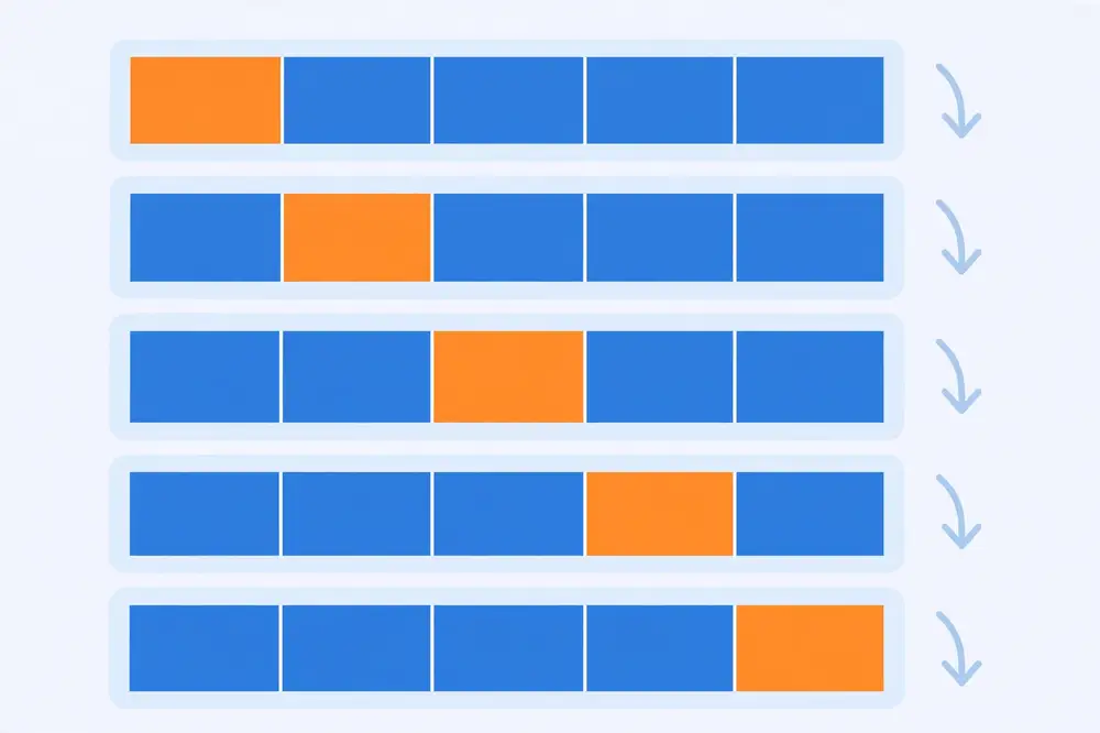
Figure 2. Five-fold cross-validation: the data is divided into five parts; each part takes a turn as the test set (highlighted) while the rest trains the model.
Worked example. You have 100 labeled soil samples and run 5-fold cross-validation (each fold: 80 train, 20 test). The accuracy on each test fold:
Mean = (0.85 + 0.90 + 0.80 + 0.95 + 0.85) / 5 = 4.35/5 = 0.87.
Standard deviation: deviations from mean are −0.02, +0.03, −0.07, +0.08, −0.02. Squared: 0.0004, 0.0009, 0.0049, 0.0064, 0.0004. Sum = 0.013; divide by 5 → 0.0026; √0.0026 ≈ 0.051.
Report: accuracy = 0.87 ± 0.05. Now compare honestly: a competing model scoring 0.89 ± 0.06 is not clearly better — the intervals overlap heavily. A model scoring 0.94 ± 0.03 probably is. Without the ±, you would have declared a winner on noise. This is why reviewers ask for error bars.
Plain k-fold splits randomly, which can put almost all rare-class examples in one fold. Imagine 100 samples with only 10 positives: a random fold of 20 might contain zero positives, making recall undefined (division by zero) on that fold. Stratified k-fold preserves the class ratio in every fold — each fold gets ~2 positives out of 20, mirroring the full dataset. Cost: nothing. Benefit: every fold is evaluable. Always use stratified folds for classification, especially with imbalance. (The standard library implementations, e.g., scikit-learn's StratifiedKFold [6], make this a one-word change.)
Here is the subtle failure mode that invalidates many student projects. Suppose you use cross-validation to choose the best hyperparameters (try 20 settings, pick the winner), then report the winner's CV score as your result. That score is optimistic: you selected the setting that got lucky on those particular folds. The selection process itself overfit.
The honest procedure is nested cross-validation:
Nested CV costs k_outer × k_inner trainings (e.g., 5 × 3 = 15), which is fine for classical models. For deep learning, where one training run takes days, researchers instead use a single held-out validation set for tuning and a locked test set for the final number — the same principle (tuning data ≠ evaluation data), cheaper packaging. Either way, the rule from Chapter 1 holds: the data that makes decisions cannot be the data that judges them.
Twelve patients: 4 sick (S), 8 healthy (H). We want 3 folds of 4, stratified — each fold must hold the 1:2 ratio (about 1–2 sick per fold).
Label patients S1–S4, H1–H8. Shuffle within each class, then deal round-robin:
Simpler with 12 divisible by 3: aim for 4 per fold with ratio preserved as 1 sick + 3 healthy ≈ matches 4:8 = 1:2 closely enough (1:3 vs 1:2 — stratification is approximate with small numbers, and that's fine):
Final: Fold 1: {S1,H1,H2,H3}, Fold 2: {S2,H4,H5,H6}, Fold 3: {S3,S4,H7,H8}. Every fold contains both classes, so recall is computable on every fold — which is the whole point. With plain random splitting, Fold 3 could easily have been {H1,H2,H3,H4} with zero sick patients. Libraries do this dealing for you; now you know what they're doing.
Standard k-fold shuffles data randomly — fatal for time-ordered data, because training on the future to predict the past is leakage (Chapter 1). Forward-chaining (rolling-origin) CV respects time:
The test set always follows the training set in time, mimicking real deployment where you predict the future from the past. Never shuffle time series. If your data has any time component (and most real data does), ask whether random folds are valid before using them.
More folds reduce bias (bigger training sets) but increase compute and the correlation between folds. There's no magic number — there's only the trade-off, stated honestly in your methodology.
For your research: Write your CV scheme in the methodology section with full specifics: "stratified 5-fold cross-validation (seed 42); hyperparameters selected by inner 3-fold CV; we report mean ± std of F1 across outer folds." That one sentence answers four reviewer questions at once. And never, ever re-shuffle your folds until the number looks good — that is p-hacking with extra steps, and it is exactly what pre-registration (Chapter 12) protects you from.
Key takeaways - A single split's result depends on luck; k-fold CV averages over k test rotations for a stable estimate. - Always report mean ± standard deviation — the ± is what lets you compare models honestly. - Use stratified folds for classification so every fold contains every class. - Tuning on the same folds you report from is optimistic; use nested CV or a locked test set. - Fix and report your random seed; reproducibility starts with the split.
Model A scores 87.2% accuracy. Model B scores 86.1%. Is A better? Not necessarily — the 1.1-point gap might be noise from the particular data split, random initialization, or fold assignment. Chapter 7 gave you the ±; this chapter tells you how to decide whether the gap is real. This is statistical significance: asking whether an observed difference would likely persist on new data, or whether chance alone could explain it.
Why does this matter for publication? Because "our model beats the baseline by 0.8%" is the most common sentence in ML papers — and without a significance test, it is also the least trustworthy. Reviewers increasingly demand evidence that improvements are real, especially as benchmark gains shrink to fractions of a percent.
The right way to compare two classifiers is paired: test both on the same folds (or same test examples) and look at the differences, fold by fold. Pairing removes a huge source of noise — some folds are just harder than others — because both models face the same difficulty. Comparing A's average against B's average from different splits is far weaker.
Worked example: the paired t-test by hand. Two models, same 5 folds, accuracy per fold:
| Fold | Model A | Model B | Difference (A−B) |
|---|---|---|---|
| 1 | 0.85 | 0.83 | +0.02 |
| 2 | 0.90 | 0.86 | +0.04 |
| 3 | 0.80 | 0.79 | +0.01 |
| 4 | 0.95 | 0.90 | +0.05 |
| 5 | 0.85 | 0.84 | +0.01 |
Mean difference d̄ = (0.02+0.04+0.01+0.05+0.01)/5 = 0.13/5 = 0.026. Standard deviation of differences: deviations from 0.026 are −0.006, +0.014, −0.016, +0.024, −0.016; squares: 0.000036, 0.000196, 0.000256, 0.000576, 0.000256; sum = 0.00132; ÷(5−1) = 0.00033; s = √0.00033 ≈ 0.0182.
t-statistic = d̄ / (s/√n) = 0.026 / (0.0182/√5) = 0.026 / 0.00814 ≈ 3.19. With 4 degrees of freedom, the two-sided critical value at the 5% level is 2.78. Since 3.19 > 2.78, the difference is statistically significant (p < 0.05): A is genuinely better than B, not just luckier.
Note what made this work: A beat B on every single fold (all differences positive). Consistency across folds is strong evidence. If the differences had been +0.06, −0.05, +0.04, −0.03, +0.01 (same-ish mean, wild swings), the test would say "not significant" — correctly, because the winner flips with the fold.
A p-value is the probability of seeing a difference this large if the models were actually equal and only luck varied the folds. p < 0.05 means: if there were truly no difference, you'd see a gap this big less than 5% of the time. It is not the probability that your conclusion is wrong, and it is not a measure of how big the improvement is. A tiny, meaningless 0.1% gain can be "significant" with enough data; a huge 5% gain can be "non-significant" with 3 folds. Report the effect size (the actual gap, e.g., +2.6 points) alongside the p-value — significance tells you the gap is real, effect size tells you whether it matters.
When you have a single test set (common in deep learning), the paired t-test across folds doesn't apply. McNemar's test compares two classifiers on the same test examples using only the cases where they disagree:
Test statistic = (|b − c| − 1)² / (b + c), compared against the chi-squared critical value 3.84 (5% level).
Worked example. On 200 test images: A right/B wrong on 18 (b=18); A wrong/B right on 7 (c=7). Statistic = (|18−7| − 1)² / 25 = 100/25 = 4.0 > 3.84 → significant: A is better. If instead b=14, c=9: (5−1)²/23 = 16/23 ≈ 0.70 < 3.84 → not significant. Same test set, same models — the second result correctly refuses to crown a winner on thin evidence.
A p-value says "the difference is real." A confidence interval (CI) says "the difference is real, and here's how big it plausibly is." Readers — and reviewers — increasingly prefer the CI because it carries both significance and size.
Worked example (paired differences, by hand). Reuse Chapter 8's fold differences: d̄ = 0.026, s = 0.0182, n = 5. The 95% CI for the true mean difference:
CI = d̄ ± t × (s/√n), with t = 2.78 (4 degrees of freedom).
Margin = 2.78 × (0.0182/√5) = 2.78 × 0.00814 ≈ 0.0226. CI = 0.026 ± 0.0226 → (0.003, 0.049).
Interpretation: "Model A beats B by 2.6 points (95% CI: 0.3 to 4.9 points)." The interval excludes zero — consistent with p < 0.05 — and tells you the win could be as small as 0.3 points (barely matters) or as large as 4.9 (substantial). One line, total honesty. When the CI includes zero, the difference isn't significant — same conclusion as the p-value, but you also see the range of plausible effects.
Statistical significance asks "is it real?"; effect size asks "does it matter?" A 0.2-point gain can be significant with 10,000 test examples and still be worthless. Report:
A common honest sentence: "The improvement is statistically significant (p = 0.02) but modest in absolute terms (+0.9 points), representing a 9% relative error reduction." Let the reader decide if it matters; your job is to make the size unmissable.
With 3+ models, pairwise t-tests multiply the fluke risk (Chapter 8's multiple-comparison warning). The principled approach:
In practice, many papers simplify honestly: pre-register one primary comparison (your model vs the strongest baseline), test that pair properly, and present the rest of the table as descriptive ("other baselines shown for context, without significance claims"). This is legitimate as long as you don't crown winners among the untested pairs.
You don't need a statistics chapter in your paper — one careful sentence per comparison suffices. The template:
"Model A outperforms baseline B by 2.6 accuracy points (95% CI: 0.3–4.9; paired t-test across 5 folds, p = 0.03)."
That sentence contains the effect size, the uncertainty, the test, and the verdict. Reviewers who see it relax; reviewers who don't see it reach for the reject button's neighborhood. And if the test fails — report that too: "the 1.1-point gain over baseline C was not significant (p = 0.24)" reads as honesty, not weakness. Papers get rejected for hiding non-significance far more often than for reporting it.
For your research: Pick one primary comparison for your paper (your model vs the strongest baseline, on your primary metric) and test it: paired t-test across folds, or McNemar on a single test set. Report the gap, the p-value, and the confidence interval in one sentence. Pre-register this comparison (Chapter 12) so no one — including you — can suspect you tested ten baselines and reported the one that came out significant. Reviewers trust a paper that says "the improvement over baseline X is significant (p = 0.03)" far more than one that just bolds the biggest number in a table.
Key takeaways - A higher score is not a better model until you rule out luck; that's what significance testing does. - Compare paired: same folds, same test examples — look at per-fold differences. - Paired t-test across folds, or McNemar's test on a single test set using only disagreements. - p < 0.05 means the gap is unlikely to be luck; always report the effect size too. - Correct for multiple comparisons, and pre-register your primary comparison.
Chapter 2's 99%-accuracy trap was just the opening. Fraud detection, rare-disease screening, network intrusion, manufacturing defects, equipment failure prediction — the most valuable ML applications are exactly the ones where the positive class is rare. Standard evaluation machinery breaks down here in specific, predictable ways, and this chapter gives you the replacement toolkit.
The core problem, restated: when negatives outnumber positives 100-to-1, metrics that average over all examples are dominated by the easy negatives. The model can be perfect on negatives, useless on positives, and still score beautifully. You need metrics that force attention onto the rare class.
1. Precision, recall, and F1 on the minority class. Always report these for the rare class explicitly. A fraud model with 99.9% accuracy but recall 0.30 catches less than a third of fraud — the F1 tells the truth.
2. Balanced accuracy = (recall on positives + recall on negatives) / 2. Each class contributes equally regardless of size. The always-predict-majority "model" scores (0 + 1)/2 = 0.5 — correctly exposed as worthless, where plain accuracy gave it 99%.
3. Matthews Correlation Coefficient (MCC) = (TP×TN − FP×FN) / √((TP+FP)(TP+FN)(TN+FP)(TN+FN)). MCC is the correlation between predicted and true labels: +1 perfect, 0 random, −1 totally wrong. It uses all four cells of the confusion matrix, so it stays honest under any imbalance. Many researchers now consider it the best single-number summary for binary imbalanced problems.
4. PR-AUC (area under the precision-recall curve). Chapter 5 showed ROC-AUC hiding false-alarm floods; the PR curve plots precision vs recall across thresholds, and precision has no such hiding place — every false alarm directly lowers it.
Worked example. Fraud detection: 1,000 transactions, 20 fraud (2%), 980 legitimate. Model flags 30 transactions as fraud: 15 are real fraud, 15 are false alarms.
Read the story: accuracy 0.98 is a lie; balanced accuracy 0.87 is inflated by the easy negatives; F1 0.60 and MCC 0.60 agree the model is mediocre — decent recall, poor precision. If each false alarm costs an investigator an hour, precision 0.50 is the number the business actually feels.
On imbalanced data, the default 0.5 threshold is almost never right. Because positives are rare, you typically lower the threshold to catch more of them, accepting more false alarms — then report the full precision-recall curve so readers see the trade-off you chose. Tune the threshold on the validation set (never the test set), optimizing the metric you actually care about (often F1 or a cost-weighted score). Report the chosen threshold in the paper. "We operate at threshold 0.22, maximizing F1 on validation" is a complete, honest sentence.
Common imbalance remedies — oversampling the minority class, undersampling the majority, SMOTE, class weights — change the training distribution. Critical rule: evaluate on the natural distribution. If you oversample fraud to 50% in training but deploy into a world with 0.1% fraud, your test set must reflect the 0.1% world, or your precision estimate is fantasy. Resample the training folds; keep validation and test folds at natural prevalence. (And with cross-validation: resample inside each fold's training portion, never before splitting — resampling first leaks information across folds.)
Every imbalanced-data paper must state the class ratio plainly: "fraud prevalence 0.18% in the test set." Without it, precision and F1 are uninterpretable — precision 0.5 means something completely different at 10% prevalence vs 0.1%. Reviewers in applied fields check this first.
Take the fraud example's spirit but smaller, so you can compute by hand. Ten transactions, 3 fraud (F), 7 legitimate (L), model scores:
F 0.95, L 0.85, F 0.70, L 0.60, F 0.55, L 0.40, L 0.30, L 0.20, L 0.10, L 0.05.
Compute (recall, precision) at thresholds:
The PR curve starts at (0.33, 1.0), dips to (0.33, 0.5) — that legitimate transaction scoring 0.85 costs half your precision instantly — recovers, then slides to (1.0, 0.3). That dip is the reality of rare-event detection: one confident false alarm devastates precision because true positives are so few. PR-AUC (≈0.68 here by trapezoid) summarizes the whole trade-off in the currency you actually care about.
When you can estimate real costs, skip abstract metrics and compute expected cost directly (as in Chapter 4's clinic example).
Worked example. Fraud team: each missed fraud costs $2,000 on average; each false alarm costs $25 of investigator time. Model X: 20 frauds in test, catches 15 (FN=5), raises 60 false alarms (FP=60). Model Y (higher threshold): catches 12 (FN=8), only 15 false alarms (FP=15).
Model X wins on cost despite far worse precision (15/75 = 0.20 vs 12/27 ≈ 0.44), because missed fraud dominates the budget. If the business instead capped investigator hours, the ranking could flip — which is precisely why the cost model must come from the stakeholder, not the researcher. Report the cost assumptions; they're the most-argued-over and most-useful line in an applied paper.
In pure anomaly detection (network intrusion, equipment failure), "positives" may be unlabeled — you only know normal behavior. Standard precision/recall need labels, so evaluation adapts: inject synthetic anomalies with known labels, use time-to-detection on historical incidents, or report precision@k ("of the top-100 flagged events, how many were real incidents per expert review?"). The principle never changes: measure what the deployment actually needs, on data shaped like deployment.
A complete imbalanced-data results table has two layers:
Papers that report only layer 1 leave readers guessing about real performance; papers that report only layer 2 hide whether a better threshold was available. Together they tell the full story — and the PR curve figure connects them visually, with your operating point marked.
Imbalanced models often output scores, not just rankings — "87% probability of fraud." Calibration asks whether 87% means 87%: among all cases scored ~0.87, do ~87% turn out positive? Check with a reliability diagram (bin predictions by score, plot mean score vs actual positive rate per bin) or the Brier score (mean squared error of probabilities). Miscalibrated models are dangerous when scores drive decisions (auto-blocking transactions above 0.9) — a model can rank perfectly (AUC 1.0) while its probabilities are nonsense. If your deployment acts on probability values rather than just rankings, report calibration. It's a one-paragraph addition that applied reviewers notice and appreciate. As a quick first check, compare the model's average predicted probability on the test set against the actual positive rate — a large gap means the scores are systematically over- or under-confident, and any threshold you set from them will misbehave in production.
For your research: If your positive class is under ~10%, build your results around PR curves, F1/MCC, and per-class precision/recall — not accuracy or ROC-AUC alone. State prevalence, describe how you handled imbalance in training, confirm the test set kept natural prevalence, and report your tuned threshold. This checklist is what separates a publishable rare-event paper from one that gets rejected with "the evaluation does not address class imbalance."
Key takeaways - On rare events, accuracy lies; use precision/recall/F1 on the minority class, balanced accuracy, MCC, and PR-AUC. - MCC (±1 scale) is the most trustworthy single-number summary for binary imbalance. - Tune the decision threshold on validation data for the metric you care about; report the threshold. - Fix imbalance in training only — test on the natural class distribution, resampling inside CV folds. - Always report class prevalence; without it your metrics cannot be interpreted.
Suppose your model reaches 90% accuracy and beats the baseline significantly. Are you done? No — you still don't know why it fails on the remaining 10%, and that 10% contains your next paper. Error analysis is the systematic study of your model's mistakes: collecting the errors, categorizing them, and finding patterns. Every strong results section does this; weak ones stop at the metric table.
There is a second reason: aggregate metrics can hide that a model works well on average but fails catastrophically for one subgroup. A skin-lesion classifier at 92% overall accuracy that scores 60% on dark skin is not a 92% model — it is a biased model. Slicing results by meaningful subgroups (demographics, image conditions, classes, time periods) is how you find out.
Worked example. A crop-disease classifier: 200 test images, 24 errors (88% accuracy). Manual review of all 24:
The research plan writes itself: the biggest bucket (low light) suggests adding low-light augmentation or a "retake photo" prompt in the app; the blight/rust confusion suggests a focused two-class follow-up study; the 3 mislabels mean true accuracy is arguably 91.5%, not 88%. None of this came from the 88% — it came from looking.
Choose slice dimensions before you look at results (to avoid cherry-picking), based on domain knowledge: patient age group, image lighting, geographic region, class rarity, text length, time of year. Compute your primary metric per slice. Look for two things:
Worked example. A loan-approval model's overall accuracy is 91%. Sliced by applicant region:
| Region | n | Accuracy | Approval recall |
|---|---|---|---|
| North | 400 | 0.94 | 0.93 |
| South | 350 | 0.92 | 0.90 |
| East | 150 | 0.89 | 0.85 |
| West (rural) | 100 | 0.74 | 0.61 |
Overall 91% hides that the model fails rural Western applicants — recall 0.61 means nearly 4 in 10 creditworthy applicants there are wrongly rejected. Possible causes: fewer training examples from that region, or features that don't transfer (urban income patterns vs rural). The fix is more data from the weak slice or region-specific calibration — and ethically, this model should not deploy until the gap is addressed. A paper that reports only the 91% is misleading; a paper that reports the slice table and discusses it is doing science.
If your method has multiple components (a new feature set + a new architecture + a new loss function), an ablation study removes them one at a time and re-measures. Result: "removing the texture features costs 4.1 F1 points; removing the new loss costs 0.3." This tells readers — and you — which ideas actually matter. Components that cost nothing when removed should be cut from the paper's claims (or from the model). Reviewers routinely ask "is the gain from X or from Y?"; an ablation table answers before they ask.
Dedicate a real subsection to error analysis ("Error Analysis" or "Qualitative Results"), with: the taxonomy table with counts, 2–4 example error images/cases in a figure, the slice table, and one paragraph of interpretation linking patterns to concrete next steps. This section is often what examiners and reviewers quote — it proves you understand your model rather than just operating it.
Error analysis isn't only for classifiers. For regression, slice residuals by predicted value, by subgroup, or by feature ranges:
Worked example. A house-price model: overall MAE = $12,000. Sliced by price band:
| Band | n | MAE |
|---|---|---|
| Under $100k | 120 | $6,000 |
| $100k–$300k | 200 | $11,000 |
| Over $300k | 60 | $28,000 |
The model is twice as bad (relatively and absolutely) on expensive houses — perhaps because they're rarer in training, or luxury features aren't captured. The fix differs by cause: more luxury examples, or new features (lot size, neighborhood). Also plot residuals vs each input feature: a trend (e.g., residuals growing with house age) means the model mishandles that feature — a modeling insight no aggregate metric provides.
Error analysis earns its keep when it drives the next experiment. The loop:
If the slice improves and nothing else regresses, the analysis paid off — and the paper gains a paragraph showing scientific iteration rather than lucky tuning. Document the loop; reviewers love "error analysis revealed X, so we did Y, which improved slice Z by N points."
Reserve one figure for qualitative results: 2–4 example predictions with brief captions — one success, two characteristic failures, one interesting edge case. For vision: the images with predicted/true labels. For text: the sentences with model output. This figure does three jobs: it proves you looked at real outputs, it makes failure modes tangible for readers, and it often becomes the most-remembered part of your paper. Caption each example with why it matters ("typical low-light failure from error category 1"), not just what it shows.
Don't start your error taxonomy from a blank page — adapt these:
Expect 1–2 categories to dominate; that's normal and useful — it focuses your next experiment. And always include a "label looks wrong" bucket: in most real datasets, 2–10% of "errors" are annotation mistakes, and quantifying them sets a ceiling on achievable performance that reviewers find credible.
Error analysis has diminishing returns. Stop when new errors stop forming new categories — typically after 50–150 inspected cases — and when the remaining errors look like irreducible noise (genuinely ambiguous cases even experts disagree on). Document that stopping point: "manual review of 120 errors; categories saturated after ~80." It shows method, not exhaustion, and it keeps the analysis chapter proportionate to the rest of the thesis.
For your research: Budget two full days for error analysis before writing your results chapter — it is the highest-insight-per-hour work in the project. Pre-commit to your slice dimensions in your evaluation plan (Chapter 12) so the audit is principled, not a hunt for flattering subgroups. And when you find an embarrassing weakness (you will), report it: a discussed weakness is a future-work paragraph and a sign of maturity; a hidden one is a rejection reason when the reviewer finds it.
Key takeaways - Aggregate metrics hide error patterns and subgroup failures; error analysis and slicing reveal them. - Protocol: collect errors, inspect manually, build a taxonomy, count, check labels, prioritize the biggest bucket. - Slice results by domain-meaningful subgroups chosen in advance; watch for disparate impact. - Ablation studies show which components of your method actually earn their performance. - Give error analysis its own subsection with tables, examples, and interpretation — reviewers read it closely.
You will read dozens of papers before writing your own. Most students read results sections passively — "they got 94%, good." Researchers read adversarially: should I believe this number? This chapter is a checklist for that reading. It also secretly teaches you how to write your own results section, because every trap you learn to spot is a trap you will avoid setting.
1. What exactly was measured, and on what? Find the dataset, the split, and the metric definition. Red flags: metric named but not defined ("we report accuracy" — on which class? which split?), test set size missing, or "we split randomly" with no seed or ratio.
2. Is there a real baseline? A result without a baseline is a number without meaning. Strong papers compare against the best known method, tuned fairly. Red flags: comparing only against weak or outdated baselines, against the authors' own reimplementation with no tuning details, or against nothing at all ("our model achieves 92%").
3. Were baselines tuned fairly? The classic trick: spend weeks tuning your own model, run baselines with default settings, then celebrate the gap. Honest papers tune baselines with comparable effort (same validation data, similar search budget) and say so. If tuning effort isn't described, assume it wasn't equal.
4. Is the test set truly untouched? Look for signs of peeking: model selected by test performance ("we chose the architecture with the best test accuracy"), threshold tuned on test, or preprocessing (like feature selection or scaling) fit on the full dataset before splitting. Any of these is leakage (Chapter 1, Chapter 7).
5. Are the gains significant? A table where the proposed method beats five baselines by 0.3–0.8% with no significance test and no error bars is noise presented as victory. Look for ±, confidence intervals, or p-values (Chapter 8). Their absence doesn't prove the result is false — but it means the authors haven't shown it's true.
6. Do the metrics match the problem? Accuracy on a 99-to-1 imbalanced dataset (Chapter 9), RMSE reported without units or context (Chapter 6), AUC without a PR curve on rare events (Chapter 5) — metric choice reveals whether the authors understand their own problem.
7. Can you reproduce it? Seeds, fold counts, hardware-independent details, code or precise hyperparameters. "We used a neural network" is not reproducible. The trend in top venues is mandatory code release; treat missing code as a yellow flag, not a verdict.
You read: "Our method achieves 96.2% accuracy, outperforming Baseline A (91.0%) and Baseline B (93.5%) on the XYZ dataset."
Apply the checklist:
Verdict: this result is not evidence. A fair version would report balanced metrics on the minority class, compare against 2024 methods tuned on the same validation split, and show significance. Notice you reached this verdict without running a single experiment — critical reading is cheap, and it protects you from building on sand.
Every item above inverts into a rule for your own paper: define metrics precisely, tune baselines fairly and say so, lock the test set, show uncertainty, match metrics to the problem, release code and seeds. Write the results section you'd want to read as a skeptic. The easiest way: hand your draft to a colleague with this checklist and ask them to attack it.
Learn to translate common results-section phrasing:
None of these phrases prove misconduct — sometimes they're just sloppy writing. But each one tells you exactly which question to ask next, which is the skill.
Contrast the suspicious table from earlier with this:
"On the XYZ test set (n = 2,000; 6% positive), our model reaches F1 = 0.72 ± 0.03 (5-fold stratified CV, seed 11), vs. 0.65 ± 0.04 for the strongest baseline [14], tuned with equal budget on the same validation folds. The paired difference (+7.0 points, 95% CI 3.1–10.9) is significant (paired t-test, p = 0.008). PR curves (Fig. 3) show the gain holds across thresholds; error analysis (§4.3) attributes it to... Code and seeds: [link]."
Every clause answers a checklist item: prevalence, metric, uncertainty, split scheme, fair baseline tuning, significance with effect size and CI, threshold-robustness, error analysis pointer, reproducibility. Write yours to the same template and reviewers run out of objections.
When someone presents results, these five questions cut to the truth fastest:
Ask them of others' work to learn; expect them on your own work to survive.
Sooner or later a reviewer writes: "The evaluation is insufficient." Here's how to respond to the common variants:
The meta-principle: treat every evaluation critique as a gift. Each one you address makes the paper harder to reject and easier to build on — which is, after all, the point of publishing. Keep the checklist from this chapter taped next to your desk while writing; it's cheaper than a second round of reviews.
For your research: Start a "results autopsy" document: for every paper you cite, fill in one row — dataset/split, metric, baselines, tuning fairness, significance reported?, leakage signs, your verdict. After 15 papers you'll spot weak evaluation in seconds, and your related-work section will practically write itself ("prior work reports accuracy on imbalanced data without significance testing; we address this by..."). That sentence is a contribution claim reviewers understand instantly.
Key takeaways - Read results adversarially: dataset/split, metric definition, baselines, tuning fairness, leakage, significance, reproducibility. - A number without a baseline, without error bars, and without a defined split is not evidence. - Watch for unfair baseline tuning, test-set peeking, metric–problem mismatch, and misleading figures. - Every checklist item inverts into a rule for writing your own results section. - Keep a "results autopsy" table of papers you read — it trains your eye and feeds your related work.
In your thesis proposal or paper's methodology chapter, evaluation deserves the same care as model design. Examiners read methodology asking one question: if I ran this plan, would I trust the conclusion? This chapter turns everything in the book into a concrete plan template — and introduces pre-registration: writing the plan down before seeing results, which protects you from fooling yourself.
Human brains are excellent at finding patterns — including patterns that aren't there. If you try 20 model variants and report the best test score, you've selected for luck (Chapter 7). If you check accuracy, then F1, then AUC, and report whichever looks best, you've done the same with metrics. Pre-registration means fixing in advance: the primary metric, the data splits, the baselines, the statistical test, and what counts as success. Then you run the plan and report the outcome — good or bad.
This doesn't forbid exploration. It separates confirmatory analysis (the pre-registered plan; this is your evidence) from exploratory analysis (everything else; labeled honestly as exploration). Both are valuable; only the first proves the claim. Many theses now include the evaluation plan in the proposal defense — your examiners approve the method, and then the results are what they are.
Fill this in before training. One page. Get your supervisor's sign-off.
1. Research question (one sentence). Example: "Does adding soil-moisture sensor features improve wilt-disease detection over image-only features?"
2. Dataset and splits. Name the dataset, its size, and class distribution. Specify the split scheme: "stratified 5-fold CV (seed 42)" or "70/15/15 stratified split (seed 42)". State that the test set/folds are locked before any tuning.
3. Primary metric (one, with justification). Example: "F1 on the disease class — primary because missing a diseased plant (recall) and false alarms that waste pesticide (precision) are both costly." Name 1–2 secondary metrics.
4. Baselines (at least two). A trivial baseline (majority class / mean predictor) and the strongest known method, tuned with comparable effort on the same validation data.
5. Model selection protocol. How hyperparameters are chosen: "inner 3-fold CV within each outer fold (nested CV)"; or "validation split; test touched once at the end." State the decision threshold policy.
6. Comparison statistics. "Primary comparison (our model vs strongest baseline on F1) tested with a paired t-test across folds at α = 0.05; 95% confidence interval reported."
7. Slices and error analysis. Pre-commit slice dimensions: "metrics reported per disease stage (early/late) and per lighting condition (field/lab)." Error analysis: "100 errors manually categorized."
8. Success criterion. Example: "Success = statistically significant F1 improvement ≥ 3 points over the strongest baseline, with no slice dropping below baseline." Writing this down stops you from redefining victory after seeing the numbers.
9. Reproducibility. Seeds, library versions, hardware notes, code repository link (to be filled at submission).
Project: SMS spam detection for Urdu-language messages (a realistic MS thesis topic).
This plan is a contract. When the results come in — whatever they are — the thesis writes itself, because every methodological decision was already defended.
If the pre-registered test fails, that is a finding, not a failure: "under rigorous evaluation, the proposed features did not significantly improve over the baseline (ΔF1 = +0.8, p = 0.31)." Report it, then explore honestly: the error analysis (Chapter 10) usually reveals why — wrong features, noisy labels, or a baseline stronger than expected. Some of the best theses are careful negative results with a sharp diagnosis. What destroys credibility is not a negative result but a plan quietly rewritten to manufacture a positive one.
For your research: Put this one-page plan in your thesis proposal and again (condensed) in your paper's methodology section. When examiners ask "why this metric?" or "how do you know the improvement is real?", you point at the plan — approved before results existed. That is the difference between a student who ran experiments and a researcher who tested a hypothesis. Keep the approved plan unedited (version it); any change after seeing results gets documented as a deviation, with reasons.
Key takeaways - Evaluation design belongs in methodology; write the plan before training, not after. - Pre-register: one primary metric, fixed splits, named baselines, a statistical test, and a success criterion. - Separate confirmatory analysis (your evidence) from exploratory analysis (labeled as such). - A rigorous negative result with a sharp diagnosis beats a manufactured positive one. - Get supervisor sign-off on the one-page plan; version it and document any deviations.
[1] T. Hastie, R. Tibshirani, and J. Friedman, The Elements of Statistical Learning, 2nd ed. New York, NY, USA: Springer, 2009. [2] C. M. Bishop, Pattern Recognition and Machine Learning. New York, NY, USA: Springer, 2006. [3] T. M. Mitchell, Machine Learning. New York, NY, USA: McGraw-Hill, 1997. [4] K. P. Murphy, Probabilistic Machine Learning: An Introduction. Cambridge, MA, USA: MIT Press, 2022. [5] A. Géron, Hands-On Machine Learning with Scikit-Learn, Keras, and TensorFlow, 2nd ed. Sebastopol, CA, USA: O'Reilly Media, 2019. [6] F. Pedregosa et al., "Scikit-learn: Machine learning in Python," J. Mach. Learn. Res., vol. 12, pp. 2825–2830, 2011. [7] S. Russell and P. Norvig, Artificial Intelligence: A Modern Approach, 4th ed. Hoboken, NJ, USA: Pearson, 2020.
End of Book 5. Next: Book 6 — Overfitting and How to Avoid It.