← All 50 books
Book 4 of 50 · Free
Data Preprocessing and Feature Engineering
19,069 words · 17 chapters · illustrated
Book 4 of 50 · Free
19,069 words · 17 chapters · illustrated
Book 4 of 10 — AstolixGen Learning Series (Detailed Edition) · For researcher and publication students
You can have the most advanced model in the world, but if you feed it bad data, it will give you bad answers. This is the least glamorous and most decisive part of machine learning research. Surveys of working data scientists consistently find that they spend the majority of their project time — often cited around 60–80% — preparing data rather than tuning models. This book is about that work: how to explore, clean, transform, and document your data so that everything downstream is trustworthy.
This book is written for MS and PhD students and early researchers who want publishable results. You will learn why data quality decides outcomes, how to handle missing values and outliers without silently biasing your results, how to encode and scale features properly, how to engineer new features that carry real signal, how to select the right ones, and how to build preprocessing pipelines that someone else — a reviewer, a collaborator, a future you — can reproduce exactly. Many papers are rejected not because the model was weak, but because the preprocessing was sloppy, undocumented, or leaked information from the test set. This book teaches you to avoid every one of those traps.
Learning objectives: - Explain why data quality determines model success more than model choice, with evidence - Perform exploratory data analysis (EDA): distributions, missingness, outliers, and relationships - Diagnose why data is missing and choose an imputation strategy that does not distort results - Encode categorical variables using one-hot, ordinal, and target encoding, and avoid their pitfalls - Apply standardization and normalization correctly and explain when each matters - Engineer new features from raw data (dates, text, interactions, aggregations) - Select relevant features using filter, wrapper, and embedded methods - Preprocess text and image data for machine learning - Handle imbalanced datasets with resampling, class weights, and SMOTE - Build reproducible preprocessing pipelines and document datasets for papers (datasheets)
| Concept | Definition (one line) | Example | Use in research |
|---|---|---|---|
| Garbage in, garbage out | Bad input data produces unreliable model outputs no matter how good the model is. | Mislabeled tumor scans → a cancer classifier that looks accurate but fails in clinics. | Motivate data quality sections in your paper's methodology. |
| Exploratory data analysis (EDA) | Systematic inspection of data (distributions, missingness, relationships) before modeling. | Plotting histograms reveals an income column stored as text. | Prevents modeling on misunderstood data; many EDA findings become paper figures. |
| Missing data mechanism (MCAR / MAR / MNAR) | MCAR: missing at random; MAR: missing depends on observed data; MNAR: missing depends on the missing value itself. | Sensor failure = MCAR; older patients skip a question = MAR; patients hide low income = MNAR. | Justifies your imputation choice; reviewers check this reasoning. |
| Imputation | Filling in missing values with estimates. | Replacing missing blood pressure with the median. | Keeps sample size without inventing false precision; report what you did. |
| Outlier | A value far from the rest, either a real rare event or an error. | Age = 250 in a survey. | Detect with z-scores/IQR; decide removal vs. correction per case. |
| One-hot encoding | Converting categories into binary columns, one per category. | City → columns city_Lahore, city_Karachi. | Required for most models; watch for high-cardinality blow-up. |
| Ordinal encoding | Mapping ordered categories to numbers that preserve rank. | low=1, medium=2, high=3. | Use only when order is meaningful. |
| Target encoding | Replacing a category with the average target value for that category. | Encoding district by its average house price. | Powerful but leaks target info — always compute inside cross-validation folds. |
| Standardization | Rescaling to zero mean and unit variance: z = (x − μ)/σ. | Scaling features before logistic regression or SVM. | Required for distance-based and gradient-based models. |
| Min-max normalization | Rescaling to a fixed range, usually [0, 1]: (x − min)/(max − min). | Pixel values to [0, 1] for neural networks. | Use when a bounded range is needed (e.g., image inputs). |
| Feature engineering | Creating new informative features from raw data. | Extracting "days since last purchase" from timestamps. | Often the biggest performance lever in a paper; reportable as a contribution. |
| Feature selection | Keeping only the features that help the model. | Dropping 50 noisy sensor channels to keep 8 useful ones. | Reduces overfitting and training cost; simplifies interpretation. |
| Tokenization | Splitting text into units (words, subwords) a model can process. | "good movie" → ["good", "movie"]. | First step of any NLP experiment. |
| Embeddings | Dense vector representations capturing word meaning. | "king" − "man" + "woman" ≈ "queen". | Lets models understand semantic similarity in text. |
| Data augmentation | Creating extra training examples by transforming existing ones. | Rotating/flipping training images. | Reduces overfitting in vision tasks with small datasets. |
| Class imbalance | One class having far fewer examples than others. | 5% fraud vs. 95% normal transactions. | Fix with resampling, class weights, or SMOTE; never judge by accuracy alone. |
| SMOTE | Synthetic Minority Oversampling: creating synthetic minority samples by interpolating between neighbors. | Generating new fraud-like transaction records. | Improves minority-class recall; apply only to training data. |
| Pipeline | A fixed, reusable sequence of preprocessing + modeling steps. | Clean → encode → scale → train, applied identically to train and test. | Guarantees no train/test leakage and full reproducibility. |
| Data leakage | Test-set information accidentally influencing training. | Fitting the scaler on the full dataset before splitting. | The #1 reason reported results are inflated; pipelines prevent it. |
| Datasheet for datasets | A structured document describing a dataset's purpose, composition, collection, and limitations. | Documenting who labeled the images and under what conditions. | Increasingly expected by journals/conferences for dataset papers. |
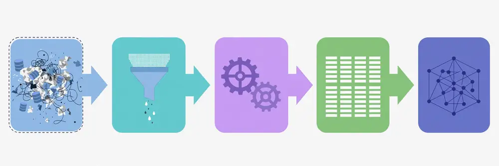
Roadmap of chapter connections. Think of this book as an assembly line: Chapter 1 explains why the line matters (data quality is the bottleneck). Chapter 2 gives you the inspection tools (EDA) to see what is broken. Chapters 3–4 fix the two most common defects: missing values and outliers. Chapters 5–6 convert raw columns into a numeric form models can digest (encoding, scaling). Chapters 7–8 are the creative core: building better features (engineering) and discarding useless ones (selection). Chapters 9–10 specialize the same ideas for text and images. Chapter 11 fixes the class-imbalance trap that ruins many first papers. Chapter 12 locks everything into a reproducible pipeline with documentation — the part reviewers actually read. Each chapter assumes only the previous ones; by the end, you can take any raw dataset and turn it into a defensible, publishable input.
Every machine learning project begins with a hope: that a clever algorithm will find patterns in our data. But there is an old saying in computing that no algorithm has ever escaped — garbage in, garbage out (GIGO). Feed a model noisy, mislabeled, biased, or badly formatted data, and the output will be wrong, no matter how sophisticated the model is. Feed it clean, well-understood data, and even a simple model can perform remarkably well.
This is not just folk wisdom. There is evidence. The widely used data mining methodology CRISP-DM (Cross-Industry Standard Process for Data Mining) was built on the experience that data preparation consumes most of a project's effort. Practitioner surveys over many years — including CrowdFlower's and Kaggle's surveys of data scientists — have consistently reported that practitioners spend roughly 60–80% of their time collecting, cleaning, and organizing data, and only a small fraction tuning models [4]. Kaggle competition winners routinely say the same thing: victory came from better features and cleaner data, not from a fancier model. In research, the pattern repeats. Studies of published ML models in healthcare have shown that models trained on datasets with label errors or distribution shifts fail when deployed, even though their published accuracy looked excellent. The model did not fail; the data pipeline failed.
A model learns whatever pattern is in the training data — including the wrong patterns. Consider these real failure modes:
The key insight: a model amplifies what the data contains. It cannot add information that is not there, and it cannot remove poison that is. Your job as a researcher is to make the data worthy of the model.
In a publication, you will be judged on your data work at least as much as your model. Reviewers ask: Where did the data come from? How was it labeled, and by whom? What was removed, and why? If you cannot answer, your results are not trusted. Good data work is also a research contribution in itself: a well-cleaned public dataset, a documented labeling protocol, or a careful analysis of data limitations can be the core of a paper.
Worked example. A student team built a model to predict student dropout from university records. Their first dataset had a column "last_login_days" — days since the student last logged into the portal. The model achieved 97% accuracy. Celebration — until someone noticed the column was computed from data after the dropout date for dropouts (their accounts were deactivated, so "last login" froze at a huge value). The model had simply learned "accounts that never log in again are dropouts" — a tautology, not a prediction. After rebuilding the feature using only data available before the prediction date, accuracy fell to 74% — honest, useful, publishable. This is data leakage, and Chapter 12 will teach you to prevent it systematically.
For your research: Before you touch a model, write a one-page "data story": where the data came from, who collected it, how it was labeled, what is missing, and what could be wrong. Keep it. Half of your paper's methodology section will grow out of it, and it forces you to confront quality problems early, when they are cheapest to fix.
The claim that data beats models is not just practitioner lore — it has been studied. Research on label noise has shown that deep neural networks can memorize completely random labels, which means a network trained on mislabeled data will happily learn the mislabels and report high training accuracy while generalizing poorly [7]. Other studies have found that a significant fraction of widely used benchmark datasets contain label errors, and that correcting those errors changes model rankings. The lesson for your research: when your model underperforms, your first suspect should be the labels, not the architecture.
This has grown into an explicit movement called data-centric AI: instead of iterating on the model while holding the data fixed, you hold the model fixed and iterate on the data — improving labels, adding hard examples, removing corrupt ones. In several benchmarks, data-centric iterations produced larger gains than model-centric ones. For a student researcher, this is good news: you may not have the compute to train giant models, but you can always afford to understand and improve your data. A paper whose contribution is "we fixed the dataset and everything got better" is a legitimate, publishable contribution.
There is also a cost argument reviewers understand. Collecting more data is expensive; cleaning the data you have is cheap. A careful error analysis — looking at the specific examples your model gets wrong and asking whether the data is wrong — often reveals that 20% of errors come from 2% of bad labels. Fixing those is an afternoon's work with outsized returns.
Researchers often find it useful to name the specific dimensions of quality they checked:
Walking through these five in your paper's dataset section — even briefly — shows a reviewer you thought systematically rather than hoping for the best.
Here is a perspective shift that helps many students: data work is not the janitorial preamble to "real" research — it can be the research. Some of the most cited papers in applied ML are dataset papers: the authors collected, cleaned, and documented a dataset the community needed, and hundreds of later papers built on it. Even without releasing a dataset, a paper that carefully analyzes data quality — "we found 12% label error in the standard benchmark, corrected it, and re-evaluated five published models" — makes a genuine contribution and gets cited.
For your thesis, consider making one chapter or section a data audit: document the five quality dimensions above for your dataset, quantify each problem you found, and show the effect of fixing it on a baseline model. This demonstrates exactly the skills examiners and reviewers value: skepticism, rigor, and honesty about limitations. It also protects you in the viva — "why should we trust your results?" is answered by "here is everything I checked, with numbers."
The broader science community has learned — painfully, through the replication crisis in psychology and medicine — that results built on shaky data do not replicate. Machine learning is now going through its own reckoning: "reproducibility checklists" at major conferences explicitly ask about data collection, labeling, splits, and preprocessing. Meeting those checklist items is not bureaucracy; it is how your work survives contact with other researchers trying to build on it. Every section of this book maps to one or two checklist items. When you finish the book, you will be able to tick them all.
A question every student asks: "Is my dataset big enough?" The honest answer: it depends on the signal-to-noise ratio, not on a magic number. A practical tool is the learning curve: train your model on 10%, 20%, …, 100% of the data and plot validation performance. If the curve is still rising steeply at 100%, more data would help — consider collecting or augmenting. If it plateaued long ago, your bottleneck is elsewhere (features, labels, model). Include the learning curve in your paper when data size is a plausible concern; it converts "we used 5,000 examples" from an arbitrary choice into an analyzed one. And remember the quality corollary from this chapter: 1,000 clean, well-labeled examples routinely beat 10,000 noisy ones.
If you are short on time, spend it where it counts: (1) verify your labels on a random sample — label errors are the highest-leverage problem; (2) check for leakage — the highest-risk problem; (3) fix the worst missingness and the obvious outliers. Everything else is refinement. This prioritization also structures your paper's limitations section honestly: "we verified labels on a 300-sample audit (4% error, corrected); residual label noise remains a limitation." Reviewers accept limitations they can see; they punish ones they discover.
Key takeaways - Garbage in, garbage out: model output quality is bounded by input data quality. - Practitioners spend most project time on data preparation; competition winners win on features, not models. - Models amplify whatever is in the data — including mislabels, bias, and measurement errors. - Data leakage (using information unavailable at prediction time) produces fake high accuracy. - Document your data story from day one; reviewers judge data work as seriously as model work.
Exploratory data analysis (EDA) is the habit of looking at your data carefully before you model it. It means checking shapes, distributions, missing values, and relationships — with tables, summary statistics, and plots — so that you build your model on facts, not assumptions. EDA is where most data problems are discovered: the column stored as text that should be numeric, the "gender" column with 14 distinct spellings, the sensor that recorded zeros all weekend.
Work through these steps on every new dataset:
df.info() in pandas (or glimpse() in R) often reveals the first surprises — numbers stored as strings, dates stored as strings, columns that are entirely empty.df.describe() gives count, mean, standard deviation, min, max, and quartiles for numeric columns. Look for impossible values: negative ages, percentages above 100, a "year" column containing 190.df.isnull().sum()). A column missing 60% of its values is a different problem from one missing 2% — the first may need to be dropped or investigated; the second can be imputed.df['col'].value_counts(). This reveals typos ("Male", "male", "M", "m"), unexpected categories, and high-cardinality columns (e.g., 10,000 unique user IDs) that need special handling.You do not need dozens of plots. Five cover most needs: histograms (distributions), box plots (spread and outliers per group), scatter plots (relationships between two numeric variables), bar charts of value counts (categorical balance), and a correlation heatmap (feature redundancy). Each plot should answer one question. If you cannot say what question a plot answers, skip it.
Good EDA produces figures and tables that belong in your publication: a table of dataset statistics, a plot of class distribution, a missingness summary. Reviewers trust papers whose authors clearly looked at their data. Conversely, a paper that jumps straight to model architecture with no dataset description raises suspicion.
Worked example. A researcher received a crop-yield dataset with 12,000 rows and a "rainfall_mm" column. describe() showed a maximum of 9999 mm — impossible. A histogram revealed a spike exactly at 9999. Checking the data dictionary (a habit worth building), 9999 turned out to be the sensor's code for "sensor offline." Treating those as real rainfall values would have destroyed the model; EDA caught it in ten minutes. The researcher documented the finding, converted 9999 to missing, and imputed it properly (Chapter 3). That one EDA step changed the model's error by 15%.
For your research: Do EDA in a notebook you keep, and save the key plots. When you write your paper, your "Dataset" subsection almost writes itself from the EDA notebook. Never skip EDA to "save time" — the time it saves you is debugging a model trained on data you never understood.
The checklist above assumes tabular data, but EDA adapts to every modality:
EDA is not just bug-hunting; it generates the hypotheses your modeling will test. When the box plot shows readmission rates rising steeply after age 70, that suggests an age interaction feature (Chapter 7). When two features correlate at 0.97, that suggests dropping one (Chapter 8). When the histogram of the target is bimodal, that suggests a hidden subgroup worth investigating — possibly your paper's most interesting finding.
Write down every hypothesis EDA suggests, even the ones that turn out wrong. In your paper's discussion section, the story "EDA suggested X; the model confirmed/refuted it" reads as genuine scientific reasoning, because it is.
For large datasets, automated EDA tools (pandas-profiling / ydata-profiling, Sweetviz) generate a full report — distributions, correlations, missingness, duplicates — in one command. Use them for the first pass, but do not stop there: automated reports do not know your domain, cannot read your text samples, and will not notice that "9999" is a sensor code. Automation finds candidates; you make judgments.
By the end of EDA you should have: (1) the data story document (Chapter 1), (2) a cleaned EDA notebook with key plots, (3) a data dictionary — one row per column: name, type, meaning, units, allowed values, missingness rate, and notes, and (4) a list of decisions (columns to drop, values to recode, hypotheses to test). The data dictionary is the single most useful artifact: it becomes your paper's dataset table, your collaborator's onboarding doc, and your own memory six months later.
Beginners explore features and forget the target — but the target deserves its own EDA. For classification: plot class counts (imbalance, Chapter 11), and check for label noise by inspecting random samples per class — mislabeled examples are often visible (a "healthy" leaf photo showing blight). For regression: histogram the target; heavy skew suggests a log transform of the target itself (common for prices, counts); a bimodal target suggests hidden subgroups. Also check the target's relationship with obvious features: if nothing correlates with the target at all, either your features are wrong or your target is broken — better to learn that in EDA than after weeks of modeling.
EDA has a failure mode: endless exploration that never becomes modeling. Time-box it. A good rule: stop when new plots stop changing your plan — when the last three things you checked confirmed what you already knew. Write the decision list (Chapter 2's deliverable #4), start building the pipeline, and let modeling results send you back to EDA with sharper questions. EDA is a loop, not a phase: explore → build → evaluate → explore again, each round more targeted than the last.
Key takeaways - EDA means inspecting shape, types, statistics, missingness, distributions, relationships, and duplicates before modeling. - Simple tools (info, describe, value_counts, histograms, box plots, correlation heatmaps) catch most problems. - Suspicious values (9999, 0-spikes, impossible ranges) are often missing-value codes or errors — investigate before modeling. - EDA outputs (tables, plots) become the dataset section of your paper. - Keep your EDA notebook; it is the audit trail of your data understanding.
Almost every real dataset has missing values — sensors fail, respondents skip questions, records get corrupted. How you handle them matters enormously: the wrong approach silently biases your results, while the right approach preserves your sample size and your honesty. The first step is not to fill anything in. It is to ask why the data is missing.
Statisticians classify missing data into three mechanisms [1], [5]:
Why does this matter? Because the mechanism determines which fixes are valid. Simple imputation works reasonably under MCAR and MAR (with the right variables included), but under MNAR, standard imputation underestimates the truth, and you must say so in your paper as a limitation.
A classic beginner error: computing the mean over the entire dataset and filling missing values before splitting into train and test. The test set's values then influenced the training data — leakage (Chapter 12). Always: split first, compute imputation statistics on the training set only, apply to both.
Worked example. A hospital dataset (n = 2,000) had missing blood pressure for 15% of patients. Analysis showed missingness correlated with age (older patients, rushed visits) — MAR, not MCAR. The researcher compared three approaches with 5-fold cross-validation: (a) dropping rows (n fell to 1,700, model AUC 0.78), (b) median imputation (AUC 0.81), (c) k-NN imputation using age, weight, and diagnosis (AUC 0.84). The paper reported all three in an ablation-style table, chose (c), and noted the MAR assumption with its limitation. Reviewers praised the comparison — it turned a chore into evidence.
For your research: In your paper's methodology, write one short paragraph: what percentage was missing per key variable, what mechanism you believe applies and why, and which imputation you chose. Add an ablation (with vs. without, or two strategies compared) if space allows. This single paragraph signals methodological maturity to reviewers more than almost anything else in preprocessing.
Imputation is not always the answer. Do not impute when:
Single imputation (one filled-in value) pretends you know the missing value, understating uncertainty. Multiple imputation creates, say, 5–10 completed datasets with different plausible values drawn from a model, runs your analysis on each, and pools the results with rules that combine both the average estimate and the disagreement between imputations [1], [5]. The wider the disagreement, the more honest your confidence intervals become.
In ML papers this is still rare — most authors use single imputation — but knowing it exists strengthens your methodology discussion. A defensible middle ground used in many papers: single model-based imputation for the main results, plus a sensitivity check (e.g., "results were unchanged under median imputation and under complete-case analysis"), reported in one sentence. That sentence tells reviewers your conclusions do not hinge on an arbitrary filling choice.
Copy, adapt, and paste this into your methodology section:
"Variable X was missing in N% of records. Missingness was associated with [variables], consistent with a MAR mechanism. We applied [method], with parameters estimated on the training set only. A sensitivity analysis using [alternative] produced qualitatively identical results."
Four sentences. Reviewers who check preprocessing will nod and move on — which is exactly what you want.
In scikit-learn [6], the pieces look like this. Simple imputation: SimpleImputer(strategy='median') for numbers, strategy='most_frequent' for categories. Smarter: KNNImputer(n_neighbors=5) fills each gap from the five most similar complete rows; IterativeImputer cycles through columns, predicting each from the others — slower but often better. The non-negotiable pattern:
split data into train / test FIRST
imputer.fit(train)        # learn medians / neighbors from train only
train_filled = imputer.transform(train)
test_filled  = imputer.transform(test)   # apply, never re-fit
Inside cross-validation, wrap the imputer and model in a Pipeline so each fold re-fits the imputer on its own training portion (Chapter 12). And add the missingness indicator with a second tiny step: a binary column per imputed feature marking "was missing here." Three lines of code, and your paper can honestly say the model had access to the missingness signal.
A final practical note: imputation changes distributions — median imputation creates a spike at the median, visible in a histogram. That spike is fine for tree models but can distort linear models slightly; it is one more reason the sensitivity check (try two strategies, compare) is worth its one sentence in the paper.
Categorical missingness needs its own handling. Options: impute with the mode (most frequent category) — simple, but can inflate the majority class; add an explicit "Missing" category — often the best choice, since it preserves the information that the value was absent and works naturally with one-hot or target encoding; or predict the category from other columns (classification-based imputation). Avoid imputing rare categories — a category with 5 examples that gains 500 imputed ones is no longer a real category. And watch the semantics: "unknown" as a category is honest; silently filling the mode pretends knowledge you do not have.
Pin this to your wall: >60% missing? → drop the column (or investigate why). Structurally absent? → "not applicable" category, never impute. MCAR and <5%? → median/mode is fine. MAR? → model-based imputation (k-NN or iterative) using the variables that explain the missingness. MNAR? → impute cautiously, add the missingness indicator, and state the limitation plainly. Target missing? → drop the rows or go semi-supervised; never impute the label. Run this tree per column, record the branch you took, and your missing-data paragraph practically writes itself.
Key takeaways - Diagnose the missingness mechanism first: MCAR, MAR, or MNAR. - Deletion is honest but wasteful and biased unless MCAR; simple imputation is a baseline; model-based and multiple imputation are stronger. - Missingness itself can be a useful feature — add an indicator column. - Compute imputation statistics on training data only, then apply to test data — never the reverse. - Report missingness rates, assumed mechanism, and your chosen strategy in the paper.
An outlier is a data point far from the rest. Outliers come in two flavors, and confusing them is expensive. Errors are values that cannot be true: age 250, a negative house price, a temperature reading of 85°C in a Karachi winter. Genuine rare events are extreme but real: a billionaire in an income survey, a once-in-a-decade flood in rainfall data. Errors should be fixed or removed. Genuine rare events often carry the most important signal — a fraud detection model is an outlier detector, and deleting the outliers would delete the entire point.
1. Statistical rules. For roughly symmetric data, the z-score flags points more than 3 standard deviations from the mean. But z-scores themselves are distorted by extreme outliers (they inflate the standard deviation), so the IQR method is often preferred: compute the interquartile range (Q3 − Q1); flag points below Q1 − 1.5×IQR or above Q3 + 1.5×IQR. This is what box plots show as individual dots — a quick visual outlier check.
2. Visual inspection. Box plots per group, scatter plots, and histograms reveal outliers instantly. A single point floating far from the cloud in a scatter plot deserves investigation before any modeling.
3. Model-based detection. For multivariate outliers (a point normal in each dimension but strange in combination — e.g., a 25-year-old with 30 years of work experience), use methods like Isolation Forest or Local Outlier Factor, available in scikit-learn [6]. These find points that are isolated or in low-density regions of the feature space.
4. Domain rules. The most powerful detector is domain knowledge: a doctor knows which lab values are physiologically impossible; an agronomist knows plausible yield ranges. Encode these as validation rules during EDA.
Once found, you have four choices — and you must be able to defend the one you pick:
A warning: never remove outliers based on the target variable in a way that makes the prediction task artificially easy. And like imputation, outlier statistics (means, IQR bounds, caps) must be computed on training data only.
Worked example. An e-commerce dataset had a "purchase_amount" column with mean $45 and max $98,000. IQR analysis flagged 212 transactions above the upper bound. Investigation: 3 were data-entry errors (extra zeros — corrected to $98.00 etc.), 40 were genuine corporate bulk orders (kept, but the researcher added a "is_bulk_order" indicator feature — genuine signal preserved), and the rest were mid-range values the IQR rule flagged only because the distribution was heavily right-skewed — a log transform handled those. The paper reported each category and its treatment in a small table. Result: the model stopped chasing the $98,000 error, kept the real bulk-order signal, and the methodology section looked rigorous.
For your research: Create an "outlier log": every flagged value, your investigation, and your decision (correct / remove / cap / transform / keep). Put the summary in your paper's appendix or methodology. Reviewers rarely ask for it — but when they do, having it ready marks you as a serious researcher. And it protects you: undocumented outlier removal is indistinguishable from cherry-picking.
The hardest outliers to find are normal in every single column but impossible in combination. A person who is 25 years old with 30 years of work experience passes every univariate check. A transaction of $50 at 3 a.m. is unremarkable — unless the account holder is 82 and has never transacted after 6 p.m. These are multivariate outliers, and they matter because real fraud, real faults, and real discoveries live in combinations.
Detection tools: Isolation Forest (points that are easy to isolate with random splits are outliers), Local Outlier Factor (points in unusually low-density neighborhoods), and Mahalanobis distance for roughly Gaussian data — all available in scikit-learn [6]. In practice, run one of these on your feature matrix after basic cleaning, inspect the top-ranked points by hand, and decide case by case. The algorithm proposes; you dispose.
Everything above concerned features, but outliers in the target deserve special care. In regression, a single extreme target value can drag a least-squares fit dramatically (least squares penalizes large errors quadratically [1]). Options: verify and correct it; use robust loss functions (Huber loss, which behaves like squared error for small residuals and like absolute error for large ones); or use models inherently robust to target outliers (tree ensembles, quantile regression). If you remove target outliers, your paper must say so — you are redefining the prediction task, and readers deserve to know the task's boundaries.
Write this down for your project and follow it:
Step 5 is the mark of maturity: it converts outlier handling from a suspicious judgment call into a reported robustness check.
Imagine a "delivery_time_minutes" column, n = 5,000: median 35, mean 42, max 1,440. Step 1 — domain rules: anything above 480 minutes (8 hours) is impossible for this city's deliveries; 11 records exceed it. The operations log shows 9 were timestamp typos (AM/PM swap) — corrected via the log; 2 unverifiable — removed, logged. Step 2 — IQR check on the rest: Q1 = 25, Q3 = 50, IQR = 25, upper bound = 87.5; 63 records above it. Step 3 — inspect: these are real long deliveries during a flood week — genuine rare events, kept, and a "flood_week" indicator feature added (signal preserved, Chapter 7). Step 4 — sensitivity: model trained with and without the 63 extremes; error changes 2%, conclusions unchanged — reported in one sentence. Total rows removed: 2 of 5,000 (0.04%), each documented. That is what a defensible outlier policy looks like in practice: mostly investigation, minimal deletion, everything logged.
Build two plots into every EDA: box plots of each numeric feature grouped by the target class (outliers often cluster in one class — informative), and a scatter plot matrix of your top correlated feature pairs (multivariate weirdness shows as lonely points). When a plot looks wrong, trust the plot over the summary statistics — means and standard deviations are themselves corrupted by the outliers they are supposed to help you find.
Not every outlier is a nuisance — some are the whole point. The ozone hole was initially dismissed as instrument error because the values were "impossible"; pulsars were first labeled "LGM" (Little Green Men) as a joke about an anomalous signal. In your own work, before deleting an extreme point, ask: "if this is real, what would it mean?" A sensor spike might be the fault signature your model needs; a bizarre transaction might be the fraud pattern. The discipline is symmetric: investigate errors before keeping them, and investigate anomalies before deleting them. Your outlier log should record both kinds of decisions — "removed as error" and "kept as genuine signal" — because both are scientific judgments a reviewer may question.
A subtle point: when you compute outlier bounds (IQR, z-score thresholds) inside cross-validation, each fold gets slightly different bounds — that is correct and desirable, since each fold's training data is a different sample. What you must not do is compute bounds once on all the data and reuse them across folds. And when reporting, describe the rule ("values beyond 1.5×IQR were capped per training fold"), not the specific numbers, since the numbers vary by fold. Rules are reproducible; one-off numbers are not.
Key takeaways - Distinguish errors (fix or remove) from genuine rare events (often the signal — keep). - Detect with z-scores, the IQR rule, box plots, Isolation Forest, and domain rules. - Treat by correcting, removing, capping (winsorizing), or transforming — and document the choice. - Never remove outliers to inflate accuracy; that is cherry-picking. - Compute outlier thresholds on training data only.
Most machine learning models work with numbers, not words. Encoding is the translation of categories like "Lahore", "male", or "high" into numeric form. The choice of encoding changes what the model can learn — and the wrong choice silently injects false assumptions.
One-hot encoding creates one binary column per category: a "city" column with values Lahore, Karachi, Islamabad becomes three columns (city_Lahore, city_Karachi, city_Islamabad), with a 1 in the matching column and 0 elsewhere [4], [6]. It makes no assumption about relationships between categories — Lahore is not "more than" Karachi. This is the default, safe choice for nominal categories (categories with no natural order).
The pitfall is high cardinality: a "user_id" column with 50,000 unique values becomes 50,000 columns — sparse, memory-hungry, and useless for learning. For high-cardinality features, consider grouping rare categories into "other", hashing, or target encoding.
When categories have a natural order — low < medium < high, or "strongly disagree" to "strongly agree" — ordinal encoding maps them to integers that preserve the rank (1, 2, 3). This is correct and compact. The danger is using it for unordered categories: encoding Lahore=1, Karachi=2, Islamabad=3 tells the model that Islamabad is "three times" Lahore and that Karachi is halfway between — pure fiction the model will happily learn from.
Target encoding replaces each category with the average target value for that category — e.g., each district encoded by its historical average house price. It handles high cardinality elegantly and often boosts performance. But it has a notorious trap: target leakage. If you compute the averages on the full dataset, information about the target leaks into the features, and your validation scores will be inflated. The safe practice: compute target encodings inside each cross-validation fold using only the fold's training data, with smoothing toward the global mean for rare categories.
Worked example. A student predicting crop disease from farm records had three categorical columns: "crop_type" (8 values, no order), "soil_quality" (poor/fair/good/excellent — ordered), and "village" (214 villages). First attempt: ordinal encoding for all three. The model learned that village #214 was "worse" than village #1 — nonsense, and validation was poor. Fixed version: one-hot for crop_type (8 columns, fine), ordinal 1–4 for soil_quality (order is real), and target encoding for village computed inside cross-validation folds with smoothing (rare villages shrank toward the global disease rate). Accuracy rose 6 percentage points, and — more importantly — the encoding section of the paper became a crisp paragraph reviewers could verify.
For your research: Encoding choices are easy to describe and easy to get wrong, which makes them perfect reviewer bait. Write one paragraph naming each categorical feature, its cardinality, the encoding you chose, and why. If you used target encoding, state explicitly that it was computed within folds — reviewers check for this leakage, and stating it preempts the question.
When a categorical feature has hundreds or thousands of levels, one-hot encoding explodes and target encoding risks leakage. Additional tools:
Whatever you choose, the encoding must be a deterministic function learned from training data and applied blindly to new data. Concretely: the set of one-hot columns, the ordinal mapping, the target-encoding lookup table, the hash function — all fixed at training time. New categories at prediction time map to your pre-decided fallback ("other" or most-frequent). If your pipeline rebuilds the encoding on each new batch of data, columns shift meaning between runs and your model silently breaks. This is another reason Chapter 12's pipeline discipline matters: the encoder is fitted once, stored, and reused.
When you assign low=1, medium=2, high=3, you assert not just order but equal spacing — that the jump from low to medium equals the jump from medium to high. Sometimes that is wrong (the jump from "poor" to "fair" may matter more than "fair" to "good"). If spacing matters and you have enough data, one-hot encoding the ordered categories lets the model learn its own spacing. If data is scarce, ordinal encoding with a frank acknowledgment of the equal-spacing assumption is the pragmatic choice.
Suppose you encode "district" for house-price prediction. District A has 200 sales averaging 8.0M; district B has 3 sales averaging 15.0M (one mansion). Raw averages would encode B as 15.0M — absurdly confident from 3 sales. Smoothing blends each category's average with the global average, weighted by evidence:
encoded = (n × category_avg + m × global_avg) / (n + m)
With global average 7.0M and smoothing strength m = 10: district A → (200×8.0 + 10×7.0)/210 ≈ 7.95M (barely moves — lots of evidence); district B → (3×15.0 + 10×7.0)/13 ≈ 8.85M (pulled hard toward global — little evidence). Rare categories automatically become conservative. Larger m means more skepticism; tune it or use a rule of thumb like m = 10–100.
And the leakage-safe procedure, step by step: split into 5 folds; for each fold, compute the smoothed averages on the other 4 folds and encode the held-out fold; the test set is encoded with averages from the full training data. Libraries can automate this, but understanding the manual version means you will never silently leak — and you can explain it in a viva without hand-waving.
Neural networks offer a fourth option beyond one-hot, ordinal, and target encoding: entity embeddings. Each category gets a dense vector (say, 10–50 dimensions) that the network learns during training — similar categories end up with similar vectors, just like word embeddings (Chapter 9) [7]. A network predicting house prices learns that two similar districts have similar vectors, capturing relationships one-hot encoding cannot express and target encoding only approximates. The cost: more parameters to learn, so you need enough examples per category, and the vectors are model-specific (not reusable features). For small tabular datasets, stick with the classical encodings; for large ones with rich categorical structure, embeddings are worth an experiment — and worth a paragraph in the paper.
| Situation | Use |
|---|---|
| Few categories, no order (gender, city) | One-hot |
| Ordered categories (low/medium/high) | Ordinal (or one-hot if spacing matters) |
| Hundreds+ categories, enough data per level | Target encoding (in-fold, smoothed) or embeddings |
| Millions of categories (IDs, URLs) | Hashing or domain aggregation |
| Test set may bring new categories | Any of the above + a fixed "other"/fallback rule |
When in doubt, one-hot with rare-grouping is the safe default a reviewer will never question. Reach for the exotic options only with evidence they help — an ablation table, as always.
Key takeaways - One-hot encoding: safe default for unordered categories; breaks down at high cardinality. - Ordinal encoding: only when order is genuinely meaningful; never for nominal categories. - Target encoding: powerful for high-cardinality features but leaks the target unless computed inside CV folds with smoothing. - Plan for unseen categories in test data; handle them in the pipeline. - Document every encoding decision — it is cheap to write and expensive to be asked about.
Features live on different scales: age in years (0–100), income in rupees (0–10,000,000), a ratio (0–1). Many models are sensitive to these scales, and feeding them raw features is like asking someone to compare distances measured in millimeters and kilometers without converting. Scaling puts features on comparable footing.
Standardization transforms each feature to have zero mean and unit variance: z = (x − μ) / σ. Values become "how many standard deviations from the mean." It does not bound the range, and it is the standard choice when data is roughly symmetric [4], [6].
Min-max normalization rescales to a fixed range, usually [0, 1]: x' = (x − min) / (max − min). It bounds every feature identically, which neural networks and image data typically want. Its weakness: a single extreme outlier stretches the whole range and squashes everything else into a sliver — another reason to handle outliers first (Chapter 4).
(There is also robust scaling, using median and IQR instead of mean and standard deviation — worth knowing when outliers remain.)
Scaling is essential for: - Distance-based models — k-NN, k-means, SVMs: a feature in millions dominates Euclidean distance completely. - Gradient-based models — neural networks, and linear/logistic regression trained with gradient descent: wildly different scales make optimization slow and unstable [7]. - Regularized models — ridge/lasso penalize large coefficients; without scaling, the penalty hits features unevenly [1].
Scaling is irrelevant for tree-based models (decision trees, random forests, gradient boosting): trees split on thresholds ("income > 500,000"), and rescaling does not change the order of values, so the splits are identical. This is a favorite interview and viva question — know it.
Compute μ, σ, min, max on the training set only, then apply the same transformation to validation and test sets. Fitting the scaler on the full dataset before splitting is one of the most common forms of data leakage in student papers — the test set's distribution quietly shapes the training features. In scikit-learn, fit on train and transform on test; better yet, put the scaler inside a Pipeline (Chapter 12) so you cannot get it wrong [6].
Worked example. A researcher built an SVM to classify loan default using "monthly_income" (20,000–500,000) and "credit_score" (300–850). Without scaling: 61% accuracy — the income feature dominated every distance computation, and credit_score might as well not have existed. With standardization (fit on train only): 79% accuracy. The paper's ablation table showed "no scaling / with scaling" side by side — a two-row table that demonstrated the author understood the model. A second model, a random forest on the same data, scored identically with and without scaling, which the author noted in one sentence — showing they knew why.
For your research: If your model is distance- or gradient-based, scaling is not optional — report which method you used and that parameters came from the training set only. If you use tree models, you may skip scaling, but say so explicitly ("no scaling applied; tree-based models are scale-invariant") so the reviewer knows it was a decision, not an oversight.
Here is a subtle interaction worth understanding. Regularized models (ridge, lasso) add a penalty on the size of coefficients [1]. Without scaling, a feature measured in millions needs a tiny coefficient to have any effect — and the penalty then punishes that feature's coefficient less than a feature measured in units, distorting which features the model keeps. Standardization before regularization is not a nicety; it is required for the penalty to treat features fairly. The same logic applies to lasso-based feature selection (Chapter 8): unscaled features get selected or dropped for the wrong reasons.
When outliers remain (or are genuine and must stay), standard scaling's mean and standard deviation are distorted by them. Robust scaling uses the median and IQR instead: x' = (x − median) / IQR. Outliers barely move the median, so the bulk of your data gets a sensible scaling while extremes remain extreme but bounded in influence. It is a good default when you chose to keep genuine outliers (Chapter 4) and still need scaling.
A common confusion: after one-hot encoding, you have binary 0/1 columns alongside standardized continuous features. Scaling the binary columns is usually unnecessary and can even hurt interpretability — but some practitioners standardize everything for uniformity, especially for neural networks. Either choice is defensible; what is not defensible is doing it accidentally. Decide, document, and be consistent. (Tree models, as noted, do not care either way.)
Two houses: A = (income 300,000, credit_score 700), B = (income 320,000, credit_score 500). Euclidean distance: income contributes (20,000)² = 400,000,000; credit score contributes (200)² = 40,000. Income outweighs credit score by a factor of 10,000 — the credit score might as well not exist, even though lenders consider it crucial. After standardization (say income σ = 100,000, score σ = 100): income contributes (0.2)² = 0.04, score contributes (2.0)² = 4.0. Now the two features compete fairly, and the distance reflects both. This two-line arithmetic is worth keeping in your back pocket: it ends every "do I really need to scale?" debate for distance-based models, and it makes an excellent viva answer.
Neural networks are happiest with inputs roughly in [−1, 1] or [0, 1]: large inputs saturate activation functions and destabilize gradients [7]. Standardization or min-max both work; what matters most is consistency between training and inference. One real-world failure mode: a model trained on standardized inputs deployed with raw inputs because the preprocessing step was "just a notebook cell" that never made it into the serving code. Chapter 12's saved-pipeline discipline exists precisely to prevent this class of silent failure.
Scaling is not only a tabular concern. Image pixels are min-max normalized ([0,255] → [0,1]) or standardized per channel as a matter of routine (Chapter 10). TF-IDF vectors are often L2-normalized per document so long documents do not dominate (many libraries do this by default — know whether yours does). Embeddings from pretrained models usually arrive already well-scaled, but if you concatenate embeddings with raw tabular features, scale the tabular side to match. The general principle: whenever features from different origins meet in one model, check their scales. A 768-dimensional embedding with values around ±0.1 next to an unscaled "income" feature in the millions is the k-NN disaster from the mini-example, wearing a fancier costume.
In regression, the features get all the attention, but the target can need scaling too. If you predict house prices in the millions with a neural network, the large target values produce large gradients and unstable training — standardizing the target (then converting predictions back) often helps [7]. Tree-based regressors do not care. And if you log-transformed a skewed target, remember to transform predictions back (exponentiate) before computing error metrics — reporting error in log-space without saying so is a classic way to confuse readers. State the target transformation wherever you state the feature scaling.
Key takeaways - Standardization (zero mean, unit variance) vs. min-max normalization ([0, 1] range) — know both formulas. - Scaling is essential for k-NN, SVMs, neural networks, and regularized linear models; irrelevant for tree-based models. - Min-max is sensitive to outliers — handle outliers before scaling. - Always fit scalers on training data only; transform test data with the same parameters. - Report your scaling choice; for tree models, state explicitly that scaling was unnecessary.
If data cleaning is defense, feature engineering is offense. It is the creative act of constructing new features from raw data that make patterns visible to the model. Time and again, in Kaggle competitions and in published research, the winning edge came not from a novel architecture but from a feature someone thought to build. A model can only learn from what you show it; feature engineering decides what it gets to see.
1. From dates and times. Raw timestamps are nearly useless to models, but their components are gold: hour of day, day of week, month, is_weekend, days_since_last_event, time_since_start. For a hospital readmission model, "days since discharge" built from two date columns can be the single most predictive feature.
2. Aggregations. Group raw records and summarize: per customer — total spent, average order value, number of orders, days since last order; per sensor — hourly mean, max, standard deviation. Aggregation turns event-level data into entity-level features, which is usually the right grain for prediction.
3. Interactions and ratios. Combine features: BMI from weight and height; debt-to-income ratio; price per square foot. Ratios often capture the relationship the model needs but cannot easily construct itself (linear models especially benefit).
4. Binning and discretization. Convert continuous values into bands: age → age_group (0–18, 19–35, 36–60, 60+). Useful when the relationship is non-linear and stepwise (risk jumps at thresholds), or when you want robustness to small measurement noise. Do not bin blindly — you throw away information.
5. Mathematical transforms. Log transforms tame right-skewed data (income, prices); square roots help counts. These make distributions more symmetric, which linear models and many statistical tests assume [1].
6. Missingness and count features. As Chapter 3 noted, "was this missing?" is itself a feature. Similarly, "how many records contributed to this aggregate?" guards against aggregates built on thin data.
The best features come from understanding the problem, not from generic tricks. An agronomist knows that "rainfall in the 30 days before flowering" matters more than "annual rainfall" — that single domain-informed feature can beat a dozen generic ones. Talk to domain experts; read the applied literature in your field; the features are hiding in how experts already think.
Every new feature must earn its place: does it improve cross-validated performance, or at least improve interpretability? Features built by peeking at the test set, or that use information unavailable at prediction time (Chapter 1's leakage example), are worse than useless. Keep a feature list with a one-line justification for each — it becomes a table in your paper.
Worked example. Predicting taxi demand per city zone per hour. Raw data: pickup timestamps and GPS points. Engineered features: hour_of_day, day_of_week, is_public_holiday (from a calendar — external data is legitimate engineering), pickups in the same zone in the previous hour (lag feature), average pickups in that zone at that hour over the past 4 weeks (historical baseline), and is_raining (joined from weather data). The lag and baseline features alone cut the error by 30% versus raw timestamp features. The paper listed each feature with its rationale in a table — reviewers could see the domain thinking, and the feature set itself was cited by later work as a contribution.
For your research: Feature engineering is the most citable part of applied ML work. Document each feature's definition, rationale, and data source in a table. If a feature uses external data (calendars, weather, maps), name the source — reproducibility demands it. And always ask the leakage question: "Would I know this value at the moment I must make the prediction?" If not, the feature is forbidden.
Libraries exist that generate hundreds of candidate features automatically (deep feature synthesis, polynomial expansions, automated interaction builders). They can help, but they come with three costs: an explosion of features that invites overfitting (see Chapter 8 — you will need aggressive selection afterward), features nobody can interpret or explain to a reviewer, and a higher risk of accidental leakage (an auto-generated "mean of target per group" is target encoding without the safety rails). Use automation as a brainstorming partner: generate candidates, keep the ones that are interpretable and survive selection, and discard the rest. The features you can explain in one sentence are the ones that belong in a paper.
In production systems, teams keep engineered features in a feature store — a central place where feature definitions, their code, and their computed values live, shared between training and serving. You do not need this infrastructure for a thesis, but adopt its spirit: keep every feature's definition as code in one file, with a comment stating its rationale. When your examiner asks "how exactly was 'days_since_last_purchase' computed?", you point to one function, not a scattered notebook.
Not all models need the same help:
Knowing this saves effort: do not hand-craft polynomial interactions for a gradient boosting model that finds them itself — spend that time on the temporal aggregations it cannot build.
Raw data: a "signup_date" and "last_purchase_date" per customer, task: predict churn. Raw dates are useless to the model, so build: (1) tenure_days = today − signup_date (loyalty signal); (2) days_since_last_purchase = today − last_purchase_date (recency — usually the strongest churn predictor); (3) purchase_frequency = total_orders / tenure_days (habit strength); (4) is_weekend_signup (behavioral segment). Four features from two date columns plus an order count — and in most churn datasets, days_since_last_purchase alone beats every demographic feature combined. The pattern generalizes: whenever you see a timestamp, ask "what durations, recencies, frequencies, and calendar properties does it imply?" Each answer is a candidate feature; validate each with cross-validation and the leakage question ("is this knowable at prediction time?").
Give features boring, explicit names: days_since_last_purchase, not feat_7. Future you — and your co-authors — will thank you. In the feature table for your paper, each row needs: name, definition (exact formula), rationale (one line), and data source. A reviewer who can recompute your features from this table trusts your results; one who cannot, does not.
Two cautionary tales worth remembering. Tale 1: A team predicting hospital readmission included a feature "discharge_disposition" — which recorded where the patient went after discharge, including "expired" (died). The model achieved near-perfect accuracy by learning that dead patients are not readmitted. The feature was unknowable at prediction time. Tale 2: A churn model used "cancellation_date is not null" as a feature — a direct encoding of the target. Both papers/models looked brilliant until someone asked the leakage question. The defense is procedural, not cleverness: for every feature, write down when its value becomes known relative to the prediction moment. Features known after the moment are forbidden. Make this timestamp audit part of your feature table (Chapter 7), and leakage becomes a checkable property rather than a lurking risk.
Experts in every field already combine raw measurements into meaningful quantities — steal those formulas. Medicine: BMI, dosage per kg, heart-rate variability indices. Finance: debt-to-income, current ratio, moving averages. Agriculture: growing degree days (heat accumulation for crops), rainfall deficit vs. historical average. E-commerce: recency, frequency, monetary (RFM) scores. These are not arbitrary combinations; each encodes decades of domain knowledge in one number. When you read papers in your application field, collect their feature definitions — that list is a starter feature set for your own work, and citing the sources grounds your engineering in literature rather than whim.
Key takeaways - Feature engineering creates new predictive signals: date parts, aggregations, ratios, bins, transforms, missingness indicators. - Domain knowledge beats generic tricks — learn how experts in your field think. - Every feature must be validated; decorative features add noise and overfitting risk. - The leakage test: only use information available at prediction time. - A feature table (definition + rationale + source) is a publishable contribution.
More features are not always better. Irrelevant or redundant features add noise, slow training, increase overfitting risk, and make models harder to interpret — a real problem when a reviewer asks why your model works. Feature selection is the disciplined removal of features that do not help. It has three classical families [1], [4].
Filters score each feature independently of any model, using statistics: correlation with the target, chi-squared tests, mutual information, or variance thresholds (drop near-constant features). They are fast and model-agnostic — a good first pass. Their weakness: they evaluate features one at a time, so they miss interactions (two features useless alone but powerful together) and they do not remove redundancy between correlated features.
Wrappers treat the model as a black box and search over feature subsets: forward selection (start empty, add the best feature repeatedly), backward elimination (start full, remove the worst), or recursive feature elimination (RFE) (train, drop the least important, repeat). They find good subsets but are expensive — each candidate subset means retraining — and they can overfit the selection to the validation data if you are not careful. Use cross-validation inside the wrapper.
Embedded methods select features during training. L1 regularization (lasso) shrinks some coefficients exactly to zero, performing selection automatically [1]. Tree-based models provide feature importance scores; features with near-zero importance are candidates for removal. These are efficient and widely used — lasso-based selection plus a short justification is a solid, reviewer-friendly choice.
A sensible sequence: (1) drop zero-variance and near-duplicate features (filters, cheap); (2) drop one of each highly correlated pair (correlation heatmap from EDA); (3) apply an embedded method (lasso or tree importance) or RFE with cross-validation; (4) report the final feature count and, ideally, a figure showing performance vs. number of features. Always perform selection inside cross-validation folds — selecting on the full dataset before splitting leaks information and inflates scores.
Worked example. A researcher had 120 sensor features to predict equipment failure. Filter pass: dropped 18 zero-variance channels and, from correlated pairs (|r| > 0.95), kept one of each — down to 74. Lasso (embedded) with cross-validated penalty shrank 41 more to zero — down to 33. A final RFE pass with the actual classifier settled on 22 features with no performance loss (F1 0.83 before and after). The paper included a curve of F1 vs. feature count, plateauing at 22 — one figure that told the whole story: simpler, faster, equally accurate, and interpretable enough to name the 22 surviving sensors in a table.
For your research: Reviewers love parsimony. A plot of performance versus number of features, plateauing at a small set, is one of the most persuasive figures you can include — it says your model is not memorizing noise. Report which method you used and confirm selection happened inside CV folds; selection-before-splitting is a quiet form of leakage that experienced reviewers look for.
Feature selection keeps a subset of your original features. Feature extraction builds new ones — the classic method being PCA (Principal Component Analysis), which compresses your features into a smaller set of uncorrelated components capturing the most variance [1], [2]. PCA is excellent for visualization, denoising, and speeding up models, but the components are linear combinations of everything — "component 3" means nothing to a domain expert. Rule of thumb: use selection when interpretability matters (most papers), extraction when pure performance or compression matters. You can also do both: select, then extract.
A selection result you cannot reproduce is not a finding. Stability asks: if I re-ran selection on a slightly different sample, would I get the same features? Unstable selection (common with wrappers on small data) means your "important features" are an accident of the sample. Check stability by bootstrapping: repeat selection on resampled data and count how often each feature survives. Features selected 95 times out of 100 are trustworthy; features selected 40 times are not. Reporting stability — even in one sentence — elevates your feature analysis from anecdote to evidence, and it is exactly the kind of rigor that distinguishes a thesis from a coursework report.
A final caution: "selected by the model" does not mean "causally important." Lasso drops one of two correlated features arbitrarily — the survivor is not necessarily the true driver, just the one the algorithm kept. Feature importance from trees is biased toward high-cardinality features. When you write about selected features, use the language of predictive utility, not causation: "these 22 sensors were sufficient for 0.83 F1" — not "these 22 sensors cause failure." Reviewers in applied fields notice the difference.
Do not just write "we selected 22 features." Show: (1) the method and its settings ("lasso with penalty chosen by 5-fold CV, then RFE with the final classifier"); (2) the performance-vs-feature-count curve (the plateau is the argument); (3) the final feature list with a one-line interpretation each, ideally grouped by theme (sensor type, time window); and (4) the stability note ("19 of 22 features were selected in ≥90 of 100 bootstrap runs"). This is one figure plus one table — compact, and it answers every question a reviewer could ask about your selection before they ask it.
It is tempting to chain everything — imputation, encoding, scaling, selection, model — into one giant automated search over all combinations. Resist the urge to automate blindly: with small datasets, searching hundreds of pipeline configurations overfits the validation set (you end up selecting the luckiest configuration, not the best method). Automate the mechanics (the pipeline object), but keep the decisions deliberate and few. In a paper, three well-justified configurations beat thirty searched ones — and "we tried everything and report the best" is a sentence reviewers read as a warning.
Filters deserve a closer look because they are your cheap first pass. Variance threshold: drop features that barely vary (a column that is 0 in 99.9% of rows carries almost no information). Correlation with the target: fast for numeric features, but only captures linear relationships — a U-shaped relationship scores near zero. Mutual information: captures any statistical dependence, linear or not, and works for categorical targets; slightly more expensive but the best single filter for mixed data. Chi-squared: for categorical features vs. categorical targets. Practical recipe: variance threshold → mutual information ranking → keep the top K as candidates for the embedded/wrapper stage. Filters will not find your final set, but they cheaply shrink 10,000 features to a manageable few hundred.
Wrappers are expensive: forward selection over 100 features trains ~5,000 models (100 + 99 + …); with 5-fold CV inside, that is 25,000 fits. On a student laptop, that can mean days. Budget accordingly: use filters to cut to a few hundred, embedded methods (lasso, tree importance — essentially free, since you train the model anyway) to cut to dozens, and reserve wrappers for the final refinement among tens of features. Report runtimes honestly; "RFE completed in 40 minutes on a laptop" tells a reviewer your method is practical, not just accurate.
Key takeaways - Filters (fast, per-feature statistics), wrappers (search with the model, expensive), embedded (selection during training, e.g., lasso). - Practical order: drop constant/duplicated features → handle correlated pairs → lasso/tree importance or RFE with CV. - Fewer features mean less overfitting, faster training, and better interpretability. - Perform selection inside cross-validation folds, never on the full dataset before splitting. - A performance-vs-feature-count plot is a persuasive, reviewer-friendly figure.
Text is the messiest common data type: misspellings, slang, emojis, mixed languages, inconsistent punctuation. Before any model can use text, it must be converted into numbers — and the choices you make in that conversion shape everything downstream. This chapter covers the classical pipeline and the modern embedding view.
Standard steps: lowercase everything (so "Good" and "good" match), remove or normalize URLs, mentions, and HTML tags, handle punctuation (keep it or drop it depending on the task — for sentiment, "!!!" carries signal), normalize whitespace, and fix encoding issues. For social media text, decide a policy for emojis and hashtags: deleting them loses sentiment; converting them to words ("😊" → "smiley") preserves it. Whatever you choose, apply it identically to all data via your pipeline.
Tokenization splits text into units the model processes: words, subwords, or characters. Word tokenization is intuitive but breaks on typos and rare words (out-of-vocabulary problem). Modern systems use subword tokenization (e.g., Byte-Pair Encoding): common words stay whole, rare words split into pieces ("unhappiness" → "un" + "happiness"), so nothing is ever truly unknown [7]. Character-level tokenization is the fallback for noisy text. Choose the tokenizer that matches your model — and for pretrained models, always use the model's own tokenizer.
Stop words (the, is, and) are often removed for classical bag-of-words models to reduce noise — but keep them for modern neural models, which use context. Stemming chops words to roots ("running" → "run") crudely and fast; lemmatization reduces to dictionary forms ("better" → "good") correctly but slower. For deep learning with embeddings, both are usually skipped — the model learns the morphology itself.
Classical: bag-of-words and TF-IDF. Represent each document by word counts (bag-of-words) or by TF-IDF weights, which upweight words that are frequent in the document but rare across documents. Simple, interpretable, and still a strong baseline for classification [4].
Modern: embeddings. Words become dense vectors where similar meanings sit close together — the famous "king − man + woman ≈ queen" arithmetic. You can use pretrained embeddings (trained on massive corpora; just look up each word) or contextual embeddings from transformer models, where a word's vector depends on its sentence ("bank" as river vs. money). For a student paper, fine-tuning a small pretrained transformer usually beats anything built from scratch — and "we fine-tuned a pretrained model" is a completely legitimate methodology.
Report: the cleaning steps, the tokenizer (exact name/version), vocabulary size, maximum sequence length and how longer texts were handled (truncated? split?), and whether embeddings were pretrained or trained. Text preprocessing decisions change results substantially — an undocumented pipeline is an irreproducible paper.
Worked example. A student classified Urdu-English code-mixed tweets by sentiment. First attempt: standard English pipeline — lowercasing, English stop-word removal, stemming. Result: 58% accuracy, barely above chance; the stemmer mangled Urdu words and stop-word removal deleted meaningful particles. Revised pipeline: kept original casing mix, built a custom cleaning step for Roman Urdu normalizations (e.g., unifying "acha"/"achha"), used subword tokenization, removed no stop words, and fine-tuned a multilingual pretrained transformer with its own tokenizer. Accuracy: 81%. The paper's preprocessing subsection — half a page describing exactly these decisions — was what made the work credible and reusable for other code-mixed language researchers.
For your research: Text preprocessing is where "I used the default settings" goes to die. Your language, your domain, and your noise type are specific — document the exact cleaning steps and tokenizer, and include an ablation showing that your choices matter (e.g., with vs. without your normalization step). For low-resource languages, a careful preprocessing description is itself a contribution other researchers will cite.
Real-world text — especially in regions like South Asia — is messy in specific ways your pipeline must handle deliberately:
The meta-lesson: never trust a text pipeline you have not tested on 100 random samples from your data. The defaults were designed for clean English news text, which your data probably is not.
Models accept limited input lengths. For long documents you must choose: truncate (keep the first N tokens — fine when the key information is front-loaded, as in news), split (chunk the document, classify each chunk, aggregate — good for long reports), or hierarchical approaches (encode chunks, then combine). Report your choice and the length limit: changing it changes results, so it is part of the method, not a footnote.
Three tiny documents: D1 = "the cat sat", D2 = "the dog sat", D3 = "the cat ate the fish". Term frequency (TF) of "cat" in D1: 1/3. Document frequency: "cat" appears in 2 of 3 docs; "fish" in 1 of 3. IDF = log(total_docs / docs_containing_term): IDF("cat") = log(3/2) ≈ 0.18; IDF("fish") = log(3/1) ≈ 0.48. TF-IDF("cat", D1) ≈ 0.33 × 0.18 ≈ 0.06; TF-IDF("fish", D3) ≈ 0.20 × 0.48 ≈ 0.10. Notice: "the" appears everywhere, so its IDF is log(3/3) = 0 — it contributes nothing, which is exactly why TF-IDF downweights stop words automatically. "fish", rare across documents, gets the highest weight — it is the most discriminative word. This five-line calculation is the entire intuition behind classical text features: frequent locally, rare globally = informative.
You rarely train embeddings from scratch. The practical path: (1) pick a pretrained set (general-purpose like GloVe/fastText, or domain-specific such as BioWordVec for biomedical text); (2) build your vocabulary from your data and look up each word's vector, assigning a random or zero vector to out-of-vocabulary words — and report your OOV rate, since a 40% OOV rate means the embeddings barely cover your domain; (3) decide whether to freeze the embeddings (faster, safer for small data) or fine-tune them (better if you have enough data); (4) for sentence or document representations, average the word vectors (simple baseline) or use a transformer that produces contextual vectors. Document the embedding source, dimension, OOV handling, and freeze/fine-tune choice — four facts that determine whether anyone can reproduce your text pipeline.
For web-scraped or social-media corpora, run language identification before anything else. A surprising share of "English" datasets contains other languages, and every downstream choice — stop-word lists, stemmers, pretrained models — assumes a language. Detect per document, report the language distribution (it belongs in your dataset table), and either filter to your target language or route documents to language-specific pipelines. This single step, rarely reported, prevents a whole class of silent degradation — an English stemmer applied to Urdu text does not fail loudly; it just quietly destroys your features.
Key takeaways - Clean consistently: casing, URLs, punctuation, emojis — one policy, applied via pipeline. - Tokenize appropriately: subword tokenization is the modern default; always use a pretrained model's own tokenizer. - Classical path: bag-of-words/TF-IDF baselines; modern path: pretrained or contextual embeddings. - Stemming/lemmatization help classical models; skip them for neural models. - Document every text decision (cleaning, tokenizer, vocab size, sequence handling) — text pipelines are a top source of irreproducibility.

Images look ready-made for models, but raw image collections are rarely uniform: different sizes, different formats, inconsistent lighting, wrong orientations. Preprocessing standardizes them so the model sees a consistent input — and, through augmentation, sees more of the world than your dataset literally contains.
1. Resizing. Neural networks need fixed input dimensions (e.g., 224×224). Resize every image to the target size, preserving aspect ratio when distortion would destroy information (pad instead of stretch for objects where shape matters) [7].
2. Format and channel consistency. Convert everything to the same mode (RGB), handle grayscale images (replicate to 3 channels or adapt the model), and strip alpha channels. A single RGBA image in a batch of RGB will crash training at 2 a.m. — standardize early.
3. Normalization. Scale pixel values from [0, 255] to [0, 1] (divide by 255) or standardize per channel using dataset or ImageNet mean/std. When using a pretrained model, use that model's expected normalization — it was trained on those statistics, and mismatching them silently degrades performance [4], [7].
4. Train/test transforms discipline. Preprocessing has two modes: training transforms (include random augmentation) and evaluation transforms (deterministic only — resize, center crop, normalize). Never augment validation or test images; you would be measuring a moving target.
Augmentation creates new training examples by transforming existing ones: random horizontal flips, small rotations, crops, brightness/contrast jitter, zoom. The label stays valid (a flipped cat is still a cat), but the model learns invariance — it stops memorizing exact pixel arrangements [7]. For small datasets, augmentation is often the difference between overfitting and generalizing. Rules: keep transformations label-preserving (don't vertically flip X-rays where orientation is anatomical; don't rotate digits 6 and 9 into each other), and keep them realistic for your domain.
In medical, satellite, or scientific imaging, "standard" augmentations can be invalid or even unethical to apply naively — a rotated tumor scan is fine, but color jitter on stained pathology slides may destroy diagnostic information. Consult domain literature; augmentation policies are part of your methodology, not an afterthought.
Worked example. A student classified mango leaf diseases with only 900 field photos — far too few for a CNN from scratch. Pipeline: resize to 224×224, RGB consistency check (37 phone photos were grayscale — converted), per-channel normalization with ImageNet statistics (using a pretrained ResNet), training augmentation of random horizontal flip, ±15° rotation, and brightness jitter. Validation used only resize + center crop + normalize. Result: 88% accuracy vs. 71% without augmentation and 64% training from scratch. The paper reported the exact augmentation parameters and the train/eval split of transforms — two sentences that let anyone reproduce the result.
For your research: With small image datasets — the norm in student research — your preprocessing and augmentation choices matter more than your architecture choice. Report input size, normalization statistics, and the full augmentation list with parameters. If you use a pretrained model, name it and its expected preprocessing. Reviewers in applied vision check these details first.
There is no universal augmentation recipe — only principles. Start with the mildest transforms that plausibly occur in your deployment setting: if your model will see phone photos, brightness jitter and small rotations mirror reality; if it will see scanned documents, perspective warps do. Increase strength gradually and watch validation performance: augmentation that is too aggressive creates unrealistic images and hurts performance, a fact you can demonstrate in an ablation (no / mild / strong augmentation). Report the winning configuration with parameters — "random horizontal flip (p=0.5), rotation ±15°, brightness ±20%" — because these numbers are part of your method.
One more technique worth knowing: test-time augmentation (TTA). At prediction time, create several augmented versions of each test image, predict all of them, and average. It is a cheap accuracy boost with no retraining — but it multiplies inference cost, so mention the trade-off if you use it.
If augmentation is not enough, consider: transfer learning (fine-tune a pretrained model — almost always the right first move for small datasets [7]), synthetic data (rendered or GAN-generated images — useful but validate that synthetic artifacts do not become shortcuts), and collecting more of the right data (often, 200 more hard examples beat 2,000 easy ones). For a student paper, the honest ranking is usually: pretrained model + good augmentation first, exotic solutions only if those fail.
On the mango-leaf task from this chapter's worked example, the researcher ran a clean ablation — same model, same splits, only the training augmentation changed:
| Augmentation | Val. accuracy |
|---|---|
| None | 71% |
| Horizontal flip only | 78% |
| Flip + rotation ±15° | 84% |
| Flip + rotation + brightness jitter | 88% |
| Flip + rotation + brightness + vertical flip | 83% |
The vertical flip hurt — leaves photographed from above do not appear upside down in the field, so the model wasted capacity on an impossible variation. This table did double duty in the paper: it justified the final augmentation recipe and demonstrated domain awareness. The lesson: ablate your augmentations, keep what helps, and let the table tell the story.
Class imbalance hits vision tasks too — and resampling images needs care. Oversampling by duplicating images invites memorization; the fix is oversampling with augmentation: sample minority-class images more often, but apply different random augmentations each time, so the model never sees the exact same pixels twice. Most deep learning frameworks support class-weighted sampling in the data loader, which achieves this elegantly. And the train/test discipline from Chapter 11 applies unchanged: the test set keeps its natural class distribution (it must reflect reality), while only the training stream is rebalanced. Report both the natural ratio and your sampling strategy.
When fine-tuning an ImageNet-pretrained model, the default is ImageNet's mean/std — the model's weights expect them. But if your images look nothing like ImageNet (grayscale X-rays, satellite imagery, microscopy), computing normalization statistics from your own training set can help, since it centers your actual data distribution. Either choice is legitimate; the mistake is mixing them unknowingly (normalizing with ImageNet stats while believing you used dataset stats). State which you used in one clause: "images were standardized with ImageNet mean/std" — six words that close a reproducibility gap.
Key takeaways - Standardize size, format/channels, and pixel value ranges before training. - Match normalization to your pretrained model's expectations. - Augmentation (flips, rotations, crops, jitter) teaches invariance and fights overfitting on small datasets. - Keep augmentations label-preserving and domain-realistic; never augment validation/test data. - Report input size, normalization stats, and augmentation parameters exactly.
Many important problems are imbalanced: 1% of transactions are fraud, 2% of scans show a rare disease, 5% of customers churn. Train naively on such data and the model learns a cynical strategy: always predict the majority class, achieving 99% "accuracy" while catching zero frauds. Imbalance is where accuracy lies to you — which is why Book 5 covers proper metrics, and this chapter covers fixing the data side.
Before any technique, confirm the imbalance is real and not a sampling artifact, and decide what matters: in fraud and medicine, missing a positive (recall) is usually far costlier than a false alarm. Your preprocessing should serve that goal, and your evaluation must use metrics beyond accuracy (precision, recall, F1, PR-AUC — see Book 5).
Instead of changing the data, change the loss: tell the model that misclassifying a minority example costs more (e.g., class_weight='balanced' in scikit-learn [6]). Clean, no synthetic data, no information loss. Often the first thing to try — and trivially easy to report.
Apply SMOTE or oversampling after splitting, to the training folds only — inside cross-validation. Resampling before splitting leaks information: synthetic points derived from test examples end up in training, and your scores become fiction. This is the same leakage principle as Chapters 3, 6, and 8, and reviewers check it.
Worked example. Credit-card fraud data: 284,000 transactions, 0.17% fraud. Baseline logistic regression: 99.8% accuracy, fraud recall 0.12 — useless. Experiment table (5-fold CV, PR-AUC as metric): class weights alone → PR-AUC 0.71; SMOTE on training folds → 0.76; SMOTE + threshold tuned to 0.3 → 0.81 with fraud recall 0.83 at precision 0.74. The paper's key table compared all four configurations with per-class precision/recall — and explicitly stated SMOTE was applied within folds after splitting. That sentence preempted the reviewer's first objection.
For your research: Imbalanced data is extremely common in publishable applied work (medicine, fraud, fault detection) — and mishandling it is extremely common in rejected papers. Your methodology must state: the class ratio, which technique you used, that resampling touched training data only, and per-class metrics. A small comparison table (baseline vs. weights vs. SMOTE) turns a routine fix into evidence of rigor.
Not every skew needs fixing. If the minority class still has thousands of examples, many models learn it fine — imbalance mainly bites when the minority class is absolutely small (tens or hundreds of examples), because then the model barely sees it. Also, some algorithms are naturally robust: tree ensembles, which split to isolate pure regions, often handle moderate imbalance without help. So the workflow is: establish a baseline first, look at per-class metrics, and intervene only if the minority performance is actually poor. Fixing a non-problem adds complexity and new ways to leak.
When the minority class is extremely rare (fraud at 0.01%, manufacturing defects at 0.001%), classification struggles no matter what — there may be too few positives to learn a boundary. An alternative framing is anomaly detection: learn what "normal" looks like (autoencoders, one-class SVM, Isolation Forest [6], [7]) and flag deviations. This needs no positive examples at all and is often the honest formulation when positives are vanishingly few. Mentioning this alternative in your paper's related-work or limitations section shows you understand the problem deeply, even if you stay with classification.
The deepest fix for imbalance is not technical but economic: cost-sensitive learning, where each type of error carries its real-world price. Missing a cancer (false negative) may cost far more than a false alarm (false positive). Class weights are the simple version of this; full cost-sensitive decision-making uses expected cost at prediction time. When you can state costs — even roughly, from domain literature — your threshold choice stops being a tuning trick and becomes a justified decision. That justification belongs in your paper.
A fraud model outputs probabilities. At the default 0.5 threshold: precision 0.92, recall 0.45 — it catches less than half the fraud. Lower the threshold to 0.3: precision 0.74, recall 0.83. Lower to 0.1: precision 0.31, recall 0.96 — nearly all fraud caught, but two-thirds of alarms are false. Which is right? It depends on cost: if a missed fraud costs 100× a false alarm, 0.1 may be optimal; if investigators drown in false alarms, 0.3 is saner. Plot precision vs. recall across thresholds (the PR curve), mark your operating point, and justify it with costs or with the F1 maximum. One curve, one marked point, one sentence of justification — and the "why this threshold?" question is answered before it is asked.
Plain SMOTE interpolates between a minority example and its minority neighbors — but not all minority regions deserve equal synthesis. Borderline-SMOTE focuses synthesis near the class boundary, where the classifier actually struggles; ADASYN generates more synthetic points for minority examples that are hardest to learn (those surrounded by majority-class neighbors). Caveats to know: in very high-dimensional spaces (e.g., raw TF-IDF vectors), "nearest neighbors" become nearly meaningless and SMOTE can synthesize garbage — reduce dimensionality first or prefer class weights. SMOTE also assumes the space between two minority examples is valid minority territory, which fails if classes overlap heavily. When in doubt, compare SMOTE against class weights empirically (Chapter 11's ablation table) rather than assuming the fancier method wins.
A robust, underused approach: balanced ensembling. Train many models, each on all the minority examples plus a different random subsample of the majority class, then average their predictions (balanced bagging) or sequence them (balanced boosting variants). Each model sees a balanced problem; together they see all the majority data — no information discarded, no synthetic points invented. It costs more compute but is conceptually clean and hard to get wrong, which makes it easy to defend. If SMOTE's synthetic points make you (or your reviewer) nervous, balanced ensembling is the respectable alternative to try next.
Key takeaways - Imbalance makes accuracy meaningless; optimize for recall/precision on the minority class. - Options: undersampling, oversampling, SMOTE (synthetic interpolation between minority neighbors), class weights. - Try class weights first; add SMOTE if needed; tune the decision threshold. - Resample training data only, inside CV folds — never before splitting. - Report class ratios, your technique, and per-class metrics in the paper.
Everything in this book fails if it is done by hand, in the wrong order, differently each time. A pipeline is a fixed, ordered sequence of preprocessing steps plus the model, defined once and applied identically to training, validation, test, and future data. It is the difference between "I cleaned the data somehow" and science.
Chapters 3, 6, 8, and 11 each contained the same warning: compute statistics on training data, apply to test data. Doing this manually across imputation, scaling, encoding, selection, and resampling — inside cross-validation folds — is nearly impossible to get right by hand. A pipeline object (e.g., scikit-learn's Pipeline [6]) encodes the order and the fit/transform discipline: fit learns parameters from training data, transform applies them, and cross-validation re-fits the whole pipeline per fold automatically. Leakage becomes structurally impossible rather than a matter of vigilance.
Increasingly, venues expect structured dataset documentation. The "Datasheets for Datasets" concept proposes a standard set of questions every dataset should answer: Why was it created? Who collected and labeled it, and under what conditions? What does each instance represent? What is missing, and what are the known biases and limitations? What are the recommended and discouraged uses? You do not need the full formal template for every project — but answering its core questions in your paper's dataset section (or appendix) puts you ahead of most submissions. At minimum, document: source and collection method, labeling protocol and annotator agreement if any, size and splits, preprocessing steps applied, known limitations, and licensing/consent.
Worked example. A researcher submitted a paper on air-quality prediction and got the classic reviewer comment: "Preprocessing is unclear; results may not be reproducible." Revision: they wrapped all steps in a scikit-learn Pipeline (median imputation → target encoding of station IDs within folds → standardization → lasso selection → gradient boosting), seeded every random operation, recorded library versions, and added a half-page "Data and Preprocessing" appendix answering datasheet-style questions (sensor network source, calibration notes, 6% missingness MAR assumption, station coverage gaps as a stated limitation). The paper was accepted. The model had not changed at all between submission and acceptance — only the pipeline and documentation had.
For your research: Treat your preprocessing pipeline as a first-class research artifact, as citable as your model. Reviewers increasingly reject papers they cannot reproduce, and preprocessing vagueness is the most common cause. Build the pipeline early (not the night before submission), keep the checklist above next to your desk, and write the datasheet-style appendix while the decisions are fresh — reconstructing them months later is painful and error-prone.
You version your code with git — but what about your data? A preprocessing pipeline run on "the dataset" is meaningless if the dataset changed silently between runs. Lightweight answers exist: DVC (Data Version Control) tracks data files and pipeline stages alongside git; even simpler, keep a DATA_VERSIONS.md log noting each dataset snapshot's date, source, row count, checksum, and what changed. At minimum, never overwrite your raw data: keep data/raw/ immutable and write all cleaned outputs to data/processed/. When a reviewer asks "which version of the data produced Table 3?", you should be able to answer in seconds.
All of this book converges on about a page of your paper. A strong preprocessing/methodology section follows this arc:
Write it while the work is fresh, in the order you did it. Future you — writing the thesis at 1 a.m. — will be grateful.
The ideas in this chapter map directly onto scikit-learn's Pipeline [6]. Schematically:
preprocess = ColumnTransformer([
    ('num', Pipeline([
        ('impute', SimpleImputer(strategy='median')),
        ('scale', StandardScaler())]), numeric_features),
    ('cat', Pipeline([
        ('impute', SimpleImputer(strategy='most_frequent')),
        ('encode', OneHotEncoder(handle_unknown='ignore'))]), categorical_features),
])
full = Pipeline([
    ('preprocess', preprocess),
    ('select', SelectFromModel(LassoCV())),
    ('model', GradientBoostingClassifier()),
])
scores = cross_val_score(full, X, y, cv=5)   # everything re-fit per fold
Every step is re-fit inside each cross-validation fold automatically — imputation medians, scaler parameters, encodings, the lasso selection — so leakage is impossible by construction. The handle_unknown='ignore' handles new categories at prediction time. Save full after fitting, and deployment preprocessing is identical to training preprocessing. When your examiner asks "exactly what did you do to the data?", this object is the answer.
Research code usually starts as an exploratory notebook and must end as a defensible pipeline plus a methodology section. Make the handoff explicit: freeze a notebook as "exploration" (dated, read-only), and build the final pipeline as clean, reviewed code. The paper's methodology is then written from the pipeline, not from memory — which is why the two agree. The most common reproducibility failure is not malice but drift: the paper describes what the author remembers doing, which differs from what the final code actually does. Writing from the pipeline eliminates the gap.
To make datasheets concrete, here is what the core questions look like answered for a hypothetical crop-disease image dataset: Why created? To train disease classifiers for smallholder wheat farms in Punjab. Collected by whom, how? Two agronomy graduates photographed fields in 2024–2025 with phone cameras, following a written protocol (three angles per plant, morning light). Labels? Each image labeled by one graduate and verified by a plant pathologist; disagreements (4%) resolved by the pathologist. Composition? 8,200 images, 6 disease classes, 60/20/20 split by farm (not by image — images from one farm never span splits, preventing leakage). Limitations? Single province, two growing seasons, no night images; models may not transfer to other regions. Recommended use? Research and advisory tools with expert oversight; not for autonomous pesticide decisions. Six questions, honest answers, one page — and a reviewer instantly trusts the dataset section.
Before submission, have someone — a labmate, a friend, anyone — read your preprocessing code and your methodology section side by side, checking that every claim in the text matches the code. Offer to do the same for them. Most leakage and irreproducibility bugs are invisible to the author (you know what you meant) but obvious to a fresh reader. If no human is available, do it yourself after a week's break: print the methodology section, and for each sentence, find the exact lines of code that implement it. Sentences with no matching code are either missing implementation or missing honesty — fix whichever it is.
Key takeaways - A pipeline fixes the order of preprocessing + model and enforces fit-on-train/apply-everywhere discipline, making leakage structurally impossible. - Version your code, seed randomness, pin libraries, and persist the fitted pipeline — not just the model. - Structure pipelines for ablations; your comparison tables come from toggling steps. - Document datasets datasheet-style: source, labeling, splits, preprocessing, limitations, licensing. - Use the reproducibility checklist before every submission; preprocessing clarity is what gets papers accepted.
[1] T. Hastie, R. Tibshirani, and J. Friedman, The Elements of Statistical Learning, 2nd ed. New York, NY, USA: Springer, 2009.
[2] C. M. Bishop, Pattern Recognition and Machine Learning. New York, NY, USA: Springer, 2006.
[3] T. M. Mitchell, Machine Learning. New York, NY, USA: McGraw-Hill, 1997.
[4] A. Géron, Hands-On Machine Learning with Scikit-Learn, Keras, and TensorFlow, 2nd ed. Sebastopol, CA, USA: O'Reilly Media, 2019.
[5] K. P. Murphy, Probabilistic Machine Learning: An Introduction. Cambridge, MA, USA: MIT Press, 2022.
[6] F. Pedregosa et al., "Scikit-learn: Machine learning in Python," J. Mach. Learn. Res., vol. 12, pp. 2825–2830, 2011.
[7] I. Goodfellow, Y. Bengio, and A. Courville, Deep Learning. Cambridge, MA, USA: MIT Press, 2016.
describe(), missingness counts, value counts for categoricals, histograms, box plots, and a correlation heatmap. List every anomaly you find and its likely cause.End of Book 4. Next: Book 5 — Model Evaluation: Accuracy, Precision, Recall.