← All 50 books
Book 2 of 50 · Free
Machine Learning Basics: Supervised vs Unsupervised
19,656 words · 17 chapters · illustrated
Book 2 of 50 · Free
19,656 words · 17 chapters · illustrated
Book 2 of 10 — AstolixGen Learning Series (Detailed Edition) · For researcher and publication students
This is the second book in the detailed edition of the AstolixGen Learning Series. Book 1 introduced you to artificial intelligence as a researcher — what it is, how researchers use it, and how to choose a first research problem. This book goes one level deeper, into the core subject that powers almost all modern AI research: machine learning.
Almost every paper you will read in your MS or PhD program uses one of two families of machine learning: supervised learning (learning from labeled examples) or unsupervised learning (finding structure in unlabeled data). The choice between them shapes your dataset, your method, your evaluation, and even the story you tell in your paper. Researchers who understand both families — and the judgment calls behind each — read papers faster, spot weak experiments quicker, and design their own studies more defensibly.
This book teaches you the definitions, the mathematics you actually need, the main algorithms, how to evaluate models honestly, and how to frame all of this in a publishable paper. Each chapter ends with practical advice aimed directly at your research and publication goals.
Learning objectives: - Define machine learning precisely and explain the learning paradigm in your own words - Distinguish supervised learning from unsupervised learning and know when to use each - Explain classification and regression, including decision boundaries, loss functions, and model fitting - Describe k-means, hierarchical clustering, and DBSCAN, and work through a clustering example by hand - Explain PCA intuition and when dimensionality reduction helps a research project - Describe semi-supervised and self-supervised learning and why they matter for scarce labels - Split data into training, validation, and test sets correctly and avoid data leakage - Explain the bias-variance tradeoff and use it to diagnose model behavior - Choose a baseline algorithm for a new problem using a practical decision guide - Structure an ML paper's problem, method, results, and gap sections
| Concept | Definition (one line) | Example | Use in research |
|---|---|---|---|
| Machine learning | Systems that improve at a task automatically from data, without being explicitly programmed for every rule | Spam filter trained on labeled emails | State the learning task formally in your paper's problem formulation |
| Supervised learning | Learning a mapping from inputs to known outputs using labeled training data | Predicting house prices from area and location | Most common student-paper setup; pick when labels exist or can be created |
| Unsupervised learning | Finding hidden structure in data without labels | Grouping news articles by topic | Use for exploration, discovering patterns, or when labeling is too expensive |
| Classification | Supervised task of assigning an input to one of a fixed set of classes | Email is "spam" or "not spam" | Baseline for most diagnostic and detection papers |
| Regression | Supervised task of predicting a continuous numerical value | Predicting tomorrow's temperature | Use for forecasting and estimation studies |
| Decision boundary | The surface in feature space that separates predicted classes | Line separating two classes in 2D | Visualize it to explain and sanity-check your classifier |
| Loss function | A number measuring how wrong the model's predictions are, minimized during training | Squared error between predicted and true price | Report it alongside metrics; reviewers check you chose it sensibly |
| Overfitting | Model memorizes training data and fails on new data | 99% training accuracy, 70% test accuracy | Always discuss in limitations; guard with validation splits |
| k-means clustering | Unsupervised grouping of points around k learned centroids | Segmenting customers into groups | Use to find natural groupings before designing a study |
| Hierarchical clustering | Clustering that builds a nested tree (dendrogram) of merges or splits | Grouping species by similarity | Use when the number of clusters is unknown and structure matters |
| DBSCAN | Density-based clustering that finds arbitrarily shaped clusters and labels outliers | Detecting fraud hotspots in transactions | Use when clusters have odd shapes and noise must be flagged |
| PCA (principal component analysis) | Linear projection that keeps directions of maximum variance | Compressing 100 sensor readings to 3 components | Use for visualization, noise reduction, and faster models |
| Semi-supervised learning | Training on a small labeled set plus a large unlabeled set | 200 labeled + 10,000 unlabeled medical images | Use when experts are expensive — a strong publication angle |
| Self-supervised learning | Creating prediction tasks from unlabeled data itself (labels from the data) | Predicting masked words in text | Use with large raw data; mention as future work or baseline |
| Training / validation / test split | Partitioning data so tuning and evaluation never touch the final test set | 70% / 15% / 15% split | Required for honest evaluation; reviewers reject leaky splits |
| Data leakage | Information from the test set influencing training | Normalizing with statistics from all data before splitting | Avoid it — it is one of the most common reviewer objections |
| Bias-variance tradeoff | The balance between a model too simple to capture the signal and too flexible to generalize | Choosing polynomial degree in regression | Use to explain why a simpler model beat a complex one in your results |
| Cross-validation | Repeating training on rotating data folds to estimate performance robustly | 5-fold cross-validation on 1,000 samples | Report it when your dataset is small (common in student papers) |
| Baseline | A simple method compared against your proposed approach | Logistic regression before a neural network | Always include one — a paper without baselines rarely survives review |
Roadmap — how the chapters connect: Chapters 1–2 set the foundation (what learning is, and the supervised setup with its notation). Chapters 3–4 go deep on the two supervised tasks, classification and regression, each with a worked example. Chapters 5–7 cover unsupervised learning: its concepts, the main clustering algorithms, and PCA. Chapter 8 bridges the two worlds with semi-supervised and self-supervised learning. Chapters 9–10 teach the evaluation discipline every researcher needs: honest data splits and the bias-variance tradeoff. Chapter 11 turns knowledge into judgment: how to choose an algorithm for a new problem. Chapter 12 ties everything together into the structure of a publishable ML paper.
The most quoted definition in the field comes from Tom Mitchell, who wrote one of the first textbooks on machine learning [1]: a computer program is said to learn from experience E with respect to some class of tasks T and performance measure P, if its performance at tasks in T, as measured by P, improves with experience E.
This definition is worth memorizing because it is actually a checklist for your research. Every ML paper you write should be able to answer three questions:
If any of these is vague in your paper, reviewers will notice. Mitchell's framing turns "I used machine learning" into a precise, defensible claim [1].
Before machine learning, engineers solved problems by writing explicit rules: "if the pixel is dark in this region, it is probably a tumor." This is called rule-based or expert-system programming. It works when rules are few and clear, but collapses when the real world is messy — and the real world is always messy.
Machine learning flips the approach. Instead of writing rules, you:
The paradigm shift is this: the knowledge lives in the data, not in the code. As Bishop puts it, machine learning generalizes from examples — the goal is to make good predictions on new, unseen data, not just to describe the training set [2]. This is why "generalization" is the central word of the entire field.
Book 1 introduced the three types of learning. Here they are again, because everything in this book hangs on them:
There is also a middle ground, semi-supervised learning, which mixes a few labeled examples with many unlabeled ones — covered in Chapter 8.
Suppose you are an agriculture researcher who wants to detect leaf disease in cotton plants. A rule-based approach would try to hand-code "yellow patches of this size mean disease" — and fail on lighting changes, leaf angles, and overlapping symptoms.
Using Mitchell's checklist:
Notice what the checklist forced you to decide: the exact task, the exact data and labeling process, and the exact measure of success. Those three decisions are the skeleton of your paper's method section.
For your research: Write Mitchell's T, E, and P for your project idea before you touch any code. If you cannot write them in two sentences each, your research question is not ready. Supervisors and reviewers respond well to this framing — it shows you think like a researcher, not like someone who just ran a library.
Here is a subtle point that underpins the entire book. When you train a model, you minimize error on the training set — the data you have. But what you actually care about is error on future data — the data you don't have yet. The difference between the two is the generalization gap.
A model can achieve zero training error and still be useless. Imagine a "classifier" that simply memorizes every training example: shown a training image, it recites the memorized label; shown a new image, it guesses randomly. Training error: 0%. True error: 50%. This is memorization, the degenerate extreme of learning, and every real algorithm must be designed to avoid it.
This is why machine learning theory talks about the true risk (expected error on new data drawn from the same distribution) versus the empirical risk (error on the training set). Training minimizes empirical risk; we hope it also reduces true risk. Whether that hope is justified depends on the model's complexity relative to the amount of data — the subject of Chapter 10 — and on honest evaluation — the subject of Chapter 9. Whenever a paper reports only training accuracy, you now know exactly what is wrong with it.
Two words that beginners mix up:
Learning = an optimization algorithm adjusting parameters to minimize loss. Tuning = you adjusting hyperparameters to minimize validation error. The two levels must use different data (Chapter 9), or the tuning contaminates the evaluation. When a paper says "hyperparameters were tuned via grid search on the validation set," it is telling you this separation was respected — a small sentence that signals methodological care.
A final note on vocabulary: researchers say a model fits the data (finds parameters), generalizes (works on new data), and overfits/underfits (the two failure modes). You will use these three verbs in every paper you write.
For your research: When reading a paper, check whether the authors distinguish parameters from hyperparameters and report how the latter were chosen. Papers that never mention hyperparameter tuning often tuned on the test set — or didn't tune at all. Either way, it's a weakness you can note in your related work and avoid in your own experiments.
Beginners often ask how ML differs from statistics and from AI. The honest answer: the boundaries are blurry and mostly historical.
For your research, the practical implication: borrow freely. A statistics concept (confidence intervals on your metrics) strengthens an ML paper; an ML method (cross-validation) strengthens a statistics-flavored analysis. Reviewers care that your tools fit the question, not which department's name is on them. When in doubt, describe what you did precisely and let readers file it under whatever tradition they prefer.
For your research: If your supervisor comes from a statistics background, frame your ML work in their vocabulary — "we estimated generalization error via cross-validation" lands better than "the model slaps." Translation between traditions is a research skill, not just politeness.
Key takeaways - Machine learning = programs that improve at a task from data, measured by a performance metric [1]. - Define every ML project with Mitchell's checklist: task, experience, performance measure. - The goal of learning is generalization: good predictions on unseen data, not memorization of training data [2]. - Rule-based systems encode knowledge in code; ML systems extract knowledge from data. - Your paper's problem statement should name the task, data, and metric explicitly.
Supervised learning is learning with a teacher. You are given a training set of N examples:
D = {(x₁, y₁), (x₂, y₂), …, (x_N, y_N)}
where each xᵢ is the input (also called features, attributes, or independent variables) and each yᵢ is the correct output (also called the label or target). The goal is to learn a function f such that f(x) predicts y for new, unseen inputs x. The function f is called the model or hypothesis.
The notation matters: in papers, x is always the input, y is always the label, and f (or sometimes h for hypothesis) is the model. Learning this convention now will save you hours when reading papers later.
Every supervised learning project follows the same five steps:
No model can learn without assumptions. The set of assumptions a model brings — "the answer is probably a straight line," "nearby points probably share a label" — is called its inductive bias [1]. A linear model assumes the world is linear; a nearest-neighbor model assumes similar inputs have similar outputs.
Inductive bias is neither good nor bad; it is a choice. When the bias matches reality, the model learns fast and generalizes well. When it mismatches, the model fails no matter how much data you feed it. As a researcher, one of your jobs is to choose a bias that fits the problem — and to justify that choice in your paper.
A hospital administrator wants to predict which patients will miss their appointments, so staff can send extra reminders. Turn this into supervised learning:
The labels already exist in historical records, so supervised learning is a natural fit. That last observation — "do the labels exist?" — is the first question in the Chapter 11 decision guide.
For your research: When you describe your dataset in a paper, readers want to know three things: where the labels came from, who verified them, and what fraction might be noisy. A sentence like "labels were assigned by two domain experts, with disagreements resolved by a third" is cheap to write and greatly increases reviewer trust.
Strip away the libraries and nearly all supervised learning is one idea: empirical risk minimization (ERM). You pick a family of candidate functions F (linear functions, trees, neural networks), define a loss L(y, f(x)) measuring the cost of predicting f(x) when the truth is y, and solve:
f* = argmin over f in F of (1/N) · Σᵢ L(yᵢ, f(xᵢ))
In words: among all functions your model family allows, pick the one with the smallest average loss on the training data. Logistic regression, linear regression, support vector machines, neural networks — all are ERM with different choices of F and L [2][3].
Why should you care about this abstraction? Three reasons. First, it tells you that the loss function is a design decision: squared error treats all deviations symmetrically, cross-entropy punishes confident mistakes, and choosing the wrong loss quietly optimizes the wrong thing. Second, it explains why optimization matters: the argmin is found by algorithms like gradient descent, and when the loss surface is non-convex (neural networks), you may land in a merely good local minimum [7]. Third, it frames the central danger: minimizing training loss is not the goal — minimizing future loss is. Everything in Chapters 9 and 10 exists to keep ERM honest.
You don't need every algorithm today, but you need the map. Supervised models cluster into a few tribes:
No tribe dominates everywhere — this is the informal content of the no free lunch observation: averaged over all possible problems, every algorithm is equal, so what matters is matching the algorithm's assumptions to your problem [6]. Chapter 11 turns this taxonomy into a decision procedure.
The vector x doesn't fall from the sky — someone designs it. Feature engineering is the craft of turning raw reality (an email, a photo, a patient record) into numbers a model can use: word counts, pixel intensities, "days since last visit." In traditional ML, feature quality decides outcomes more than algorithm choice; a logistic regression on great features beats a neural network on poor ones.
Deep learning's big promise was representation learning: neural networks that learn their own features from raw data [9]. It works — but only with large datasets. On the small tabular datasets typical of student research, hand-crafted features plus a simple model remain extremely competitive. Budget your time accordingly: for your first paper, spend 60% of effort on data and features, 40% on models.
For your research: In your method section, describe your features as carefully as your model — what each feature is, why you included it, how you handled missing values. Reviewers in applied domains (medicine, agriculture, education) scrutinize features more than architectures, because features encode domain knowledge.
Almost all supervised learning theory quietly assumes the data is i.i.d. — independent and identically distributed: each example drawn independently from the same distribution as future data. Training on past, testing on future, and expecting the test score to predict deployment performance all rest on this.
Real data violates it constantly: patients from one hospital (not identical to another's), consecutive video frames (not independent), data collected before a policy change (distribution shift). When i.i.d. breaks, test scores become optimistic fiction.
You can't always fix it, but you must handle it: split by group or time so the test set mimics deployment (Chapter 9), report performance per subgroup, and discuss distribution shift in limitations. The strongest sentence in many applied papers is an honest one: "performance dropped from 91% to 83% on the second hospital's data, indicating distribution shift — a limitation we discuss below." Naming the violation beats pretending the assumption held.
For your research: Before modeling, ask "will deployment data look like my training data?" If the answer is "not exactly" — different region, different year, different device — design your test split to measure that gap, not hide it. Reviewers increasingly demand this.
Key takeaways - Supervised learning learns f: x → y from labeled examples; memorize the notation [1][2]. - The pipeline is fixed: label → split → choose model and loss → train → evaluate. - Every model has an inductive bias; matching bias to problem is a core research decision. - Labels are ground truth — their quality caps your model's quality. - "Do labels exist?" is the first decision question for any ML project.
Classification predicts a category. Given an input x, the model outputs one of a fixed set of classes C = {c₁, c₂, …, c_K}. Two cases:
A classifier usually outputs probabilities for each class (e.g., "85% diseased, 15% healthy"), and the final decision picks the most probable class. Keeping the probabilities matters: in medicine, a "51% diseased" prediction deserves different handling than "99% diseased."
Imagine plotting your data points on a graph with two features (say, petal length and width for iris flowers). A classifier draws a decision boundary — the line (or curve) where its prediction flips from one class to another. Points on one side are classified as class A, points on the other as class B.
The shape of the boundary reveals the model's inductive bias:
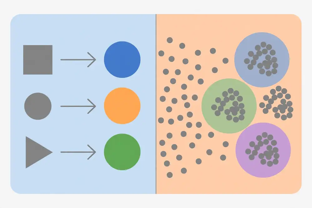
The figure above contrasts the two learning families this book is about: supervised learning maps inputs to known labeled outputs, while unsupervised learning finds clusters in unlabeled data.
Beginners report accuracy (fraction correct) and stop. Researchers know accuracy can lie. If 95% of your patients are healthy, a model that always predicts "healthy" gets 95% accuracy and is completely useless.
For binary classification, the four numbers in the confusion matrix tell the real story:
From these:
Choose your metric by the cost of errors. In disease screening, missing a case (FN) is expensive, so optimize recall. In spam filtering, flagging a real email (FP) is expensive, so optimize precision. A good paper states this choice and justifies it in one sentence.
Task: classify emails as spam (1) or not spam (0).
This exact template — features, model, loss, optimizer, metrics — is the skeleton of every classification paper's method section.
For your research: Never report accuracy alone on an imbalanced dataset — reviewers will call it out. Report the confusion matrix or at least precision, recall, and F1. And pick a metric that matches your problem's real-world cost of errors, then say so explicitly in the paper.
Binary classification is the atom; multiclass is the molecule. Two standard ways to handle K > 2 classes:
In practice, use softmax (or your library's multiclass default) unless you have a reason not to. One practical warning: with many classes and few examples per class, multiclass accuracy gets noisy — report macro-averaged F1 (average F1 across classes, treating each class equally) rather than accuracy, so rare classes aren't drowned out by common ones.
Precision, recall, and F1 depend on the decision threshold — the probability above which you predict "positive" (default 0.5). But the threshold is a policy choice, not a property of the model. The ROC curve plots the true positive rate (recall) against the false positive rate as the threshold sweeps from 1 down to 0. A perfect classifier hugs the top-left corner; a random one follows the diagonal.
The AUC (area under the ROC curve) compresses this into one number: the probability that the classifier ranks a random positive example above a random negative one. AUC = 1.0 is perfect, 0.5 is random. AUC is threshold-free, which makes it excellent for comparing models — but remember it doesn't tell you how the model performs at the threshold you'll actually deploy. Report AUC for model comparison and precision/recall/F1 at your chosen operating threshold for deployment reality.
Choosing the threshold is itself a research decision: lower it to catch more positives (higher recall, more false alarms), raise it for fewer false alarms (higher precision, more misses). Plot precision vs. recall across thresholds, pick the point matching your error costs, and state it. "We used threshold 0.5 because it was the default" is a sentence reviewers dislike.
When one class is rare (fraud, disease, dropouts), models learn to ignore it — predicting the majority class is an easy local optimum. Beyond choosing the right metric, three remedies:
Start with class weights (cheapest), then threshold tuning, then resampling. And always ask whether the imbalance is real (fraud really is rare — keep it) or an artifact of data collection (you sampled controls lazily — fix the data).
For your research: If your dataset is imbalanced, devote one paragraph to it: report the class ratio, name your remedy, and justify your metric. This paragraph is so commonly missing that its presence alone signals competence. Reviewers in medical and fraud-detection venues treat imbalance handling as a basic hygiene check.
A classifier that says "90% diseased" should be right about 90% of the time on such cases. When predicted probabilities match observed frequencies, the model is well calibrated. Many models — especially naive Bayes and deep networks — are discriminative (good at ranking) but miscalibrated (overconfident).
Check with a reliability diagram: bucket predictions by confidence (0.5–0.6, 0.6–0.7, …) and plot mean predicted probability vs. actual positive rate per bucket. Points on the diagonal = calibrated. Fix miscalibration with Platt scaling (fit a logistic regression on the model's outputs) or isotonic regression — both are one-line post-processing steps fit on validation data, never test.
Why does this matter for research? Because in medicine, finance, and any human-in-the-loop system, decisions use the probabilities, not just the labels — "operate if risk > 20%." An uncalibrated 35% that behaves like 12% causes real harm. If your paper's use case involves thresholds on probabilities, report calibration. It's a short paragraph that signals you thought about deployment, not just leaderboard numbers.
For your research: Add a reliability diagram to your appendix whenever your classifier's probabilities drive decisions. Reviewers in applied venues increasingly ask for it, and producing it takes ten lines of code.
Key takeaways - Classification predicts categories; models typically output class probabilities, not just hard labels [2]. - The decision boundary's shape reveals a model's inductive bias — linear for logistic regression, flexible for neural nets. - Accuracy lies on imbalanced data; use precision, recall, and F1 chosen by the cost of errors. - Logistic regression + cross-entropy loss + gradient descent is the canonical binary classification pipeline [5]. - Report a confusion matrix; justify your metric choice in one sentence.
Regression predicts a continuous number rather than a category: tomorrow's temperature, a house's price, a patient's blood pressure, a crop's expected yield. The label y is a real number, and the model's job is to get as close as possible.
The distinction from classification is not just cosmetic — it changes the loss function, the evaluation metrics, and often the model. But the underlying machinery (features, parameters, loss, optimization) is identical.
Linear regression predicts y as a weighted sum of the features:
ŷ = w₁x₁ + w₂x₂ + … + w_dx_d + b
The parameters (w₁…w_d, b) are learned from data. Geometrically, this fits a line (in 1D), a plane (in 2D), or a hyperplane (in higher dimensions) through the data points.
Training minimizes the mean squared error (MSE):
MSE = (1/N) · Σᵢ (yᵢ − ŷᵢ)²
Squaring the errors does two things: it makes large errors hurt disproportionately (a miss of 10 hurts 100 times more than a miss of 1), and it makes the function smooth and differentiable, so gradient descent works. Linear regression is also one of the few models with a closed-form solution — the parameters can be computed directly with linear algebra, no iteration needed [3].
Choose MSE/RMSE when big mistakes are disproportionately bad; choose MAE when you want a robust, interpretable number. As with classification, justify the choice in one sentence.
A real-estate researcher has 500 house sales with features: area (sq ft), number of bedrooms, distance to city center (km), and age (years). Target: sale price.
The residual check in step 4 is what separates a researcher from someone running a library: you are testing whether the model's assumptions hold.
For your research: Always plot predicted vs. actual values (or residuals) for a regression paper — one honest plot convinces reviewers more than a table of decimals. And remember that R² can be inflated by adding useless features; report it on the test set, not the training set.
Linear regression looks restrictive — a straight line can't bend. But the "linear" in linear regression refers to linearity in the parameters, not the features. You can feed the model transformed features: x², x³, log(x), or interactions like x₁·x₂. Polynomial regression fits ŷ = w₀ + w₁x + w₂x² + … + w_dx^d — still linear regression under the hood, still with a closed-form solution, but now able to curve [3].
This is a general trick: engineer nonlinear features, keep the linear model. It buys flexibility while preserving interpretability and the closed-form solution. The price is the bias-variance tradeoff (Chapter 10): each added feature is another degree of freedom, and degree-9 polynomials on 60 points will memorize noise gloriously.
Feature engineering for regression also includes transforming the target: if house prices grow multiplicatively, model log(price) instead — errors then become relative ("off by 5%") rather than absolute, which often matches the real cost of mistakes. Always ask: is my target's scale the scale on which errors matter?
Linear regression comes with fine print. The classical assumptions: (1) the true relationship is linear in the features; (2) errors have constant variance (homoscedasticity); (3) errors are independent; (4) errors are roughly normally distributed (matters for confidence intervals, less for predictions).
You check them with residual plots — predicted vs. residual (error) scatter plots:
This diagnostic habit is what makes regression a research method rather than a library call. Two papers can fit the same model; the publishable one is the one that checked the assumptions and can show the residual plot. Include it as a figure — reviewers in statistics-adjacent fields expect it.
When features are many or correlated, ordinary least squares becomes unstable — tiny data changes swing the weights wildly (high variance). Ridge regression adds an L2 penalty λ·Σwᵢ², shrinking weights smoothly; lasso adds an L1 penalty λ·Σ|wᵢ|, driving some weights to exactly zero and thus selecting features automatically [3].
Lasso is a researcher's friend: run it, see which features survive, and you have a data-driven shortlist of "what actually matters" — often a finding in itself. The penalty strength λ is tuned on validation data (Chapter 9). Report the λ selection procedure; "λ chosen by 5-fold cross-validation" is the standard one-liner.
For your research: If your regression has more than ~15 features, run lasso as an analysis step even if your final model is something else. The surviving features tell a story about your domain ("only 4 of 20 sensor readings predicted failure"), and that story often becomes the most cited sentence of an applied paper.
Linear regression is the right first tool, not always the right tool. Reach for alternatives when:
The research habit here is model criticism: fit the simple model, examine where it fails (residual plots, Section 4.6), and let the failure pattern choose the next model. "Linear regression underfit the curvature in residuals, so we moved to gradient boosting" is a method section that shows thinking. "We used XGBoost because it's state of the art" is not.
For your research: Always try linear regression first even if you expect to abandon it — its coefficients give you a baseline story ("each extra bedroom adds ~8,000") that complex models can't, and the residual diagnosis tells you exactly why you needed something fancier.
Key takeaways - Regression predicts continuous values; linear regression fits a weighted sum minimizing MSE [3]. - MSE punishes large errors; MAE is interpretable and robust; R² measures explained variance. - Check residuals — they reveal whether the model's assumptions hold. - Report regression metrics on the test set, and plot predictions vs. actuals. - The feature → parameters → loss → optimize pipeline is the same as classification; only the loss and metrics change.
In unsupervised learning, the training set has no labels:
D = {x₁, x₂, …, x_N}
Just inputs, no answers. The model must find structure on its own: natural groupings, hidden patterns, compressed representations, or anomalies. Because there is no "correct answer" to train against, unsupervised learning is sometimes called density estimation or structure discovery — the goal is to model p(x), the distribution of the data itself, rather than p(y|x), the prediction of a label from an input [2][4].
This makes evaluation genuinely harder. In supervised learning, accuracy tells you if you are right. In unsupervised learning, "right" is often in the eye of the beholder — a clustering is good if it is useful for a downstream purpose. Keep this in mind: unsupervised results always need a story about why the discovered structure matters.
Labels are missing more often than beginners expect. Labeling requires experts, time, and money: a radiologist labeling 10,000 scans, an agronomist labeling 5,000 leaf photos. In many real projects, you face one of these situations:
A common and respectable research pattern is exploratory unsupervised analysis first, supervised study second: cluster your data to discover natural patient subgroups, then design a supervised study around the subgroups you found. The unsupervised step is what makes the research question original.
A telecom researcher has records for 50,000 customers — monthly usage, call duration, data consumed, tenure, payment delays — but no labels at all, and a vague question: "who are our customers?"
The unsupervised approach:
No labels were needed to produce a result that marketing can act on and that the paper can report. The clusters become the vocabulary for everything that follows.
For your research: If your thesis data has no labels yet, do not panic and do not invent them. An unsupervised exploratory analysis — clustering plus visualization — is a legitimate chapter or paper section on its own. Frame it as "understanding the data landscape," and let the discovered structure motivate your supervised experiments later.
Anomaly detection (outlier detection) asks: which points don't belong? It is unsupervised — you rarely have labeled examples of fraud, equipment failure, or network intrusion, because anomalies are rare by definition and novel by nature. The approach: model normal behavior, flag what deviates.
Three common techniques:
Evaluation is the hard part: with no labels, use injected synthetic anomalies or the small set of known historical incidents, and report precision@k ("of the top 100 flagged, how many were real?"). In papers, anomaly detection results are most convincing when domain experts validate a sample of flagged cases — that expert validation sentence carries enormous weight.
Since unsupervised learning has no ground truth, researchers use a toolkit of indirect validation:
A good unsupervised paper combines at least two of these. "The clusters were stable across subsamples and predicted outcomes in a downstream classifier and were interpretable by clinicians" — that triple lock is what makes unsupervised findings publishable rather than speculative.
When facing a new unlabeled dataset, work in this order:
Steps 2 and 4 are where insight lives; steps 1, 3, 5 are where rigor lives. A paper needs both.
For your research: Never present a clustering result with only an internal metric ("silhouette 0.62") and stop. Always add profiling (what are these groups?) and at least one external check (stability, downstream task, or expert review). Reviewers' most common objection to unsupervised papers is "interesting, but is it real?" — answer it before they ask.
Clustering and PCA get the spotlight, but two other unsupervised families appear regularly in applied research:
Both share unsupervised learning's evaluation challenge (Section 5.6): validate with human judgment (do the rules/topics make sense to a domain expert?) and downstream utility (do the topics improve a classifier?). And both reward the same workflow: clean ruthlessly, visualize, interpret with experts, validate externally.
For your research: If your data is text (surveys, reviews, articles) or transactions (purchases, symptoms, clicks), consider topic models or association rules before reaching for clustering — they're designed for exactly these data shapes, and reviewers from those domains will recognize the methods as appropriate rather than forced.
Key takeaways - Unsupervised learning models p(x) — the structure of the data — with no labels to guide it [2][4]. - Main tasks: clustering, dimensionality reduction, density estimation, anomaly detection. - Evaluation is harder without ground truth: a result is good if it is useful and interpretable. - Labels are expensive; unsupervised exploration is often the correct first step of a research project. - Discovered structure (clusters, outliers) can define the research question for follow-up supervised work.
Clustering partitions data into groups (clusters) so that points in the same cluster are more similar to each other than to points in other clusters. "Similar" almost always means close in feature space — typically Euclidean distance after standardization.
Every clustering algorithm answers two questions differently: how many clusters? and what shape can a cluster be? There is no universally correct answer, which is why several algorithms exist.
k-means is the most used clustering algorithm in research, and the one you should learn first [5]. You choose k (the number of clusters) in advance. The algorithm:
k-means minimizes the within-cluster sum of squares — the total squared distance from each point to its centroid. It always converges, though it can converge to a local optimum, so researchers run it several times with different initializations and keep the best result (this is what scikit-learn does by default [8]).
Strengths: simple, fast, scales to large data, easy to explain. Weaknesses: you must choose k; clusters are assumed spherical and roughly equal-sized; sensitive to outliers and to feature scaling — always standardize first.
Hierarchical clustering builds a nested tree of clusters called a dendrogram, bottom-up (agglomerative): start with every point as its own cluster, repeatedly merge the two closest clusters, and stop when everything is one cluster. You then cut the tree at the height that gives a sensible number of clusters.
The advantage: you see the whole merge history, so you can decide k after seeing the structure — and the dendrogram itself is a publishable figure. The cost: it is O(N²) or worse, so it struggles beyond a few thousand points. Use it when N is small and the hierarchy itself is informative (species, document topics, gene expression).
DBSCAN (Density-Based Spatial Clustering of Applications with Noise) finds clusters as dense regions separated by sparse regions. It needs two parameters: ε (epsilon, the neighborhood radius) and minPts (minimum points to form a dense region). Points in dense neighborhoods become clusters; points in sparse areas are labeled noise (−1).
Strengths: finds arbitrarily shaped clusters (not just spheres), automatically determines the number of clusters, and explicitly flags outliers — the noise points are often the most interesting result (fraud, faults, anomalies). Weaknesses: choosing ε is fiddly; it struggles when clusters have very different densities.
Six customers described by two standardized features — (monthly spend, support calls):
A(1,1), B(1.5,2), C(2,1.5), D(8,8), E(9,7.5), F(8.5,9). Choose k = 2. Initialize centroids at μ₁ = A(1,1) and μ₂ = D(8,8).
Iteration 1 — assign (Euclidean distance to each centroid): - A: d to μ₁ = 0, to μ₂ ≈ 9.9 → cluster 1 - B: d to μ₁ ≈ 1.1, to μ₂ ≈ 8.5 → cluster 1 - C: d to μ₁ ≈ 1.1, to μ₂ ≈ 7.8 → cluster 1 - D: d to μ₁ ≈ 9.9, to μ₂ = 0 → cluster 2 - E: d to μ₁ ≈ 10.4, to μ₂ ≈ 1.1 → cluster 2 - F: d to μ₁ ≈ 10.9, to μ₂ ≈ 1.1 → cluster 2
Iteration 1 — update: μ₁ = mean(A,B,C) = (1.5, 1.5); μ₂ = mean(D,E,F) = (8.5, 8.17).
Iteration 2 — assign: distances recomputed; every point stays in its cluster. Converged.
Result: cluster 1 = {A, B, C} ("low spend, few calls"), cluster 2 = {D, E, F} ("high spend, many calls"). In a real project you would now profile each cluster — average spend, churn rate — and those profiles become findings.
Choosing k in practice: the elbow method — run k-means for k = 1…10, plot the within-cluster sum of squares vs. k, and pick k at the "elbow" where improvement flattens. Or use the silhouette score, which measures how well each point fits its own cluster versus the next-best cluster. Report whichever you used.
For your research: A clustering result is only as convincing as its interpretation. Always profile your clusters (means of the original features per cluster) and give each cluster a plain-language name. "Cluster 2 has 3× the churn rate of cluster 1" is a finding; "we found 2 clusters" is not. And state how you chose k — reviewers ask.
| k-means | Hierarchical | DBSCAN | |
|---|---|---|---|
| Cluster shape | Spherical | Depends on linkage | Arbitrary |
| Number of clusters | You choose k | Choose after seeing dendrogram | Discovered automatically |
| Outliers | Forced into a cluster | Forced into the tree | Labeled as noise (−1) |
| Scalability | Excellent (large N) | Poor (beyond ~few thousand) | Good |
| Key decision | k (elbow/silhouette) | Where to cut the tree | ε and minPts |
| Best when | You suspect k round groups | N is small, hierarchy matters | Shapes are odd, noise is informative |
A practical workflow: run k-means first for speed and a baseline; if the clusters look non-spherical or outliers distort centroids, try DBSCAN; if N is small and you want the full merge story for a figure, run hierarchical. Reporting two algorithms that agree is stronger than reporting one — agreement across methods with different assumptions is evidence the structure is real, not an artifact.
Gaussian mixture models (GMMs) deserve a mention as k-means' probabilistic cousin: instead of hard assignments, each point gets a probability of belonging to each cluster, and clusters can be elliptical rather than spherical [2][4]. When you need soft assignments ("this customer is 70% segment A, 30% segment B"), GMMs are the upgrade path.
Twelve delivery locations form two crescent-shaped (non-spherical) groups plus two obvious outliers (wrong GPS pings). k-means with k=2 would slice each crescent in half and drag centroids toward the outliers — a bad result from violated assumptions. DBSCAN with ε set to the typical within-group spacing and minPts=3: the two crescents emerge as dense regions, the GPS errors get labeled noise (−1). The researcher reports the noise points as a data-quality finding ("0.4% of pings are faulty") — turning a preprocessing nuisance into a result. This is the DBSCAN value proposition: shape freedom plus honest outlier handling in one run.
For your research: When you cluster, save and publish the elbow/silhouette analysis and the cluster profiles as supplementary material or an appendix figure. It costs little, and it lets reviewers verify your k choice instead of doubting it. Transparency about ambiguous choices is a competitive advantage in review.
Every clustering algorithm asks "how far apart are these points?" — and the answer shapes the clusters as much as the algorithm does:
The metric is part of your inductive bias: Euclidean k-means finds round blobs; cosine k-means on text finds topical groups. Mismatching metric and data is a silent failure — clusters form, numbers print, and everything is subtly wrong. When you report clustering, name the metric alongside the algorithm: "k-means with cosine distance on TF-IDF vectors" tells the full story in one phrase.
For your research: If your features are mixed (numbers + categories), don't shoehorn them into Euclidean distance. Either use a mixed-type metric (Gower distance), encode categories carefully, or cluster numeric and categorical structure separately and compare. Reviewers notice metric–data mismatches.
Key takeaways - k-means: fast, simple, needs k up front, assumes spherical clusters; run multiple initializations [5][8]. - Hierarchical clustering gives a dendrogram — choose k after seeing the tree; best for small N. - DBSCAN finds arbitrary shapes and flags noise; tune ε carefully. - Always standardize features before distance-based clustering. - Profile and name your clusters; report how k (or ε) was chosen.
Modern datasets easily have hundreds or thousands of features: gene expressions, sensor readings, word counts. In high dimensions, three problems appear: distance becomes meaningless (everything is far from everything), models overfit (Chapter 10), and humans cannot visualize anything. Dimensionality reduction compresses the data into fewer dimensions while preserving as much structure as possible.
Principal component analysis (PCA) is the classic linear technique [3]. The intuition:
Mathematically, the components are the eigenvectors of the data's covariance matrix, ordered by eigenvalue (which equals the variance each component captures). You don't need to derive this to use PCA well — but you should know it exists, because reviewers sometimes ask "why PCA and not something else," and "it finds orthogonal directions of maximum variance" is the correct one-line answer.
The explained variance ratio tells you how much information each component keeps: if the first 2 components explain 92% of the variance, a 2D plot is faithful; if they explain 35%, it is misleading.
Caution: PCA is linear — it cannot untangle curved structure (a Swiss roll stays a roll). It is also unsupervised: it maximizes variance, not class separation, so the first components may not be the most discriminative ones. For nonlinear reduction, mention t-SNE or UMAP for visualization — but never use them as model inputs without understanding their distortions.
An IoT researcher collects 40 sensor readings per machine per hour (temperature, vibration at many frequencies, pressure…). With 40 dimensions, no plot is possible and models overfit on 300 machines.
Step 3 is the payoff: dimensionality reduction turned an incomprehensible 40-dimensional dataset into a figure that tells a story.
For your research: A 2D PCA scatter plot colored by your classes is one of the cheapest high-value figures you can put in a paper. But always report the explained variance — if your 2D plot shows only 30% of the variance, say so, and don't over-claim what the picture proves.
Four standardized exam scores for students — math (M) and physics (P) are highly correlated (r ≈ 0.95); literature (L) and history (H) are highly correlated with each other but not with M/P. Intuitively the data has two underlying dimensions: "science ability" and "humanities ability," not four.
Running PCA:
The lesson: PCA discovered the latent structure (two abilities) from correlations alone, with no labels. When your paper says "the first k components captured X% of variance and corresponded to interpretable factors," inspect the component loadings (the weights like 0.7·M + 0.7·P) — named, interpretable components turn a compression trick into a domain finding.
PCA draws straight axes. When structure curves, consider:
Rule of thumb: PCA first, always. If PCA's explained variance is high and the plot is informative, stop — simplicity is a virtue reviewers appreciate. Reach for nonlinear methods only when PCA demonstrably fails (low explained variance, structureless plots) and you can articulate what nonlinearity you expect.
Two pipeline rules prevent the most common PCA errors:
In scikit-learn this is a Pipeline([('scale', StandardScaler()), ('pca', PCA(n_components=...)), ('clf', ...)]) — the pipeline object guarantees the fit/transform discipline automatically [8]. Mentioning that you used a pipeline is a one-word credibility signal.
For your research: Report three PCA numbers in every paper that uses it: the number of components kept, the cumulative explained variance, and how you chose k (variance threshold like 90–95%, or the elbow of the scree plot). These three numbers let anyone reproduce and judge your reduction.
PCA components are only useful if you can say what they mean. The loadings — the weights of original features in each component — are the interpretation key. If PC1 = 0.7·temperature + 0.65·vibration + 0.1·pressure + …, PC1 is essentially a "heat-and-shaking" axis. Name it that in your paper; named components turn math into findings.
A biplot overlays the loadings as arrows on the PC1–PC2 scatter plot: arrow direction shows which original features drive each axis, arrow length shows how strongly. One biplot simultaneously shows where the points are and why — it's among the most information-dense figures you can put in a paper, and most plotting libraries draw it in a few lines.
Two cautions for the interpretation step. First, signs are arbitrary: PC1 and −PC1 are the same component, so don't over-read "positive vs. negative direction" — only the axis matters. Second, components are mathematical constructs; a component that mixes "temperature" and "day of week" may be statistically real but domain-meaningless. Report the loadings honestly, interpret conservatively, and let a domain expert sanity-check your naming before it goes in the paper.
For your research: Include the loadings table (top features per component) in your appendix or supplementary material. It lets reviewers verify your interpretation ("PC1 as 'thermal stress'") instead of taking it on faith — and it often sparks the most interesting discussion in a defense.
Key takeaways - PCA finds orthogonal directions of maximum variance; keep the first few components [3]. - Always standardize before PCA; always report explained variance ratios. - Main uses: visualization, noise reduction, speed, decorrelating features. - PCA is linear and unsupervised — it maximizes variance, not class separation. - A PCA scatter plot colored by class is a strong exploratory figure; don't over-claim from it.
Supervised learning is hungry for labels, and labels are expensive — they need experts, time, and often consensus procedures. Unsupervised learning needs no labels but can't answer "which class is this?" directly. The middle ground asks: can a small labeled set plus a large unlabeled set get us most of the way? In practice, the answer is often yes, and this is where some of the most publishable student research lives — because label scarcity is a real, respected problem.
Semi-supervised learning trains on a small labeled dataset plus a large unlabeled dataset. The core assumption is the smoothness assumption: points close to each other (in a good representation) likely share a label — so the unlabeled data reveals the shape of the data distribution, and the few labels pin down which region is which class [4].
Common approaches:
Self-supervised learning goes further: it manufactures its own prediction tasks from unlabeled data, with the labels derived from the data's own structure. Train on these "pretext tasks," then use the learned representations for the real task with few labels.
Classic examples:
Self-supervised pretraining followed by supervised fine-tuning is the recipe behind modern language and vision models [9]. For a student researcher, the practical takeaway is narrower but valuable: pretrained self-supervised models are free starting points — fine-tuning one on your small labeled dataset usually beats training from scratch.
Recall the cotton leaf project from Chapter 1: 2,000 labeled photos was the dream, but the agronomist only had time to label 200. You also have 10,000 unlabeled field photos.
Semi-supervised plan (self-training):
What to report: the accuracy at each round, the confidence threshold, and — critically — an analysis of where self-training helped and where confident mistakes slipped in. Reviewers respect this honesty, and "label efficiency" (accuracy per labeled example) is itself a publishable metric.
For your research: "We achieved X% accuracy with only N labeled examples" is a strong paper angle when N is small — it directly addresses the label bottleneck every applied field faces. Compare against the purely supervised baseline on the same N labels; the gap is your contribution. And always disclose your confidence threshold and stopping rule.
Semi-supervised learning is not free accuracy — it rests on assumptions, and when they break, unlabeled data hurts:
The defense is empirical discipline: always compare against the purely supervised baseline on the same labeled set. If semi-supervised doesn't beat it, report that honestly — a negative result about when the method helps is itself a contribution, and it protects you from publishing a degradation as an improvement. Also monitor the quality of pseudo-labels on a small held-out labeled sample as rounds progress; if pseudo-label accuracy drops, stop.
Here's a complete, publishable experimental design for label-scarce problems — the kind of design that turns "we didn't have enough labels" from an apology into the paper's premise:
This design is honest by construction: the supervised baseline can't be accused of being a straw man (it's the natural alternative), and the oracle shows the headroom. Many applied venues (medical imaging, agriculture, low-resource languages) actively welcome this framing because label scarcity is their daily reality.
You don't need to invent pretext tasks — use pretrained models. A vision model pretrained with self-supervision on millions of images, fine-tuned on your 200 labeled examples, routinely beats training from scratch [9]. The research contribution then isn't the pretraining (done by others) but the adaptation: which layers you froze, how little data sufficed, what failed.
Document the adaptation precisely: base model name and version, frozen vs. fine-tuned layers, learning rates, and the from-scratch baseline for comparison. "Fine-tuned X, freezing the first N layers" is reproducible; "we used deep learning" is not.
For your research: If labeling budget is your constraint, make it your paper's hero, not its footnote. Title-level framings like "Achieving 90% of full-supervision accuracy with 5% of the labels" state a crisp, verifiable claim that reviewers can check — and that practitioners in your field will actually cite.
Semi-supervised learning assumes your small labeled set is fixed. Active learning asks a sharper question: if you can afford to label only 200 examples, which 200? Instead of labeling randomly, the model iteratively requests labels for the examples it finds most informative:
In practice, uncertainty + diversity beats random labeling by a wide margin: studies routinely show the same accuracy with 30–50% fewer labels. For a student with an expert who'll label "a few hundred images, max," active learning is the difference between a thin dataset and a sufficient one. The experimental design mirrors Section 8.6: plot accuracy vs. number of labeled examples for random vs. active selection — the gap between the curves is your contribution, and it's a beautiful figure.
For your research: If expert labeling time is your bottleneck, propose active learning to your supervisor before labeling begins — retrofitting it after random labeling wastes the advantage. Even a simple uncertainty-sampling loop over two or three rounds is publishable as a "label-efficient annotation protocol" in applied venues.
Key takeaways - Semi-supervised learning combines few labels with many unlabeled examples via the smoothness assumption [4]. - Self-training, label propagation, and consistency regularization are the standard approaches. - Self-supervised learning creates its own labels from data structure (masking, contrastive tasks) [9]. - Fine-tuning a pretrained self-supervised model beats training from scratch on small labeled sets. - Report label efficiency: accuracy achieved per labeled example, with thresholds and stopping rules disclosed.
You need three disjoint datasets, each with a distinct job:
Why not just two? Because every decision you make based on validation performance — picking k=5 over k=3, choosing the better of two algorithms — leaks information from the validation set into your process. After enough tuning, your validation score becomes optimistic. The test set is the untouched referee that keeps you honest [5].
Typical ratios: 70/15/15 or 80/10/10 for large data. For small data (under ~1,000 examples), use cross-validation instead of a single split (Section 9.3).
Data leakage is when information from outside the training set influences training — most dangerously, from the test set. Leaked models report glowing numbers that collapse in the real world, and experienced reviewers hunt for leakage specifically.
Common leaks and their fixes:
| Leak | Fix |
|---|---|
| Normalizing/standardizing with mean and std computed on all data before splitting | Compute statistics on the training set only; apply to validation/test |
| Selecting features using the whole dataset | Do feature selection inside the training fold only |
| Duplicate or near-duplicate records across splits (e.g., same patient in train and test) | Split by group (patient, hospital, time period), not by row |
| Tuning on the test set ("we tried 20 models and report the best test score") | Tune on validation; report test once |
| Using future data to predict the past (time series) | Split chronologically: train on past, test on future |
The group-split and chronological-split rows deserve emphasis: random splitting is wrong when rows aren't independent (same patient twice) or when time matters. State your splitting strategy in the paper — one sentence prevents a major reviewer objection.
With small data, a single split wastes precious examples and gives noisy estimates. k-fold cross-validation: split the data into k equal folds (k=5 or 10); train on k−1 folds, validate on the remaining fold; rotate so each fold validates once; average the k scores. Every example is used for both training and validation, and you get a mean and a standard deviation of performance — report both ("84.2% ± 2.1%").
Stratified k-fold preserves the class ratio in each fold — always use it for classification, especially imbalanced data. And remember: cross-validation replaces the validation set, not the test set. Keep a held-out test set for the final report whenever you can afford one [3][5].
From Chapter 2: predicting missed hospital appointments. 12,000 appointment records from January–June.
Naive (wrong): shuffle all 12,000, split 80/20 randomly. Problem: the same patient appears multiple times across splits (leak), and June patterns differ from January (time matters).
Correct:
This procedure is what "done right" means — and describing it takes five sentences in a paper's method section.
For your research: Write your splitting procedure before you run experiments, and never change it after seeing test results. If a reviewer asks "how did you split?", the answer should be one precise sentence naming the strategy (random / group / chronological / stratified k-fold) and the ratios. Vague splitting descriptions are a top-three reviewer complaint in applied ML papers.
Standard k-fold cross-validation has a subtle flaw: if you use it to both select hyperparameters and estimate performance, the estimate is optimistic — you picked the hyperparameters that looked best on those very folds. Nested cross-validation fixes this with two loops:
The outer scores estimate the performance of your whole procedure (including tuning), honestly. It's computationally expensive — k_outer × k_inner trainings — so use it when the dataset is small and every bit of credibility counts (thesis experiments, medical data), and use a single validation split when data is plentiful. When a reviewer asks "did tuning bias your estimates?", "nested 5×3 cross-validation" is the gold-standard answer [3].
Correct splits are necessary but not sufficient. A result nobody can reproduce is a rumor, not a finding. The reproducibility checklist:
None of this is glamorous; all of it is what separates a thesis that passes from one that gets "major revisions." Build these habits now, when your projects are small, and they'll be automatic when the stakes are high.
When in doubt, ask: "what will 'new data' look like in deployment?" Then make your test set look like that. The split should simulate the future, not flatter the present.
For your research: Put your splitting strategy in a highlighted "Experimental Setup" or "Evaluation Protocol" subsection with: split type, ratios, seed, stratification/grouping, and what was computed on train-only. Five lines that preempt the most common reviewer questions in applied ML.
A real pattern, anonymized: a student built a pneumonia classifier reporting 99.2% test accuracy — suspiciously high. The post-mortem found three leaks:
The honest 89.4% was still a good result — and a publishable one, because the evaluation was now defensible. The 99.2% would have collapsed under review and damaged credibility. The moral: a suspiciously good number is a bug report, not a celebration. When your test score looks too good, investigate before you celebrate — check duplicates, check your split code, check what the model might be keying on (sometimes it's a hospital watermark in the image corner, a classic).
For your research: Build a "leakage audit" into your workflow: before final evaluation, assert no ID overlap between splits, verify preprocessing was fit on train only, and confirm the test set was never used for any decision. Five minutes of asserts saves months of embarrassment.
Key takeaways - Three splits: train (learn), validate (tune decisions), test (honest final score, touched once) [5]. - Tuning on validation leaks into decisions — that's why the test set must stay untouched. - Data leakage (test statistics, duplicates, future data, test-set tuning) silently inflates scores; reviewers check for it. - Split by group or by time when rows aren't independent or time matters. - Use stratified k-fold cross-validation for small datasets; report mean ± std [3].
Every model faces one fundamental tension [3]:
Total error ≈ bias² + variance + irreducible noise. The irreducible noise is the randomness no model can remove. Your job is to find the sweet spot where bias and variance are jointly minimized — complex enough to capture the signal, simple enough to ignore the noise.
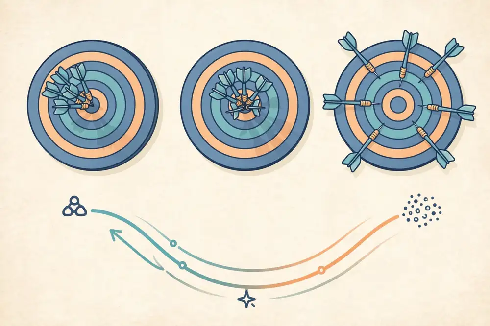
The figure above visualizes the tradeoff: as model complexity grows, bias falls but variance rises, and total error is minimized at the balance point between underfitting and overfitting.
You can't see bias and variance directly, but learning curves reveal them. Plot training error and validation error against training-set size (or model complexity):
This diagnosis turns "my model is bad" into "my model has high variance, so I need more data or regularization" — a precise, actionable statement that belongs in your paper's analysis section.
Regularization penalizes complexity during training, letting you use a flexible model while keeping variance in check. The classic forms add a penalty on the size of the weights to the loss:
The strength λ is a hyperparameter tuned on the validation set. Regularization is one of the most practically important ideas in ML: it is why big models can be trained on modest data without memorizing it [2][3].
A researcher models crop yield vs. rainfall with polynomial regression, trying degrees 1 through 9 on 60 data points, evaluating with cross-validation:
| Degree | Train error | Validation error | Diagnosis |
|---|---|---|---|
| 1 (line) | High | High | High bias — underfits the curve |
| 2–3 | Medium | Medium-low | Balanced — best validation score at degree 3 |
| 9 | Near zero | High | High variance — memorizes noise |
The validation error forms a U-shape: falling as bias drops, then rising as variance takes over. Degree 3 wins. The researcher reports the U-curve figure — it demonstrates understanding, not just a lucky hyperparameter.
Note what more data would do: with 6,000 points instead of 60, degree 9's variance would shrink and a higher degree might win. The right complexity depends on the data size — a deep insight that explains why simple models often beat fancy ones on small student datasets.
For your research: When a simple baseline beats your complex model, don't hide it — explain it with bias-variance. "The neural network overfit (high variance on n=400); logistic regression's bias was better matched to the data size" turns a disappointing result into evidence of understanding. Reviewers reward this analysis far more than a table where the author's method always wins.
Suppose the true relationship is y = x² (a curve), with small random noise, and you sample 20 training points. You fit three models and evaluate on a large test set:
Now double the training data to 200 points and repeat: Model A's errors barely move (bias is structural — data can't fix a wrong assumption), while Model C's test error drops sharply toward Model B's (variance shrinks with data). This is the general law: bias is cured by better models, variance is cured by more data (or regularization, or simpler models). When your experiments disagree with this pattern, something else is wrong — usually leakage or a bug.
If single models must trade bias against variance, ensembles cheat the tradeoff by combining many models:
Ensembles are why random forests and gradient boosting dominate tabular-data leaderboards: they deliver low bias and low variance simultaneously. The cost is interpretability (a forest of 500 trees is not explainable by inspection) and compute. For your thesis, they're excellent strong baselines — "we compared against gradient boosting" tells reviewers you didn't pick weak opponents.
Classical theory says: past the interpolation point (where the model perfectly fits training data), test error should keep rising. In very large neural networks, researchers observed double descent: test error rises, then falls again as models get enormously overparameterized [7]. The practical moral for students is modest: on small data with classical models, the U-curve of Section 10.4 is the right mental model — don't invoke double descent to justify an overfit model. Mention it in related work if relevant; don't lean on it.
For your research: Make the learning-curve plot a standard figure in your experiments section: training and validation error vs. training-set size (or vs. complexity). One plot simultaneously shows reviewers you understand bias-variance, justifies your model choice, and indicates whether collecting more data would help — three reviewer questions answered by one figure.
The U-curve of Section 10.4 isn't just theory — it's a diagnostic you plot. The validation curve shows training and validation scores vs. a complexity hyperparameter (tree depth, k in k-NN, λ in regularization):
Two practical notes. First, plot it on a sensible scale — λ usually needs a logarithmic axis (0.001 to 1000), or the interesting region compresses into invisibility. Second, the curve's flatness near the optimum matters: a broad plateau means your choice is robust (small changes don't hurt); a sharp peak means brittleness — report the plateau region, not just the argmax, and prefer hyperparameters in flat regions when scores tie.
This connects directly to Chapter 9: the validation curve is why you keep a validation set. It also gives you a second publishable figure alongside learning curves — together they tell the complete bias-variance story of your model choice: "depth 6 sits at the validation peak with a broad plateau; deeper trees overfit (Section 10.4)."
For your research: When a reviewer asks "how did you choose hyperparameter X?", the validation-curve figure is the complete answer — better than any paragraph. Generate it for every important hyperparameter and keep the figures; you'll need them in the rebuttal.
Key takeaways - Error = bias² + variance + irreducible noise; model complexity trades one against the other [3]. - Learning curves diagnose the problem: high bias (both errors high) vs. high variance (gap between train and validation). - Regularization (L1/L2) controls complexity; tune its strength on validation data [2]. - The right model complexity depends on dataset size — small data favors simpler models. - Explain surprising results with bias-variance analysis; reviewers reward the honesty.
Beginners pick an algorithm ("I'll use a neural network!") and then look for a problem. Researchers do the reverse: they interrogate the problem, and the answers narrow the algorithm choice. Work through these questions in order — they form the decision guide for this chapter.
Q1. Do you have labels? - No → unsupervised: cluster (Chapter 6) or reduce dimensions (Chapter 7) to explore; or collect labels for the most informative examples. - Few → semi-supervised (Chapter 8). - Yes → supervised; continue.
Q2. Is the target a category or a number? - Category → classification (Chapter 3). Binary or multiclass? - Number → regression (Chapter 4).
Q3. How much data do you have? - Small (hundreds): prefer simple, high-bias models — logistic/linear regression, naive Bayes, small decision trees, SVM. They won't overfit as badly, and they're interpretable. - Medium (thousands): random forests and gradient boosting dominate tabular data in practice. - Large (tens of thousands+, especially images/text): neural networks become viable and often best [7][9].
Q4. Do you need interpretability? - Yes (medicine, policy, thesis defense) → linear/logistic regression, decision trees, or explainable methods. "The model is 2% better but nobody can explain it" is a hard sell in high-stakes domains. - No → ensembles and neural networks are on the table.
Q5. What does the data look like? - Tabular (rows and columns) → start with logistic regression / random forest / gradient boosting. - Images → convolutional neural networks [7][9]. - Text/sequences → transformer-based models; but a TF-IDF + logistic regression baseline is still mandatory. - Time series → respect chronology in splits (Chapter 9); consider recurrent or temporal models after strong baselines.
Whatever you choose, always run a simple baseline first: logistic regression for classification, linear regression for regression, or even a majority-class / mean predictor. The baseline does three jobs: it sanity-checks your pipeline (if the baseline gets 50% on balanced binary data, your pipeline is broken), it quantifies the problem's difficulty, and it makes your fancy model's improvement meaningful. A paper that reports "our method: 91%, baseline: 90.5%" tells a very different story from one that reports "our method: 91%" alone [5].
Practical starter kit (the scikit-learn library implements all of these [8]): logistic/linear regression → decision tree → random forest → gradient boosting → (only then) neural networks. Move down the list only when the simpler step underfits.
Project A — thesis: predict student dropout (yes/no) from 800 records with 20 features; supervisor wants explanations. → Labels ✓, binary classification, small data, interpretability needed → logistic regression baseline, then a small decision tree. Report odds ratios — the supervisor can read them.
Project B — startup: flag fraudulent transactions; 2 million records, 200 features, labels from past investigations; missing fraud is costly. → Labels ✓, binary classification, large tabular data, recall matters → gradient boosting (excellent on tabular data), tuned for recall; logistic regression as the documented baseline.
Project C — hospital: group 5,000 unlabeled patient records to discover subtypes of a condition. → No labels → unsupervised: standardize, k-means with elbow/silhouette for k, PCA plot for visualization; profile clusters clinically. The clusters may become labels for a future supervised study.
For your research: Document your algorithm choice as a short chain of reasoning in the paper: "We chose X because [data size], [target type], [interpretability need]." One or two sentences. This preempts the reviewer's "why didn't you use Y?" — and if you did try Y and it lost, say so: negative results about algorithm choice are legitimate findings.
Research papers optimize metrics; real deployments optimize systems. When choosing an algorithm, ask the deployment questions early — they often override small accuracy differences:
A good paper acknowledges the constraint it optimized under: "we prioritized inference speed (<10 ms) for real-time deployment, accepting a 1.2% accuracy cost versus the larger model." That sentence shows engineering maturity reviewers respect.
Let's run the full guide on a realistic thesis problem: "Predict which first-year university students will fail any course, using data available in week 4 of the semester."
Final choice to report: logistic regression if within a few points of the forest (interpretability wins), with the forest as the documented strong baseline. The method section writes itself from these bullets — and every choice is defensible in a viva.
Guides are starting points. Break them deliberately when: you have a strong reason to believe the problem's structure favors something unusual (periodic data → Fourier features); prior literature on your exact problem converges on a specific method (follow the field's consensus, then improve it); or you're doing a comparison study whose contribution is the comparison itself — then breadth beats optimality. Breaking rules knowingly, with justification, is expertise; breaking them unknowingly is luck.
For your research: Keep a one-page "decision log" for your project: each modeling choice, the alternatives considered, and why it won. When your supervisor asks "why random forest?" or a reviewer asks "why not XGBoost?", you answer from the log instead of reconstructing reasoning months later. It also becomes the skeleton of your method section.
There's a quiet truth in applied ML: simple models win more often than expected, and starting simple is a strategy, not a lack of ambition. Reasons:
None of this forbids ambitious models — it sequences them. Simple first, then complex with justification, reporting every step. The paper that shows the full ladder (baseline → tuned classical → neural net, with the tradeoff discussed) reads as authoritative. The paper that shows only the top rung reads as lucky.
For your research: Make your baseline genuinely strong: tune its hyperparameters, give it good features, and let it use the same validation protocol. A weak baseline you "beat" by 5% impresses no one; a strong baseline you beat by 1.5% — or thoughtfully lose to on interpretability grounds — impresses everyone.
Key takeaways - Choose by answering Q1–Q5 (labels? target type? data size? interpretability? data modality) — not by fashion [5][6]. - Small data + interpretability needs → simple models; large data + images/text → neural networks [7]. - Always run a simple baseline first; it validates the pipeline and contextualizes gains [8]. - Tabular data: logistic regression → trees → forests → boosting. Images/text: neural networks after a simple baseline. - Document the choice chain in one or two sentences; report tried-and-rejected alternatives.
Case study 1 — supervised (crop disease classification). - Problem: smallholder farmers lose yield to late-detected leaf disease; agronomists can't visit every field. - Method: 3,200 labeled leaf photos (healthy / three disease classes); stratified 70/15/15 split; baselines: logistic regression on color histograms, then a convolutional neural network; metric: macro-F1 (classes imbalanced). - Results: CNN 93.1% macro-F1 vs. baseline 71.4%; confusion matrix shows two diseases confused with each other — honestly reported. - Gap addressed: prior work used lab photos; this dataset is field photos with natural lighting — the novelty is the realistic data, not a new algorithm.
Case study 2 — unsupervised (patient subtyping). - Problem: a condition with one diagnostic label but visibly varied patient trajectories; clinicians suspect hidden subtypes. - Method: 4,800 unlabeled patient records, 30 standardized clinical features; k-means with k chosen by silhouette score (k=4); PCA visualization; clusters profiled by outcome statistics. - Results: four subtypes with significantly different recovery rates; subtype names grounded in clinical features. - Gap addressed: first subtyping study on this population; prior work covered other regions.
Notice the pattern: the contribution is rarely "a new algorithm." For student papers it is usually a new dataset, a new domain application, a careful comparison, or a label-efficiency result. That is normal and publishable.
Every ML paper — and every thesis chapter — answers four questions. Write them as four short paragraphs before you write anything else:
A reviewer reads in this order: is the problem real? is the gap real? is the method sound? do the results support the claims? Weakness in any one sinks the paper; strength in all four is rare and gets accepted.
Idea: "predict exam failure risk for first-year students at my university."
That skeleton — four paragraphs — is a defensible conference paper or thesis chapter. Everything in Books 1 and 2 was building toward your ability to write it.
For your research: Write the four paragraphs (problem, gap, method, results-plan) before running experiments, and show them to your supervisor. It is ten times cheaper to fix a weak gap or a leaky split on paper than after three weeks of training. Most rejected student papers fail at the framing stage, not the coding stage.
The related-work section is where many student papers quietly fail. A list of summaries ("Smith et al. did X. Jones et al. did Y.") helps nobody. Instead, organize by themes and end each theme by pointing at your gap:
Then the gap paragraph: "Existing work focuses on A and B; C remains unaddressed because …; this paper addresses C by …." Every paper you cite should earn its place by relating to your gap. A useful test: if removing a citation doesn't weaken your gap argument, remove it. Aim for 15–30 well-chosen references for a conference paper, not 80 decorative ones.
You will get reviews like these. Here's how to respond:
General rule: every reviewer comment gets either a change or a reasoned rebuttal, documented in the response letter. "We thank the reviewer… we have added…" is the genre's ritual language — learn it early.
You now have every concept this plan requires: the learning paradigm (Ch 1–2), the methods (Ch 3–8), the evaluation discipline (Ch 9–10), the judgment to choose (Ch 11), and the framing to publish (Ch 12). Book 3 will give you the implementation tool — Python — to execute it.
For your research: Start your paper's repository on day one: code, a README with the four framing paragraphs, seeds, and library versions. By submission time you'll have a reproducible artifact instead of a scramble. Supervisors notice this professionalism, and it makes "major revisions" far less painful — you can re-run anything in minutes.
Key takeaways - Student contributions are usually new data, new domain, careful comparison, or label efficiency — not new algorithms. - Frame every paper as problem → gap → method → results; draft these four paragraphs before experimenting. - Reviewers check: real problem, real gap, sound method (splits, no leakage, baselines), supported claims. - Run the honesty checklist before submission; discuss failures with bias-variance language. - "Suggests, not proves" — keep claims proportional to evidence.
[1] T. M. Mitchell, Machine Learning. New York, NY, USA: McGraw-Hill, 1997.
[2] C. M. Bishop, Pattern Recognition and Machine Learning. New York, NY, USA: Springer, 2006.
[3] T. Hastie, R. Tibshirani, and J. Friedman, The Elements of Statistical Learning, 2nd ed. New York, NY, USA: Springer, 2009.
[4] K. P. Murphy, Probabilistic Machine Learning: An Introduction. Cambridge, MA, USA: MIT Press, 2022.
[5] A. Géron, Hands-On Machine Learning with Scikit-Learn, Keras, and TensorFlow, 2nd ed. Sebastopol, CA, USA: O'Reilly Media, 2019.
[6] S. Russell and P. Norvig, Artificial Intelligence: A Modern Approach, 4th ed. Hoboken, NJ, USA: Pearson, 2020.
[7] I. Goodfellow, Y. Bengio, and A. Courville, Deep Learning. Cambridge, MA, USA: MIT Press, 2016.
[8] F. Pedregosa et al., "Scikit-learn: Machine learning in Python," J. Mach. Learn. Res., vol. 12, pp. 2825–2830, 2011.
[9] Y. LeCun, Y. Bengio, and G. Hinton, "Deep learning," Nature, vol. 521, no. 7553, pp. 436–444, May 2015.
End of Book 2. Next: Book 3 — Python for AI: From Zero to First Model.