← All 50 books
Book 26 of 50 · Free
Storytelling with Data
25,689 words · 80 chapters · illustrated
Book 26 of 50 · Free
25,689 words · 80 chapters · illustrated
Book 26 of 50 — AstolixGen Learning Series For researcher and publication students
You can run the analysis, train the model, and compute the p-value — but none of it matters if your audience cannot see what you see. Research lives or dies in communication. A brilliant result buried in a cluttered figure, a conference talk that loses the room on slide three, a thesis whose graphs confuse the examiner: these are not writing problems, they are storytelling problems.
This book teaches you the craft of turning data into stories: how the human brain reads charts, how to choose the right visual for your message, how to strip away clutter, how to use color deliberately, how to annotate so a figure teaches on its own, and how to carry the same narrative skill into dashboards, live talks, reports, papers, and theses. It is written for MS and PhD students and early researchers who want their work not just published, but understood, remembered, and used.
By the end of this book you will be able to take any result — a table of numbers, a model comparison, a field survey — and shape it into a clear, honest, persuasive visual story.
Learning objectives:
By the end of this book, you will be able to:
This is a working book, not a reading book. Each chapter follows the same rhythm: a concept explained in plain language, a detailed before-and-after example you can picture, a practical walkthrough, a For your research box that applies the idea to your thesis or paper today, and key takeaways. Read the chapters in order the first time — each builds on the last (color assumes decluttering, dashboards assume both). Then keep the Learning Dashboard section open beside you while you work: the chart chooser matrix, declutter checklist, and color rules are designed as at-desk references.
Two ways to work through it:
Keep a "redesign folder" as you go: before/after pairs of every figure you fix. It becomes your portfolio, your defense evidence, and — when you teach a junior colleague the declutter pass — your lesson plan.
Imagine two ways of receiving the same research result. In the first, you open a table of 60 numbers: monthly rainfall figures for five years, no summary, no highlight. In the second, someone shows you one line chart and says, "Look — every dry season since 2022 has arrived a month earlier, and last year it arrived six weeks early. That is why the reservoirs were empty in March." Which version would you remember next week? Which would you act on?
Almost everyone picks the second. This chapter explains why, in terms of how human brains actually process information — and what that means for how you, as a researcher, communicate your work.
Tables are precise, but precision is not the same as clarity. A table gives the reader no guidance about where to look first, what matters most, or what conclusion to draw. The reader must do all the cognitive work: scan rows, hold values in memory, compare mentally, and construct the pattern themselves.
Consider this described "before" example. A researcher studying urban air quality collects PM2.5 readings (fine particulate matter, in µg/m³) across six Karachi neighborhoods, morning and evening, for one week. The "before" version is a table: 12 rows × 7 columns of numbers between 28 and 186. Everything the finding contains is technically present. Yet after two minutes of staring, a reader can tell you only vague impressions: "evenings seem higher," "Gulshan seems bad." They cannot state the finding, because the table never stated one.
Now the "after" version. Same data, one grouped bar chart with 12 bars, evenings shaded darker. A single bar — Gulshan, Friday evening, 186 µg/m³ — is colored in alarming coral red while the rest are gray. The title reads: "Friday-evening traffic pushes Gulshan's PM2.5 to 6× the WHO limit — the worst in the city." An annotation points at the red bar: "Congestion after Friday prayers." One glance, and the reader knows the problem, its size, and its likely cause. Nothing was hidden; the chart simply did the cognitive work the table refused to do.
This is the first principle of data storytelling: your job is not to display data, it is to transfer understanding. Tables display; stories transfer.
Human vision processes some visual attributes in under 250 milliseconds, before conscious thought begins. Researchers call these preattentive attributes: color, size, position, orientation, length, and a few others. When one bar in a chart is bright red among gray bars, your eye jumps to it without deciding to — the way a red apple catches your eye in a pile of green ones.
This matters because conscious thought is slow and expensive. Working memory — the mental scratchpad where we compare and reason — holds only about four items at once (modern estimates have revised the old "seven" downward; the exact number is debated, but the point stands: it is tiny). A table of 84 numbers overflows it instantly. A well-designed chart does not, because the visual system handles the pattern-finding preattentively and hands consciousness a finished conclusion: "that one is much bigger."
Two landmark findings from visualization science anchor this idea. First, Cleveland and McGill (1984) showed experimentally that people judge values encoded as position along a common scale (bar heights, points on an axis) far more accurately than values encoded as angle (pie slices) or area (bubble sizes). This is why this book will repeatedly steer you away from pie charts and 3D effects: they fight your visual hardware. Second, Bertin's (1983) theory of visual variables mapped which visual channels carry which kinds of information — position for quantity, hue for category, size for emphasis — and misusing them (for example, encoding a quantity as a rainbow of colors) creates confusion the viewer cannot explain but will feel.
The practical lesson: encoding choice is a cognitive contract with your reader. Honor it, and the chart reads itself. Break it, and the reader works hard for nothing.
Cognition explains why charts beat tables. Persuasion explains why stories beat bare charts. Three well-studied mechanisms matter for researchers.
Narrative transportation. When people follow a story — a setup, a complication, a resolution — they become mentally "transported" into it, and transported audiences counter-argue less. A skeptic who would pick apart a bare claim ("your sample is small") gets absorbed instead by the arc: the mystery of the missing fish, the hunt through the data, the reveal. This does not mean manipulation; it means that a finding embedded in a genuine intellectual journey is evaluated in context rather than attacked in isolation. For researchers defending novel or counterintuitive results, that context is everything.
Memory: stories stick, statistics slide. People forget isolated facts within days but remember stories for years — this is why every culture encodes its most important knowledge (origins, dangers, morals) as narrative. As a researcher, your goal is not just that reviewers accept your paper but that readers remember and cite it. A paper whose core finding can be retold as a one-paragraph story ("they expected X, but found Y, and here is why") gets retold. A paper whose finding is a table gets buried.
Affect: emotion tags importance. The brain marks what to remember partly by how it feels. A pure statistic ("a 12% decline") carries little emotional weight; the story behind it ("twelve percent of the surveyed households lost their primary income source") carries a lot. Data storytelling is not about making research emotional in a sentimental sense — it is about honestly connecting numbers to their human consequences, which is what makes the number matter.
There is a classic tension in persuasion research: statistics show scale, but a single vivid case moves people. Large numbers can even numb ("psychic numbing"): 10,000 affected people can feel less urgent than one well-described person. The wise storyteller uses both — the statistic for credibility, the case for meaning.
For researchers, the equivalent is the pairing of the chart and the exemplar. A public-health paper might show the distribution of clinic wait times (the pattern, honest and complete) and then trace one anonymized patient's journey through that distribution (the story, concrete and human). The chart proves; the exemplar makes it felt. Use this pairing whenever your audience includes anyone who must act on the data — policymakers, practitioners, the public.
Three concrete implications:
Aristotle, writing about rhetoric more than two thousand years ago, divided persuasion into three appeals. They map onto data storytelling so precisely that they work as a diagnostic for any weak figure or talk.
Ethos — credibility. Before your chart can persuade, you must be believed. In research, ethos is built from transparency: methods described, uncertainty shown, limitations admitted, sources cited. A beautiful chart from a source that hides its methods persuades nobody — and a modest chart from a transparent source carries weight far beyond its polish. Every honesty practice in this book (error bars in Chapter 4, the limitations layer in Chapter 10, the grayscale test in Chapter 6) is ethos-building. Reviewers are professional ethos-assessors; stakeholders assess it intuitively within minutes.
Logos — the logical case. This is the chart itself: the comparison, the control group, the trend that survives scrutiny. Logos is where most researchers over-invest, polishing the analysis while neglecting the other two appeals — and then wondering why a weaker analysis, better told, won the funding.
Pathos — the human stakes. The exemplar, the consequence, the reason the number matters. Pathos is not decoration and not manipulation; it is the honest connection between the statistic and the world it describes. "A 12% decline in clinic attendance" is logos. "One in eight patients stopped coming — mostly mothers who could not afford the bus fare after the route changed" is logos plus pathos, and it is the version that gets the route restored.
A complete data story carries all three. Check any important figure or talk against them: Would a skeptic trust me here? Does the evidence actually support the claim? Does anyone feel why it matters? A "no" anywhere is a repair task.
The biases in the room. Your audience does not process your story as a neutral computer. Four cognitive biases shape every data presentation:
The line between persuasion and manipulation. It is simple to state and demanding to honor: your story must survive the audience seeing the full data. If showing the complete dataset, the uncertainty, and the alternative explanations would collapse your narrative, the narrative was manipulation. If the full picture strengthens it — as it does for genuinely solid work — the narrative was honest persuasion. Every technique in this book passes this test, because every technique is about revealing structure, not hiding it. The moment you catch yourself choosing a chart to make an effect look bigger, you have crossed the line — go back to Chapter 4's honesty checks.
For your research: Take the central result of your current project — the one finding you most want people to know. Write it as a three-sentence story: (1) the setup — what you expected or what the situation was; (2) the conflict — what the data actually showed, especially anything surprising; (3) the resolution — what it means and what should happen next. If you cannot write these three sentences, you do not yet understand your own result well enough to visualize it. ## 1.7 The Skeptic's Corner: How Stories Can Mislead
Storytelling is powerful enough to mislead, and intellectual honesty requires naming the failure modes — so you can avoid them and spot them in others' work.
The common thread: every misleading technique works by hiding something — context, uncertainty, the denominator, the alternative. The honest storyteller's rule from Section 1.6 covers them all: your story must survive the audience seeing the full data. When you review others' charts, run the same audit in reverse: what am I not being shown?
That gap is your first research task, not a graphics task.
Key takeaways:
The single most common data-storytelling failure is not a bad chart. It is a chart built for the wrong reader. A figure that delights your supervisor can baffle a policymaker; a slide that persuades a funding panel can embarrass you in front of peer reviewers. Before you choose a chart, choose your reader. This chapter gives you a systematic way to do that.
Nearly every data story a researcher tells is aimed at one of three audiences:
1. Stakeholders and decision-makers — funders, policymakers, industry partners, hospital administrators, NGO program officers. They have limited time, strong domain context but possibly weak statistical training, and one defining trait: they need to decide something. Their question is always some version of "so what do we do?" They tolerate very little method detail and reward crisp recommendations.
2. Peer reviewers and fellow researchers — examiners, journal referees, conference audiences, your supervisor. They have deep statistical training, long attention spans for method, and one defining trait: they need to verify something. Their question is "is this true, and is it new?" They reward rigor, caveats, complete reporting, and reproducibility — and they punish overclaiming and hidden uncertainty.
3. The public and students — media readers, undergraduates, community members, social media audiences. They have minimal background, short attention, and one defining trait: they need to understand something quickly. Their question is "why should I care?" They reward simplicity, concrete examples, and human relevance — and they punish jargon instantly.
These audiences are not intelligence levels; they are different jobs. A hospital CEO is not a dumber version of a biostatistician; she is a person with a different task. Respecting the task is the whole game.
Before designing anything, answer one question in writing: What do I want this audience to think, feel, or do after seeing this? "What's in it for me" (WIIFM) is the filter every reader unconsciously applies. A stakeholder filters for decisions; a reviewer filters for validity; the public filters for relevance.
A practical tool is the audience brief — five lines you write before touching any software:
Example. You have studied dropout rates in rural schools. Your audience brief for a meeting with a provincial education secretary reads: Who: the Secretary and her two advisors. Decision: whether to fund a pilot mentoring program in 50 schools. They know: budgets, politics, school names — not statistics. They fear: funding a program that fails publicly. One message: "Dropout spikes in grade 8, and mentoring halves it — a pilot in the 50 worst schools costs less than the current repeat-grade spending." That brief now dictates everything: one chart (the grade-8 spike), one comparison (mentored vs. not), one cost figure, and a recommendation. No p-values, no model diagnostics — those belong to the reviewer version.
Two dimensions locate your audience: expertise (how much technical background they bring) and attention budget (how much time and mental effort they will spend). The combinations demand different designs:
| Audience | Expertise | Attention budget | Design demands |
|---|---|---|---|
| Stakeholder/decision-maker | Domain-high, stats-low | Minutes | One message per visual, plain words, recommendations, no method |
| Peer reviewer | Stats-high | Hours | Full method, uncertainty shown, caveats, reproducibility |
| Conference peers | Stats-medium/high | Seconds per slide | Takeaway titles, big type, one idea per slide |
| Public/students | Low | Seconds | Analogy, one vivid example, human scale, no jargon |
Notice the trap: researchers default to the reviewer row for everyone, because that is the version they built first. The stakeholder version and the public version are separate designs, not simplified accidents. Plan the time for them.
Suppose your finding is: A low-cost drip-irrigation kit raised smallholder tomato yields by 34% in a field trial across 120 farms in Sindh, with the largest gains on the smallest farms.
For stakeholders (an agricultural development fund): a one-page brief. Headline: "A $40 kit raised tomato yields by one-third — biggest gains on the smallest farms." One bar chart: yield with kit vs. without, split by farm size, the small-farm bars highlighted. One line: cost per kit and payback within one season. One ask: fund scale-up to 5,000 farms. No mention of the mixed-effects model — it is in the appendix nobody will open, and that is fine.
For reviewers (a journal paper): the full figure set. A CONSORT-style flow of farm enrollment, a table of baseline characteristics, the main results figure with 95% confidence intervals, a robustness panel (alternative specifications), and an honest limitations paragraph. The narrative arc is present (the problem of water scarcity, the surprise that small farms gained most, the mechanism you propose) but the evidence burden is carried by complete, checkable reporting.
For the public (a newspaper op-ed or university social post): one human story. "Ahmed, who farms two acres outside Hyderabad, used to lose a third of his crop to uneven watering. This season, with a kit that costs less than a bag of fertilizer, his harvest filled eleven extra crates." One simple chart: his yield before and after, in crates, not tonnes per hectare. The statistic (34% across 120 farms) appears as one sentence of credibility, not as the lead.
Same truth, three shapes. None is a "dumbed-down" version of the others; each is optimized for a different reader's job.
The discipline that prevents audience drift is simple: write the message sentence before you make the chart. Not the topic ("irrigation results") — the message ("the kit raised yields by one-third, most on small farms"). Then design the chart to make that sentence obvious, and check afterward that a stranger reading only the figure would arrive at your sentence.
A useful test is the "squint test for strangers": show the figure to someone outside your project for ten seconds, then ask what it says. If they cannot reproduce your message sentence, the figure is not yet finished — no matter how beautiful it is. Researchers resist this test because it feels like an insult to their work. It is the opposite: it is the first time you are treating communication as a testable claim.
No audience brief survives first contact unchanged. A stakeholder asks a methods question; a reviewer asks for the practical implication; half the conference audience turns out to be undergraduates. The skill is adapting without losing the story.
Signals and pivots. Treat audience questions as data about their real job. A stakeholder who asks "how was this measured?" is doing a credibility check — answer briefly and return to the decision ("we surveyed 4,000 households; the key point for the funding decision is…"). A reviewer who asks "so what should be done?" wants the implication you buried — promote it. Prepare every important talk at three depths: the headline (the one sentence, ten seconds), the standard version (your planned talk), and the deep dive (backup slides with methods, robustness, and detail). Questions tell you which depth the room needs; the deep-dive slides let you go there without derailing the narrative.
Designing for access is audience analysis at its most literal — some of your audience cannot see your chart at all, or cannot read your language easily:
Accessibility is not a separate chapter of design; it is what audience-centered design looks like when taken seriously. The same practices that include a blind reader — clear language, explicit messages, redundant encoding — make your work clearer for everyone.
For your research: Pick your most important current figure. Write the audience brief (the five lines from Section 2.2) for three audiences: your thesis examiner, a funding body in your field, and an educated non-specialist friend. Then write the one message sentence for each. You will likely discover that you have been showing all three audiences the examiner version. Redesign one figure for the non-examiner audience this week — it is excellent practice and ## 2.7 The One-Page Audience Planner (Template)
Copy this template for every important communication. Filling it takes ten minutes and saves hours of misdirected design.
Audience: [name the person, panel, or group — never "the public"] Decision or judgment they will make: [what changes because of your work?] What they already know: [background, vocabulary, prior beliefs] What they fear: [looking foolish, wasting money, being misled, missing a flaw] Attention budget: [minutes / one meeting / full reading] The one message: [single sentence they must carry away] Format: [talk / paper figure / brief / dashboard] What I will NOT show them: [detail that belongs to another audience — naming it prevents scope creep]
Filled example (the irrigation study, funder meeting): Audience — program director + two advisors at the Agri Development Fund. Decision — fund a $180,000 pilot or not. Know — budgets, districts, politics; not statistics. Fear — funding a visible failure. Attention — 15 minutes. One message — "A $40 kit raised small-farm yields by a third; a targeted subsidy pays for itself in one season." Format — 5-slide brief + one-page handout. Will NOT show — the mixed-effects model specification, the 40-coefficient table, district-level nulls (available in appendix if asked).
The last line is the template's secret weapon: explicitly listing what you will omit stops the reviewer-version from creeping back in. Keep completed planners in your project folder; after the meeting, note what worked and what the audience actually asked — the next planner gets sharper.
often becomes the figure you use in your defense presentation.
Key takeaways:
Every story ever told runs on tension and release: something is established, something disrupts it, something resolves it. Data has the same raw material — expectations, surprises, explanations — and a data story that uses the arc feels inevitable, while one that skips it feels like a random walk through slides. This chapter shows you how to build the arc honestly, without inventing drama your data does not contain.
Translate the classic three-act structure into research terms:
Notice what the arc does: it converts a finding ("a difference in reading scores") into a question the audience wants answered ("why would enrolled children read worse?"). Curiosity is the engine of attention. A list of results never creates curiosity; a violated expectation always does.
The honest constraint: the conflict must be real. You may not manufacture surprise by hiding context, cherry-picking comparisons, or staging a straw-man expectation nobody held. The arc is a way of revealing the genuine intellectual tension in your work — the gap between what was known and what you found — not a trick for manufacturing it. Reviewers, especially, can smell invented drama, and it destroys trust.
Picture the classic tension curve: it rises through the setup as stakes are established, spikes at the conflict, and falls through the resolution. Map it onto a 15-minute conference talk:
The same curve fits a paper's results section and a thesis chapter. Most student writing fails the arc in one specific way: it presents results in analysis order (the order the work was done) instead of narrative order (the order that builds understanding). Analysis order buries the surprise in the middle of routine findings. Narrative order earns it.
1. The curiosity gap. State what is known, then name the specific thing that is not known — and that your work addresses. "We know mentoring reduces dropout (many studies). We do not know which students it helps most — and that decides where the money goes." The gap must be genuine and specific; vague gaps ("little is known about...") create no tension.
2. Expectation vs. reality. Show the audience the prediction first, then the data. In a talk, this can be literal: display the expected pattern (from theory or prior studies), ask the audience to hold it in mind, then reveal your result beside it. The visual contrast is the conflict, and the audience experiences the surprise rather than being told about it. In a paper, the same move appears in text: "Contrary to the pattern reported by X, we observed..."
3. The zoom. Start wide (the population, the trend, the big picture), then zoom to the revealing detail. A national trend line that looks flat becomes, district by district, a story of two opposite movements cancelling out. The zoom creates tension through scale change: what looked settled at one resolution dissolves at another. This technique is especially powerful with maps and small multiples.
The standard paper structure (Introduction, Methods, Results, Discussion) already contains the arc — students just rarely exploit it:
When a thesis examiner says "the thesis lacks a thread," they usually mean the arc is missing: chapters read as disconnected analyses because no one built the tension that connects them. Your literature review's gap is the setup for the whole thesis; each empirical chapter should open by restating which part of the tension it addresses.
The first 60 seconds of a talk — or the first paragraph of a paper — decide whether the audience leans in. Four hook types work reliably for research:
Each hook is a promise the rest of the talk must keep. Never open with background ("I would like to thank..."; "Data science is the study of..."). Background is setup; the hook comes first, and the setup follows.
Worked mini-example: the arc in one figure. Imagine a study of exam scores after a school introduced tablets. The analysis-order figure is a single bar chart of average scores, 2023 vs. 2024, with a small increase. The narrative-order version is two panels. Panel A (setup): scores by subject in 2023, before tablets — mathematics lowest. Panel B (conflict → resolution): the change in each subject after tablets — mathematics jumped, languages barely moved — with an annotation: "Gains concentrated where interactive practice replaced rote work." The title teaches: "Tablets lifted math scores most — the subject with the most practice-based learning." Same data; the second version has an arc, and the reader experiences the discovery.
Stories fail in recognizable ways. Diagnose yours:
| Failure | Symptom | Repair |
|---|---|---|
| False suspense | Hype with no payoff; "shocking results!" that turn out to be a 2% change | Calibrate the tension to the real surprise; let modest findings be modest |
| The buried lede | The key finding appears on page 9 or slide 14 | Move the conflict forward; open findings with the most important message |
| Analysis-order narration | "First we cleaned the data, then we ran…" — the reader wades through process | Reorder by message; move process to methods or appendix |
| The missing resolution | Report ends with results; no implication, no recommendation | Add the resolution: what changes, who acts, what is next |
| Manufactured drama | A straw-man expectation nobody held, set up to be knocked down | Replace with the genuine tension — the real gap between known and found |
| The rushed conflict | Surprise stated but never explained; audience left hanging | Slow down at the peak: mechanism, robustness, then implication |
Repair in practice. Take a draft and highlight each paragraph (or slide) in one of three colors: setup, conflict, resolution. A healthy draft shows all three with the conflict given real space. The most common pattern in student work is 80% setup (long literature review, long methods), 15% conflict (results rushed through), 5% resolution (one vague "future work" line). The fix is rebalancing, not rewriting: trim the setup, expand the conflict's explanation, and write a resolution that names actions. Color-highlighting makes the imbalance impossible to ignore — which is why it works.
When not to use the arc. The narrative arc suits talks, papers, and reports — formats where you hold attention over time. For memos, executive emails, and policy briefs, use the inverted pyramid instead: lead with the conclusion and recommendation, then supporting evidence in decreasing order of importance. The busy reader who stops after paragraph one still gets the message. (Chapter 10's policy brief follows this structure.) Knowing which structure the format demands — arc for sustained attention, pyramid for skimming — is itself an audience skill.
For your research: Take the results section of your current paper or thesis chapter. List your findings in the order presented. Now reorder them by narrative logic: which finding is the setup (confirms expectations, builds context)? Which is the conflict (the surprise, the gap, the key contribution)? Which findings resolve it (mechanism, robustness)? Rewrite the section's opening paragraph as a three-sentence arc — setup, conflict, resolution — and check that every figure appears in the order its scene requires. ## 3.7 Micro-Arcs: Stories Inside Single Figures
The arc scales down: every important figure should itself be a three-act scene. Readers encounter figures one at a time, often out of order — so each needs its own miniature setup, conflict, and resolution, carried by the teaching layer (Chapter 7).
Test any figure by covering its surrounding text: can a reader still identify the setup (what am I looking at?), the conflict (what is surprising?), and the resolution (what does it mean?) from the title, subtitle, and annotations alone? If yes, the figure is a complete scene; if the reader must consult your paragraphs to find the point, the micro-arc is missing and the figure is leaking its storytelling job onto the text.
This is why the teaching layer matters so much: titles, subtitles, and annotations are not decoration — they are the figure's narrative structure. A well-built figure tells its scene; the surrounding text then connects scenes into the chapter's arc, the chapter into the paper's, the paper into the field's. Stories nest, and the researcher who builds them at every level is the one whose work gets remembered.
This single revision often transforms a "list of analyses" into a readable story.
Key takeaways:
Most bad charts are not ugly; they are miscast. A pie chart with fourteen slices, a line chart of categories, a bar chart whose axis starts at 800 — each is the right actor in the wrong role. This chapter gives you a complete, question-driven system for casting the right chart every time.

Beginners open their software and browse chart types; professionals start from the question the chart must answer. Every data message falls into one of four relationship families, a framework popularized by analysts like Andrew Abela and Stephen Few:
Identify the family first. Roughly half of all chart mistakes are family errors — answering a comparison question with a composition chart, or showing a trend with bars when a line would reveal the shape.
Bar chart (horizontal or vertical) — comparison. The workhorse of data communication. Bars encode value as length along a common scale — the most accurately perceived encoding (Cleveland & McGill, 1984). Use vertical bars for a few categories or time periods, horizontal bars for many categories or long labels (readers read horizontal labels effortlessly; rotated 45° labels are a readability tax). Always start the value axis at zero — truncating it exaggerates differences and is one of the classic honesty violations. Sort bars by value (descending) unless a natural order exists (time, age groups). A sorted bar chart is a story: the ranking is the message.
Line chart — change over time (a special comparison). Lines reveal trends, slopes, and turning points that bars chop into disconnected blocks. Use when the x-axis is continuous time or another ordered continuum. Multiple lines invite comparison of trajectories — but keep them to four or fewer; beyond that, use small multiples or highlight one line in color and gray out the rest. Never use a line chart for unordered categories (connecting "Karachi–Lahore–Islamabad" with a line implies a continuity that does not exist).
Dot plot — precise comparison. A dot on a common scale, often with a thin line to the axis. More space-efficient than bars when you have many items or multiple series, and preferred by visualization experts for clean comparisons. Excellent for before/after comparisons (two dots per item joined by a line: the slope is the story).
Pie/donut chart — composition, only in strict conditions. The pie is the most misused chart in existence. Human angle judgment is poor, so pies fail at precise comparison. Use a pie only when: there are 2–5 slices, one slice is the story (the dominant share), and approximate proportions suffice. Otherwise use a stacked bar (better for comparing across groups) or a simple bar chart of the shares (better for ranking parts). A donut adds nothing analytically — it is a pie with the middle removed — but is fine aesthetically if you must show one composition. Never use 3D pies: the perspective distorts slice sizes and is chartjunk at its worst.
Histogram — distribution of one variable. Shows the shape: normal, skewed, bimodal, with outliers. Choosing bin width is a judgment call — too few bins hides structure, too many shows noise. For a general audience, label the bins in plain ranges ("20–29 years") and annotate the shape ("most students cluster here").
Box plot — distribution comparison across groups. Shows median, quartiles, and outliers compactly. Powerful for comparing distributions across categories (test scores by school), but requires the audience to know how to read a box — fine for reviewers, risky for the public.
Scatter plot — relationship between two continuous variables. Each point is an observation; the cloud reveals correlation, clusters, and outliers. Add a trend line only if a real model backs it (never a decorative line), and label interesting outliers directly — an unexplained far-flung point distracts, an annotated one teaches. Bubble charts (scatter with a third variable as size) are rarely worth it: area is poorly judged, and the chart quickly becomes unreadable.
Heatmap/table — precise lookup. When exact values matter more than patterns — a confusion matrix, a correlation table — a well-formatted table with subtle shading is a visualization. Use color sparingly to encode magnitude (light-to-dark single hue), keep numbers aligned, and round aggressively: nobody needs six decimals.
Map — geographic patterns. Use only when location is the message. Choropleth maps (regions shaded by value) are the common choice, but beware: large regions dominate visually regardless of population. Consider cartograms or dot-density alternatives when population matters more than land area.
Work this decision tree for every figure:
Worked example — before and after. A student compares five classification models on accuracy across three datasets. The before version: a grouped 3D bar chart, rainbow colors, legend at the bottom, y-axis from 0.80 to 0.95, title "Model Comparison." It takes a minute to decode and the truncated axis exaggerates tiny gaps. The after version: a dot plot, one row per dataset, dots for each model on an axis from 0.80 to 1.00 (labeled honestly, no bars to truncate), Model B's dots in bold teal and the rest gray, direct labels, title "Model B leads on all three datasets — widest margin on the noisy sensor data." Ten seconds, and the message is unmistakable. Nothing was hidden; the encoding simply stopped lying about the differences.
Once the core cast is comfortable, five more chart types solve recurring research problems:
Small multiples. When the spaghetti plot threatens (Section 4.3's error #7), small multiples — a grid of small charts sharing the same scale — let each series breathe. Twelve districts' trends become twelve small line charts in a 3×4 grid, instantly comparable, each with a direct label. The shared scale is non-negotiable: different scales across panels are a classic deception. Small multiples also rescue the "too many categories" bar chart: one small bar chart per group, same axis, arranged for comparison.
Slope charts and dumbbell charts. A slope chart shows before/after for many items: two vertical axes (before, after), one line per item. Upward slopes versus downward slopes read instantly — the direction of the slopes is the story. A dumbbell chart is the dot-plot cousin: two dots per item (before/after) joined by a line, excellent when precise values should stay visible. Both beat grouped bars for change measured at two points.
Waterfall charts. For composition change — how a total moved from one value to another through additions and subtractions — the waterfall is unmatched: start bar, floating step bars for each component, end bar. Budget narratives ("where did the funding go?"), enrollment funnels, and emissions accounting all read naturally as waterfalls. Annotate each step's cause.
Sankey/flow diagrams. When the message is about flows — energy through a system, students through degree stages, money through a budget — a Sankey diagram's proportional bands show magnitude and path simultaneously. Use sparingly (they are visually heavy) and only when the flow itself is the finding.
Radar/spider charts: avoid. They encode values as area and angle — the two worst-judged channels (Chapter 1) — and the resulting shape depends on axis order, which is arbitrary. Almost every radar chart is better as small multiples of bars or a simple dot plot.
Showing uncertainty — the honesty requirement. A point estimate without uncertainty is a claim without credibility. Match the display to the claim:
One caution: never treat uncertainty displays as clutter to delete. They are data ink (Chapter 5). If your chart looks cleaner without error bars but your claim depends on the difference being real, the clean version is dishonest.
Log scales: powerful — handle with care. When data spans orders of magnitude (incomes, populations, pollutant concentrations), a log scale reveals structure a linear scale crushes. But log scales compress large differences visually — a "small" gap on a log axis can be a 10× difference. Rules: label the axis honestly ("log scale"), annotate what equal distances mean ("each gridline is 10×"), and never use a log scale to minimize a difference you would emphasize on a linear one. Reviewers notice.
For your research: Audit every figure in your current paper or thesis draft against the decision tree above. For each figure, write down: (a) the message sentence, (b) the relationship family, (c) whether the chart type matches, and (d) which of the seven classic errors (if any) it commits. Researchers are often shocked to find that two or three of their figures are miscast — ## 4.6 Choosing Under Constraints: Print, Slides, and Interactivity
The right chart also depends on the medium:
A useful habit: design the print version first (the most constrained), then adapt outward to slides and interactive. Constraints force the message to be sharp; a chart that works at column width in grayscale will survive any projector. The reverse — shrinking a dashboard widget into a paper — almost always fails.
fixing the casting is usually faster and more impactful than any cosmetic restyling.
Key takeaways:
Edward Tufte coined the term chartjunk for all the ink on a chart that carries no information: heavy gridlines, 3D bevels, decorative backgrounds, redundant legends, borders around everything. His data-ink ratio — the proportion of ink devoted to the data itself — remains the sharpest single diagnostic in visualization. This chapter turns that idea into a repeatable decluttering process you can apply to any chart in minutes.
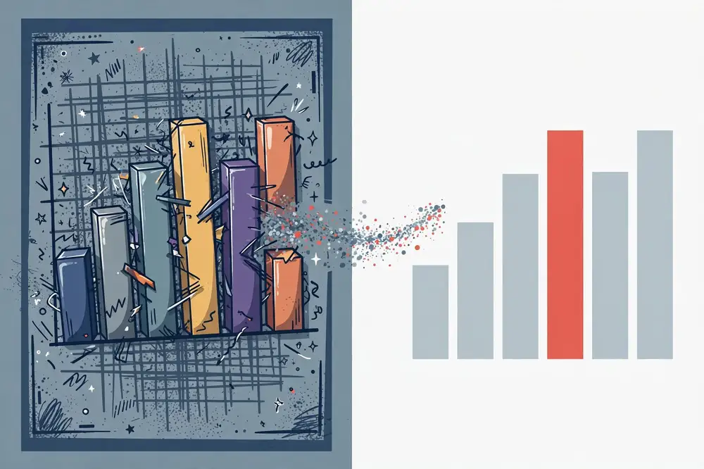
Every non-data element competes for the reader's preattentive attention (Chapter 1). A dark gridline grid shouts; the data whispers. A 3D bevel adds visual mass with zero meaning. A legend forces the reader's eye to bounce between the chart and a key, holding color mappings in working memory — which, recall, holds about four items. Clutter is not an aesthetic preference issue; it is a cognitive tax levied on every reader, and most charts are heavily taxed.
There is also a credibility cost. Cluttered, default-styled charts signal "I pasted this from the software." Clean, deliberate charts signal "I thought about you, the reader." Reviewers and stakeholders both read that signal, consciously or not.
Take any default chart from your software and apply these steps in order. Each step is small; together they transform the figure.
Step 1: Remove the container. Delete the chart border, the plot-area fill, and any background shading. The page is already white; the chart does not need a box inside the page. This single step removes a surprising amount of visual noise.
Step 2: Tame the gridlines. Gridlines are reference marks, not content. Either delete them entirely (if values are labeled directly on the data) or make them the lightest gray your medium allows. Never use dark or colored gridlines. Horizontal gridlines only, for bar and line charts — vertical gridlines rarely help and usually distract. Tufte's ideal: the minimum grid that lets a reader estimate a value.
Step 3: Quiet the axes. Remove axis lines where possible, or render them thin and gray. Remove tick marks pointing outward. Reduce axis labels to the minimum readable set — you rarely need a label on every tick. Use a clean, single font family throughout (one for the whole document, ideally), and never use bold for axis labels: bold is emphasis, and axes are not the emphasis.
Step 4: Label directly; kill the legend. Legends are cognitive middlemen. Instead of coloring series red/blue/green and explaining below, place the series name next to its line or bar in the same color. Direct labeling cuts the eye-bounce and frees working memory. Keep a legend only when direct labeling is genuinely impossible (many-series small multiples).
Step 5: Declutter the data marks themselves. Remove data labels on every point (label only what matters — the max, the min, the turning point). Remove markers on every point of a line chart (a clean line reads better; add a dot only at points you annotate). Round numbers ruthlessly: "34.2%" beats "34.17382%," and in text, "about a third" often beats both.
Step 6: Use white space as a tool. White space is not emptiness; it is grouping. Increase margins, separate panels with space rather than lines, let the chart breathe. If two elements are related, put them close; if unrelated, separate them. This is the Gestalt principle of proximity doing your layout work for free.
The before. A master's student plots monthly electricity consumption (kWh) for a university building over two years, comparing "before" and "after" a solar installation. The default output: a 3D clustered bar chart, 24 pairs of beveled bars in default blue and orange, dark gray gridlines every 200 kWh, a thick black chart border, a legend at the bottom, data labels on all 48 bars, y-axis from 0 to 12,000 with labels at every 1,000, x-axis labels rotated 45°, and the default title "Chart 1." Reading it feels like work because it is work: the eye must decode perspective, parse 48 labels, and hold the legend mapping — all before noticing the actual finding.
The declutter pass, step by step. Remove the border and background (Step 1) — immediately calmer. Lighten gridlines to faint gray and keep only every 2,000 kWh (Step 2) — the bars now dominate. Thin the axes, drop the rotated labels for clean horizontal month abbreviations (Step 3). Replace the legend with direct labels: "Before solar" in blue above the left cluster area, "After solar" in orange (Step 4). Delete all 48 data labels; instead annotate one thing: the month the solar array came online, with a vertical reference line and the note "Solar installed — March 2024" (Step 5). Add white space around the chart (Step 6).
The after. What remains is almost stark: two years of monthly bars, the post-installation months visibly and consistently lower, one annotation, one teaching title: "Solar cut the building's monthly electricity use by 38% — savings visible from the first full month." The finding that was buried under 48 labels now hits in seconds. Total time for the pass: about ten minutes. This is the highest return-on-effort skill in this entire book.
Decluttering has a failure mode: stripping away information the reader needs. Three things must survive every declutter pass:
The test: after decluttering, ask whether a careful reader could still reconstruct the claim and check it. If yes, the ink that remains is justified. Minimalism serves the message; the message does not serve minimalism.
Before. A PhD student tracks monthly survey response rates across eight universities over 18 months. The default chart: eight lines in default saturated colors, a legend, dark gridlines in both directions, markers on all 144 points, a thick border, a y-axis from 0–100% labeled every 5%, and the title "Response rates." The finding — that one university's rate collapsed after switching survey platforms in month 11 — is invisible in the rainbow tangle.
The pass. Remove border and background. Gridlines to faint gray, horizontal only, every 20%. Thin gray axes; y-labels at 0/20/40/60/80/100. Delete all 144 markers — eight clean lines. Delete the legend; instead, seven universities' lines go light gray, and the collapsed university's line goes bold coral with a direct label. One annotation at the break point: "Platform switch — response rate halved." Action title: "Response rates held steady at seven universities — but collapsed at one after the platform switch." Subtitle: "Monthly survey response rates, 8 universities · 18 months."
After. The eye goes straight to the coral line's cliff. The gray lines provide exactly the context needed: this was not a sector-wide decline; it was one institution's event. Ten minutes of work; the difference between a chart that confuses and one that testifies.
Decluttering tables (following Stephen Few's table design principles):
The 10-minute routine. Make decluttering a habit, not a project: every time you create a figure, spend the last ten minutes running the six-step pass and the checklist before you consider it done. Figures decluttered at creation stay clean; figures "to be fixed later" accumulate into the cluttered drafts that embarrass you at submission time. A decluttered table respects the reader the same way a decluttered chart does: every remaining element earns its ink.
For your research: Take the single most cluttered figure in your current draft — every researcher has one — and run the six-step declutter pass on it today. Save the before and after side by side. Show both to a colleague and time how long each takes them to state the finding. This before/after pair is also excellent material for your thesis defense: ## 5.6 Taming Your Software's Defaults
You will declutter hundreds of figures in your career; doing it by hand every time is wasteful. Invest once in clean defaults:
mplstyle file — white background, no top/right spines, light gray horizontal gridlines only, your palette as the color cycle, a clean sans-serif font. One line (plt.style.use('my-style')) then declutters every figure at creation.theme_minimal() with your fonts, palette scale, and legend positioning (or legend removal with direct labels via ggrepel). Apply it in every script's setup chunk.The principle: make the clean version the path of least resistance. When your defaults already produce borderless, gray-gridlined, palette-consistent charts, the six-step pass shrinks to a two-minute polish instead of a rescue operation. Share the style files with your lab — a research group with a shared visual standard produces theses and papers that look like they came from one careful mind.
examiners love seeing that you can critique and improve your own communication.
Key takeaways:
Color is the most powerful and most abused tool in visualization. Used deliberately, a single spot of color can deliver your message before the reader reads a word. Used carelessly — the default rainbow — it creates confusion, excludes colorblind readers, and signals that no one thought about the audience. This chapter makes your color use intentional.
Color is one of several preattentive attributes — visual channels the brain processes in milliseconds, before conscious attention. The full toolkit includes:
The master rule: use preattentive attributes to encode meaning, and use them sparingly. If everything is highlighted, nothing is. A chart where one bar is colored and eleven are gray says "look here" with total clarity. A chart where all twelve bars are different bright colors says nothing at all — the reader's preattentive system, bombarded with signals, gives up and forces slow conscious decoding.
The most underused color in data visualization is gray. Gray is the visual equivalent of a quiet room: it lets the one colored thing speak. The professional pattern, used throughout Cole Nussbaumer Knaflic's work, is:
Before/after described: a line chart of literacy rates for eight provinces over ten years, all eight lines in bright distinct colors — spaghetti. The after: seven lines in light gray, one province's line (the one that reformed its curriculum and diverged upward) in bold teal, with a direct label. The reader's eye goes to the teal line instantly; the gray lines provide the honest context that the divergence is real, not an artifact of a cropped view. Same data, opposite cognitive experiences.
Different data needs different color logic:
The colorblindness imperative. About 1 in 12 men and 1 in 200 women have color-vision deficiency, most commonly red-green. The classic red/green "bad/good" encoding is invisible to them. Design rule: never encode meaning with red vs. green alone. Use blue/orange, or add a redundant channel (position, label, shape) so the meaning survives without color. Test your figures with a colorblind simulator before submitting a paper — reviewers do notice, and accessibility is increasingly an explicit publication standard.
Contrast is what makes the colored element pop against its surroundings:
A practical contrast check: convert your figure to grayscale. If the message element still stands out (by darkness/lightness), your encoding has redundant contrast and will survive bad projectors, cheap printers, and colorblindness. If it disappears, you were relying on hue alone — fix it.
Colors carry associations — use them or deliberately override them, but never accidentally fight them:
Do this once per project; reuse everywhere.
Step 1 — Neutrals. Pick two grays: a light gray for context elements (light enough to recede, dark enough to see) and a dark gray for text and axes (near-black, softer than pure black). These carry roughly 80% of your chart.
Step 2 — The message color. Choose one saturated color with strong contrast against white: a deep teal, a confident blue, a warm coral. Check it in grayscale — it must read clearly darker than your light gray. This color means "look here; this is the finding."
Step 3 — The second meaning (optional). If your story needs two directions (improved/declined, treatment/control), add one more color that harmonizes with the first and stays distinguishable in grayscale and for colorblind viewers. Blue + orange is the classic safe pair.
Step 4 — The sequential scale. One hue, light to dark, for ordered data — take a tested ColorBrewer sequential scale rather than inventing one.
Step 5 — Test everything. Run every figure through: (a) a colorblind simulator for the common deficiencies; (b) the grayscale conversion; (c) a cheap print or projector test if the work will be presented live. Fix failures now — recoloring twelve figures the night before submission is miserable.
Step 6 — Document it. Write a half-page style note (thesis appendix, project wiki, or shared doc): the palette's values, what each color means, font choices, and the rule "this color = treatment group in every figure." Future you — and your coauthors — will thank present you. Consistency across a 200-page thesis is impossible without a written standard.
Tools worth knowing: ColorBrewer 2 (colorbrewer2.org) for tested palettes; Viz Palette for testing palettes against your data; Coblis for colorblind simulation; and your software's theme system (matplotlib style files, ggplot2 themes, slide masters) for applying the palette automatically instead of recoloring by hand.
A note on dark slides. If your talks use dark backgrounds, build a parallel palette: luminous, slightly desaturated colors for emphasis on dark, with the same meaning mapping (teal is still the finding). Never reuse print palette values blindly on dark backgrounds — fully saturated colors vibrate against black and exhaust the eye.
For your research: Define your project's palette today: one neutral gray, one primary message color, one secondary color for a second meaning, and one sequential scale — all checked in a colorblind simulator. Apply this palette to every figure in your paper or thesis. This single act of standardization will make your document look professionally designed and, more importantly, ## 6.7 Color and Emotion: The Rhetoric of Palettes
Color does not only direct attention; it sets an emotional register — and that register is part of your story, whether you choose it or not.
The ethical rule: your palette's emotional register should match the data's actual gravity. Exaggerating urgency to win attention is manipulation; muting urgency to avoid discomfort is abdication. When in doubt, choose the neutral register and let the numbers carry the weight — a 6× exceedance of a safety limit needs no red paint to alarm a careful reader, and the restraint itself builds ethos (Chapter 1).
A final practical note: document palette intent alongside palette values in your style note (Section 6.6) — "coral reserved for findings requiring action" — so coauthors use the rhetoric consistently instead of coloring by mood.
make every figure's emphasis instantly readable.
Key takeaways:
A figure without guidance is a map without labels: technically complete, practically useless. Titles, subtitles, annotations, and labels are the teaching layer of a chart — the difference between a reader who sees "some bars" and one who learns "the intervention worked, and here is where." This chapter shows how to write that layer.
Most student charts carry descriptive titles: "Figure 3: Accuracy by model," "Monthly rainfall, 2020–2024." These titles describe the topic but abdicate the teaching job. An action title (also called a takeaway title) states the conclusion: "Model B outperforms all baselines on noisy sensor data," "Dry seasons have arrived earlier every year since 2022."
The difference is cognitive. A descriptive title forces the reader to derive the conclusion from the chart — the hard work. An action title hands them the conclusion and lets the chart confirm it — the easy, pleasant work of verification. Readers of action titles understand faster and remember longer, because the title and the visual reinforce each other instead of duplicating the topic.
Practical rules for action titles:
A subtitle carries what the title cannot fit: the scope, the comparison, or the caveat. Together they form a two-line teaching header:
Solar cut the building's electricity use by 38% Monthly consumption, Jan 2023 – Dec 2024 · university admin block · savings from first full month after installation
The title delivers the message; the subtitle delivers the context that makes the message credible (what, when, where). This pattern — conclusion on top, context beneath — works for slides, dashboards, reports, and posters. Train yourself to write both lines before considering a figure done.
An annotation is text placed directly on the chart to explain a specific feature: a spike, a dip, a turning point, an outlier, a policy date. Annotations are the most underused teaching tool in student work, and the most powerful, because they answer the reader's inevitable question — "what happened there?" — at the exact moment it arises.
Annotation techniques:
Annotation discipline: annotate the few features that carry the story — typically one to three per chart. Annotating everything is just clutter with arrows. Each annotation should be short (under ~12 words), placed close to its target, and written in the same plain language as the title.
Direct labels (Chapter 5's Step 4) deserve emphasis here because they are annotation's close cousin: instead of a legend mapping colors to series, write the series name in its color next to the data. This removes the working-memory burden of holding the mapping and is almost always the right choice.
Axis titles should be plain-language, not variable names. "Monthly electricity use (kWh)" beats "cons_month_kwh." Include units in the axis title — never make the reader guess whether it is thousands or millions.
Number formatting is annotation too: every unnecessary decimal is noise. Round to the precision your claim needs. Use thousands separators. In text near charts, prefer human phrasing ("about one in three") for the headline number and exact figures in parentheses or captions.
A figure in a paper or report will often be seen without its surrounding text — in a skim, a slide deck, a forwarded PDF. Design for that reality. The self-explanatory figure carries four layers:
Full before/after walkthrough. A student studies bus punctuality. Before: a line chart titled "On-time percentage by route," 12 thin lines in default colors, a legend, no annotations. The reader's experience: spaghetti, no message. After: the same data, eleven routes in light gray, Route 7 (the redesigned express route) in bold teal with a direct label. Action title: "The redesigned Route 7 is the only route above the 90% punctuality target." Subtitle: "On-time arrivals, 12 city routes · Jan–Jun 2025 · target = city service standard." One annotation on Route 7's line at March: "Express lanes opened." One source note: "Data: city transit authority; n = 41,200 trips." The transformation used no new data — only the teaching layer. A reviewer skimming the paper now learns the finding from the figure alone, which is exactly what figures are for.
In papers, the caption does the teaching work that the title-subtitles-annotations layer does on slides. A strong caption has four parts, in order:
Example — weak caption: "Figure 3. Yield comparison. Error bars are shown."
Example — strong caption: "Figure 3. Drip-irrigation adopters out-yielded non-adopters by 34%, with the largest gains on farms under 2 acres. Bars show mean tomato yield (tonnes/hectare) across 120 farms in the 2024 season; teal = adopters (n = 58), gray = non-adopters (n = 62). Error bars show 95% confidence intervals. Districts are sorted by adoption rate; the dashed line marks the provincial average yield."
The weak caption describes nothing and teaches nothing; the strong caption lets a skimming reader learn the finding without opening the text. Note what the strong caption does not do: it does not interpret beyond the figure ("this suggests subsidies would work" belongs in the text), and it does not repeat the methods chapter.
Two more caption patterns:
Numbering and cross-reference discipline. Number figures in the order they are first referenced; reference every figure by number before it appears; never write "the figure below" (layout shifts). In a thesis, consider chapter-prefixed numbering (Figure 4.2) so readers always know where they are. Broken cross-references ("see Figure ??") are the small humiliations that signal an unfinished manuscript — compile and check them before every submission.
For your research: Rewrite the titles of all figures in your current draft as action titles using the four rules in Section 7.1. Then add subtitles with scope and context, and annotate the one to three key features of each chart. Read each figure in isolation — title, subtitle, chart, notes — and ask: "Could a colleague understand the finding without reading my text?" Keep revising until the answer is yes. This is one of the fastest ways to lift a paper from "competent" to "clear."
The teaching layer is not only for charts. Tables and equations benefit from the same treatment:
The principle generalizes: every formal element — figure, table, equation, algorithm — should announce its message and guide its reading. The document where each element teaches is the document reviewers describe as "clear," and clarity, as Chapter 11 argues, is scored as quality. Key takeaways:
A dashboard is a visual display of the most important information needed to achieve objectives, arranged on a single screen so it can be monitored at a glance (Few, 2013). The keyword is objectives: most dashboards fail not from bad graphics but from having no story — they are junk drawers of widgets. This chapter shows how to design dashboards that narrate.

Few distinguishes three dashboard purposes, and the design follows the purpose:
Before sketching anything, write the dashboard's one-sentence job: "This dashboard lets the program manager see each week whether literacy centers are on track and which ones need a visit." If you cannot write that sentence, you are building a junk drawer.
Readers scan screens in predictable patterns — top-left to bottom-right in left-to-right languages, with the top-left corner getting the most attention. Use that path as your narrative order:
This top-to-bottom flow — headline → trend → breakdown → action — is a narrative arc in dashboard form: setup (where we stand), conflict (where it breaks down), resolution (what to do). A dashboard that follows it feels guided; one that scatters widgets randomly feels like a control panel in an airplane cockpit — impressive and useless.
1. One screen, no scrolling. If the story needs scrolling, it is two stories. Constrain yourself to a single view; the constraint forces prioritization, which is the actual design work.
2. Few KPIs, chosen ruthlessly. Three to five headline metrics, maximum. Every additional widget halves the attention available for the others. For each candidate widget, ask: "What decision does this change?" If none, cut it.
3. Context on every number. A KPI without a target, a prior period, or a benchmark is just a number. "73%" means nothing; "73% (target 85%, up from 68% last quarter)" tells a story. Reference lines, targets, and sparklines are the cheapest storytelling devices in dashboards.
4. Highlight the exceptions. In operational and analytical dashboards, the reader's scarcest resource is attention. Use color and position to surface what is abnormal — the centers below target in coral, the rest in gray (Chapter 6's discipline, applied at dashboard scale). The dashboard should answer "where do I look?" before "what are the numbers?"
5. Interactivity serves the story, not the toy box. Filters and drill-downs are powerful when they let the reader follow the narrative path themselves (click a struggling district → see its centers → see the action list). They are harmful when they let the reader get lost in uncurated slicing. Design the default view as the complete story; interactivity as the footnotes.
Before: A university research office dashboard for tracking publications. Twelve widgets: total publications (a giant number), a 3D pie of publication types, a gauge showing "68% of target," a table of all 200 faculty, a word cloud of keywords, a map with one dot per paper, monthly counts as a rainbow bar chart, and more. The research director opens it, feels busy, and learns nothing — there is no headline, no trend against target, no sense of which departments need support.
After — the story version. One screen, four zones following the reading path. Top-left headline: "Publications this year: 142 (target 180) — 12 behind pace." Top row: a clean line of cumulative publications against the target trajectory line, the gap visible and annotated ("conference season dip, recoverable"). Middle: bars by department, sorted, the three behind-pace departments in coral, the rest gray, with direct labels. Bottom: the action list — the five departments furthest behind pace with their coordinators' names and a "schedule review" prompt. Five widgets instead of twelve; every widget tied to the one-sentence job: "help the director see whether the university will hit its publication target and which departments need support." The director now opens the dashboard and knows, in ten seconds, what to do on Monday morning. That is a dashboard telling a story.
To make the disciplines concrete, here is a full design for an analytical/operational dashboard monitoring the drip-irrigation field trial from this book's running example — built for the project's weekly team standup.
The job sentence: "Each Monday, the trial coordinator sees whether data collection is on track, which districts lag, and which farms need a field visit this week."
Layout on the reading path:
What was cut: the original draft had 14 widgets, including a map with one dot per farm (pretty, useless at this scale), a word cloud of farmer feedback (entertainment, not monitoring), cumulative totals that only ever rose (vanity metrics), and three different yield charts showing the same number. Each cut was decided by the decision test: "Does this change what the coordinator does on Monday?" The map failed; the action list passed.
How it is used. The standup opens on the headline (30 seconds: are we on track?), moves to the trend (is the gap closing?), then the breakdown (where is the problem?), and ends on the action list (who visits whom). Fifteen minutes, decisions made, meeting over. After six weeks, the team added one widget the data earned: an alert strip flagging sensors reporting impossible values (a data-quality exception the coordinator now catches weekly instead of discovering at analysis time). The dashboard grew by one widget in six weeks — the sign of a design with a clear job.
The research payoff. This dashboard is not thesis decoration: it is operational infrastructure that improves the data your thesis analyzes. Fewer missing farms, faster-caught sensor faults, documented weekly decisions — all of which become the methods chapter's evidence of careful fieldwork. Examiners notice.
For your research: Many theses and project reports now include a "dashboard" chapter or appendix — often a junk drawer. Take any dashboard-like display in your work (a results summary page, a monitoring figure set) and rewrite its one-sentence job. Then rebuild it on the headline → trend → breakdown → action path with at most five headline metrics, context on every number, and exceptions highlighted. If your research involves ongoing data collection (a survey wave, a field trial), this disciplined dashboard is also a genuine contribution to the project team, not just a thesis decoration.
A dashboard is a living document; a story that goes stale becomes misinformation. Four maintenance disciplines:
Plan the dashboard's retirement too: when the trial ends or the question is answered, archive it with its data and move on. A graveyard of stale dashboards teaches the organization to ignore dashboards — including the good ones.
Key takeaways:
A live talk is the most demanding form of data storytelling: you have minutes, one chance, and an audience that cannot rewind. The chart that works in a paper — dense, complete, self-explanatory — will fail on a slide if you simply paste it. This chapter covers how to translate data stories to the stage.
The research of Michael Alley and colleagues established the assertion–evidence slide structure: a concise, complete-sentence headline stating the slide's message (the assertion), supported by visual evidence (a clean chart, diagram, or image) — instead of a topic phrase plus bullet points. Compare:
Rules for the slide deck:
When a chart appears, the audience needs about five seconds of orientation before they can follow your point. Give them a guided tour in three moves:
The most common live-chart failure is skipping move 1 (the audience spends your explanation decoding axes) or move 3 (you show an interesting chart and say "as you can see," but they cannot). The pause in move 2 is a feature: silence while the audience looks is what makes the insight land.
Progressive reveal is your friend for complex charts: build the chart in stages — axes first, then context series in gray, then the highlighted finding, then the annotation. Each stage gets its narration. The audience constructs understanding with you instead of being ambushed by a finished graphic. Use it especially for the talk's key result.
A 15-minute talk holds roughly 12–15 slides — about one per minute, with breathing room for the key charts. Structure it on Chapter 3's arc:
Transitions are narration, not decoration. Say the story aloud between sections: "So we knew mentoring helped — but we didn't know who it helped most. Here's what the data said." These spoken bridges are the arc made audible, and they cost nothing.
Anticipate the three hard questions and prepare one backup slide for each: (1) the limitation you already know ("yes, the sample is urban-only — here's why the mechanism should generalize, and here's the rural study we're planning"); (2) the alternative explanation ("we tested whether income explains the gap — it doesn't; here's the adjusted analysis"); (3) the "so what" ("here is the cost per student and the policy pilot we'd propose"). Having the slide ready signals mastery; fumbling signals the opposite.
If a chart confuses the room, do not defend the chart — translate it: "Let me put it simply: the blue schools kept their students; the gray ones lost them in grade 8." Then fix the chart after the talk. The audience's confusion is data about your design, not about their intelligence.
Live demos and interactive dashboards are high-risk: they fail at the worst moment. If you must demo, record a video backup. For data talks, static progressive-reveal slides beat live dashboards — you control the narrative path instead of hoping the tool cooperates.
Rehearse out loud, standing, with a timer — silent mental run-throughs lie about timing. Then check:
The academic poster is a talk without a speaker — a static data story competing with fifty neighbors for a wandering reader's three minutes. Design it as one.
Layout as a reading path. Title banner across the top with the message, not the topic: "Drip irrigation raised small-farm yields by one-third" beats "A study of irrigation methods in Sindh." Below, three columns read left to right: setup (the problem, one short paragraph + one context chart), conflict (methods in a small box, then the two key figures, large), resolution (the implication and the takeaway box). The reader's eye should travel in a Z: title → hero figure → conclusion. Place your single most important figure at optical center, at least twice the size of the others — the hero earns the space.
Text discipline. A poster is not a paper on a wall. Aim for under 800 words total: short paragraphs, bullet-style phrases, 24pt minimum body text (if you must squint, so must the reader — and they will walk away instead). Every section heading is a message sentence. Methods shrink to a small box: data, sample, key technique, one line. Nobody reads a methods wall; everybody reads the hero figure's caption.
The two pitches. Prepare a 30-second pitch (the hook + the one finding + the implication) for the casual browser and a 3-minute guided tour (the arc, walking the poster left to right) for the engaged reader. Watch where eyes go during your tour — if visitors keep asking about something you considered minor, your poster's emphasis is wrong, not their curiosity.
Practical details. Include a QR code linking to the paper, data, or code — the poster starts conversations; the QR code continues them. Print a day early and proofread at full size (errors invisible on screen shout from a meter away). Bring handouts: a one-page summary with the hero figure and your contact — the physical artifact people actually keep. And stand beside your poster, not in front of it; you are the narrator, not the obstruction.
Common poster failures: the wall of text (a paper pasted into columns), 10pt fonts, paper figures shrunk unreadably instead of rebuilt, rainbow color with no meaning, no takeaway box (the reader leaves with no sentence to carry away), and the missing QR code (interest with nowhere to go). Each is fixed by treating the poster as a three-minute story, not a compressed thesis.
For your research: Your thesis defense and conference talks are examinations of your storytelling as much as your science. Take your next talk and convert every topic-headline slide to assertion–evidence form using the rules above. Rehearse the guided tour (orient → point → interpret) for your three most important charts, and prepare backup slides for your three hardest questions. Examiners consistently reward candidates who can narrate their own figures — it demonstrates the deep understanding that a memorized script cannot fake.
Remote presentations change the medium, and the medium changes the tactics:
The arc, the guided tour, and assertion-evidence slides all survive the move online unchanged — they are medium-independent. What changes is energy management: on screen, you must manufacture the pacing and presence that a physical room gives you for free.
Key takeaways:
Reports, white papers, policy briefs, and articles give you what slides cannot: space. But space is a temptation — to include everything, to let figures drift from the text, to write around the data instead of through it. This chapter shows how to write long-form data stories that hold together.
A strong data report follows a predictable architecture, because readers of reports skim strategically — executives read the summary, specialists read the findings, skeptics read the methods. Design for all three:
The most common long-form failure is the orphan figure: a chart appears pages from its discussion, or is never referenced at all, leaving the reader to guess why it exists. Enforce three rules:
A related discipline: never make the reader do arithmetic the text could do. If the point is a change, state the change ("a 12-point rise, from 61% to 73%"), don't make the reader subtract. The figure shows; the text tells.
Every paragraph of findings should pass the "so what" test: after stating a result, add the sentence that says why it matters. Students often stop at the result ("The correlation was 0.62") — which leaves the reader to supply the significance. The data storyteller adds the bridge ("…meaning study time explains more than a third of the variation in scores — the strongest predictor we measured").
Three devices keep long-form writing story-shaped:
Tables are not the enemy (Chapter 1 criticized uninterpreted tables, not tables as such). In reports, tables serve three legitimate roles: precise lookup (exact values a specialist needs), complete reporting (all results, honestly shown), and audit (enough detail to check the work). Design them well: clear headers in plain language, units stated, numbers aligned on decimals, heavy gridlines removed in favor of white space and a few horizontal rules, and the key row or column subtly highlighted. A well-designed table is itself a visualization — and a poorly designed one is where readers go to get lost.
Long-form stories have room for the honesty that short formats compress — use it. A dedicated limitations discussion, uncertainty shown on every inferential figure (confidence intervals, not just point estimates), and at least one alternative explanation addressed ("could income explain this? We tested it — here is the adjusted result") are what separate storytelling from salesmanship. Paradoxically, stated limitations increase persuasion with expert audiences: they signal that the author has interrogated the work, which makes the surviving claims more credible. The arc needs its conflict to be real (Chapter 3); the honesty layer is how you prove it.
The policy brief is the inverted pyramid (Chapter 3) at full compression: two pages, one decision, a reader who may give you five minutes. Everything in this chapter applies, tightened.
The structure:
The cutting discipline. Draft the brief, then cut half the words. What survives the cut is always the same: the number, the comparison, the cost, the ask. Background paragraphs, caveats that don't change the decision, and secondary findings all move to the full report — which the footnote links to. If a sentence doesn't help the reader decide, it doesn't belong in two pages.
Worked outline — the irrigation subsidy brief. Headline: the 34% finding + the affordability paradox. Problem: smallholders' water losses in three lines with the income stakes. Evidence: Figure 1 — adopters vs. non-adopters by farm size (the paradox visible); Figure 2 — payback arithmetic (one season). Options table: (a) no subsidy — adoption stays at 12% on small farms; (b) 50% subsidy for farms under 2 acres — $180,000 pilot, 2,000 farms, payback in one season; (c) full subsidy — $340,000, faster uptake, higher fiscal risk. Recommendation: option (b), pilot in the three lowest-adoption districts, implemented through the existing extension service, first disbursement before planting season. Methods footnote: 120-farm trial, 2024 season, mixed-effects analysis, full report linked. Two pages; a minister can read it between meetings and decide.
For your research: Take a recent long report, project deliverable, or thesis chapter you have written. Check: does every figure have a numbered in-text reference before it appears? Does the text state each figure's message rather than describing its mechanics? Does every findings paragraph contain a "so what" sentence? Revise one chapter against these three checks — it is the fastest structural edit most student writing ever receives.
Appendices are where detail goes to be ignored — unless you organize them as the story's supporting cast rather than its attic:
A well-built appendix does quiet persuasive work: it tells the reviewer "everything is here, check anything," which is ethos in document form. The story's honesty layer (Section 10.5) lives partly here — and reviewers notice when it's missing.
Key takeaways:
Journal reviewers and thesis examiners are the most demanding audience in this book: they are expert, skeptical, and drowning in manuscripts. Figures that respect their time and intelligence get papers accepted faster. This chapter is a field guide to what reviewers actually want from your visuals.
Read reviewer reports across fields and the same figure complaints recur:
Preempting these complaints is not cosmetic — reviewers who struggle with figures downgrade their assessment of the science, because unclear presentation reads as unclear thinking.
Apply Chapter 3's arc deliberately to the results section:
A thesis is a book-length data story, and its most common failure is episodic drift — chapters that read as separate papers stapled together. Counter it structurally:
Figure complaints are the most winnable points in peer review: they are concrete, fixable, and revising them visibly improves the paper. Treat the response letter as a second round of storytelling.
The response structure. For each figure-related comment, use three moves: (1) thank and acknowledge ("We agree Figure 3 was difficult to interpret"); (2) describe the specific change ("We have replotted it as a dot plot with direct labels, added 95% confidence intervals, and rewritten the caption to state the finding"); (3) point to the evidence ("see revised Figure 3, p. 12"). Reviewers skim response letters the way they skim papers — make each response self-contained and point precisely.
When to concede vs. defend. Concede and redesign when the complaint is about clarity, completeness, or consistency — the reviewer is right that the figure can be clearer, and a better figure helps you too. Defend only when the complaint misreads the figure, and defend with evidence, not assertion: "We respectfully disagree that the effect is driven by outliers: revised Supplementary Figure S4 shows the result holds after excluding the three extreme points." Never defend a figure's aesthetics without offering a revision — arguing "we prefer the pie chart" against a reviewer who asked for bars is a fast track to rejection.
Example rebuttal language.
Notice the pattern: agreement where possible, concrete changes, precise pointers. A reviewer who sees their figure comments addressed thoroughly upgrades their assessment of the whole manuscript — because clear figures, once again, read as clear thinking.
For your research: Before your next submission, run the "reviewer preempt" audit on your manuscript: (1) Is every figure referenced in order, with n, units, and uncertainty defined? (2) Does each figure carry exactly one message, stated in its caption's first sentence? (3) Would the figures survive grayscale printing? (4) Is the results section ordered by message rather than analysis order? Fix every "no" — this audit catches the majority of figure-related reviewer complaints before they are written.
Different research designs need different figure sets. Use these as starting checklists, then adapt:
In every case: one message per figure, uncertainty where claims depend on it, captions in the four-part structure (Section 7.6), and the full set ordered by narrative, not by analysis. Run the reviewer-preempt audit (Section 11.4's box) against the finished set.
Key takeaways:
Everything in this book converges here. Below is a complete capstone: a realistic bad report, diagnosed against every chapter, then rebuilt step by step into a story. Read it as a worked model for your own redesigns.
The document. A 14-page internal report from a fictional agricultural NGO's quarterly field survey of 600 smallholder farms. It opens with two pages of background on the NGO's history. Then come the findings: eleven figures in analysis order — a 3D pie chart of crop types (nine slices), a rainbow bar chart of yields by district (axis starting at 2.0 tonnes), a table of 40 regression coefficients with six decimals, a dual-axis chart of rainfall and yield, six more default-styled charts, and a line chart of monthly data with no annotations. Figure titles are descriptive ("Yield by district"). No figure is referenced by number in the text. The text describes chart mechanics ("the blue bars show…"). The report ends without recommendations — "further analysis is planned."
The diagnosis, by chapter:
The buried story. Reading past the clutter, the data actually says: Drip-irrigation adopters out-yielded non-adopters by 34%; the gains concentrate on farms under 2 acres; adoption is lowest exactly where gains are highest — because the upfront cost blocks the poorest farmers; a subsidy targeted at small farms would pay for itself in one season. That is a setup (smallholders struggle with water), a conflict (the best solution is adopted least where it helps most), and a resolution (targeted subsidy). The bad report never told it.
Step 1 — Audience and message (Ch. 2). Audience brief: the NGO's program director and two funders; decision: whether to fund a targeted subsidy pilot; attention: 15 minutes. One message sentence: "Drip irrigation raises small-farm yields by a third, but the poorest farmers can't afford it — a targeted subsidy pays for itself in one season."
Step 2 — Arc (Ch. 3). Restructure into three acts: setup (the water problem on small farms, two short paragraphs + one context chart), conflict (adopters vs. non-adopters; the adoption paradox — lowest adoption where gains are highest), resolution (the subsidy arithmetic and the pilot proposal).
Step 3 — Recast the charts (Ch. 4). The 9-slice pie becomes a sorted bar chart of the top five crops plus "other." The truncated rainbow bars become a dot plot of yield by district, axis honestly scaled, adopters vs. non-adopters. The dual-axis chart becomes two aligned panels (rainfall; yield) sharing the time axis. The 40-coefficient table becomes one forest plot of the five key effects with 95% CIs, the rest to an appendix. The categorical line chart becomes bars.
Step 4 — Declutter (Ch. 5). Borders, 3D, heavy gridlines, and legends removed across all figures; direct labels; data labels kept only on the key comparisons; white space between panels.
Step 5 — Color with intent (Ch. 6). Project palette: gray for context, teal for adopters/gains, coral for the gap. Small farms highlighted; everything else gray. Grayscale-tested.
Step 6 — Teaching layer (Ch. 7). Every figure gets an action title ("Adoption is lowest where gains are highest — the poorest farms"), a subtitle with scope, one annotation (the cost barrier note on the adoption chart), and a source line.
Step 7 — Structure (Ch. 10). One-page executive summary written last. Every figure numbered and referenced before it appears. "So what" sentences in every findings paragraph. Methods in a half-page box. Three specific recommendations with costs and owners. Appendices hold the full tables.
The redesigned report is six pages. Page one: the executive summary — the whole story, the number (34%), the paradox, the ask ($180,000 pilot, 2,000 farms, payback in one season). Pages two to four: three acts, five figures, each self-explanatory. Page five: recommendations with owners and timelines. Page six: methods box and honesty layer (limitations, the one district where the effect didn't hold, next steps). A funder reading it in fifteen minutes knows the problem, the evidence, the paradox, and exactly what is being asked. The same data, the same honesty — but now the understanding transfers.
The capstone lesson: no step in the redesign required new data or advanced statistics. Audience clarity, narrative order, correct chart casting, decluttering, intentional color, and a teaching layer — the full toolkit of this book — turned a document nobody would act on into one that funds a program. That is the whole promise of storytelling with data: the analysis discovers the truth; the story delivers it.
Run this audit on any document before it leaves your hands — paper, thesis chapter, report, or slide deck:
Audience & message - [ ] 1. Audience brief written (who, decision, knowledge, fears, one message). - [ ] 2. One message sentence exists for the document — and for every figure. - [ ] 3. A stranger passes the ten-second test on each key figure.
Narrative - [ ] 4. Findings are in narrative order (setup → conflict → resolution), not analysis order. - [ ] 5. The conflict is genuine — no manufactured drama, no buried lede. - [ ] 6. The resolution states implications: what changes, who acts, what is next.
Charts - [ ] 7. Every chart's family matches its question (comparison / composition / distribution / relationship). - [ ] 8. Honesty checks pass: bars at zero, no dual axes, no cherry-picked windows, log scales labeled. - [ ] 9. Uncertainty is shown wherever a claim depends on it (CIs defined in captions).
Clarity - [ ] 10. Declutter pass applied: no chartjunk, direct labels, rounded numbers, white space. - [ ] 11. Action titles on every figure; subtitles give scope; 1–3 annotations mark key features. - [ ] 12. Color discipline: gray for context, one color for the message; palette consistent throughout.
Access & honesty - [ ] 13. Colorblind simulator + grayscale test passed on every figure. - [ ] 14. Captions are four-part (finding, what's shown, statistics, reading guide); figures referenced in order. - [ ] 15. Limitations, alternative explanations, and null results are reported honestly.
Consistency - [ ] 16. Notation, colors, fonts, and styles are consistent across the whole document. - [ ] 17. Numbers are rounded appropriately; units appear on every axis and table header. - [ ] 18. Every figure is referenced by number before it appears; cross-references compile cleanly.
Finish - [ ] 19. The executive summary / abstract tells the whole story alone. - [ ] 20. You have kept the before version — the before/after pair is your portfolio.
Score yourself honestly. Items 1–3 are where most documents fail; items 8, 9, and 15 are where trust is won or lost. A document passing all twenty is rare — and unmistakable.
For your research: Your capstone task is Exercise 10 below: take the weakest chapter, report, or slide deck in your current work and run the full seven-step redesign on it. Keep the before version. The before/after pair is not just an exercise — it is portfolio material for job interviews, a demonstration for your supervisor, and often the version of your work that finally gets understood.
One redesign makes you capable; routine makes you good. A sustainable practice:
Storytelling with data is not a talent. It is a set of checkable practices — audience briefs, arcs, chart families, declutter passes, palettes, teaching layers — applied repeatedly until they become instinct. You now own the checklist. The instinct is a year of Fridays away.
Key takeaways:
Quick-reference summaries of the book's core systems. Print these pages and keep them beside you while you work.
| Question you are answering | Relationship family | Best chart | Avoid |
|---|---|---|---|
| Which is biggest/smallest? How do items rank? | Comparison | Sorted bar chart (axis at zero) | Truncated axes, 3D bars |
| How has it changed over time? | Comparison (time) | Line chart | Bars for long series; lines for categories |
| Before vs. after, precisely? | Comparison | Dot plot / slope chart | Grouped 3D bars |
| What are the parts of the whole? | Composition | Bar of shares / stacked bar; pie only if ≤5 slices with a dominant one | Pies with many slices; donut for precision |
| How are values distributed? | Distribution | Histogram | Too few/many bins; hiding the shape |
| How do distributions compare across groups? | Distribution | Box plot (expert audience) | For general audiences without explanation |
| Do two variables move together? | Relationship | Scatter plot (+ trend line only if modeled) | Bubble charts; decorative trend lines |
| Where exactly are the values? (lookup) | Lookup | Formatted table with subtle shading | Rainbow cell coloring; six decimals |
| Where is it happening geographically? | Spatial | Choropleth map (or cartogram if population matters) | Maps when location isn't the message |
| Attribute | Processed in | Best used for | Caution |
|---|---|---|---|
| Position (along a scale) | ~200 ms, most accurate | Encoding the actual data values | Keep scales honest and consistent |
| Color (hue) | ~200 ms, strong | Highlighting the message; separating a few categories | Fails for ~1 in 12 men (red-green); always redundant-encode |
| Color (intensity/lightness) | ~200 ms | Sequential magnitude (dark = more) | Survives grayscale; hue alone does not |
| Size / length | Fast | Emphasis; magnitude via length | Area is misjudged — prefer length |
| Orientation / shape | Fast | Distinguishing categories among points | Limit to a few distinct shapes |
| Enclosure | Fast | Grouping ("these belong together") | Keep the enclosure light so it doesn't dominate |
| Motion | Fastest, irresistible | Live alerts only | Never in static figures; sparingly in talks |
Rule of thumb: one preattentive signal per message. Each additional signal competes with the others; a chart that shouts in five channels says nothing.
| Act | Job | Where it lives | Check |
|---|---|---|---|
| Setup | Establish context and expectation | Intro, background, baseline chart | Does the reader know the stakes? |
| Conflict | Reveal what the data disrupted | Results, key figure, anomaly | Is there a genuine violated expectation? |
| Resolution | Explain and prescribe | Discussion, recommendations | Does the reader know what changes? |
1. Table to story (easy). Take any data table from your field (at least 20 numbers). Write the one-sentence finding it contains, then sketch the single chart that makes that sentence obvious. Time how long a friend takes to state the finding from the table vs. the chart.
2. Audience briefs (easy). Choose one result from your research. Write the five-line audience brief (Section 2.2) for a stakeholder, a peer reviewer, and a non-specialist friend. Note how the "one message" sentence changes.
3. Arc mapping (easy–medium). List the findings of your current paper in presentation order. Label each as setup, conflict, or resolution. Reorder them into narrative order and rewrite the section's opening paragraph as a three-sentence arc.
4. Chart recasting (medium). Find one miscast chart in your work (wrong family, truncated axis, pie with too many slices, dual axes). Recast it using the Chapter 4 decision tree and write down which of the seven classic errors it committed.
5. Declutter pass (medium). Take your most cluttered figure and run the six-step declutter pass (Chapter 5) plus the declutter checklist. Save before/after side by side and test both on a colleague with the ten-second stranger test.
6. Palette design (medium). Build your project's 3–5 color palette (Chapter 6): neutral gray, message color, second-meaning color, sequential scale. Test all figures in a colorblind simulator and in grayscale. Document the palette for your thesis.
7. Teaching layer (medium–hard). Rewrite every figure title in a draft chapter as an action title, add subtitles and one to three annotations per figure, and add source/statistics notes. Verify each figure is self-explanatory in isolation.
8. Dashboard story (hard). Design a one-screen dashboard for a real monitoring need in your work (field trial, survey waves, lab throughput) following the headline → trend → breakdown → action path, with at most five KPIs and context on every number.
9. Talk rebuild (hard, research-oriented). Convert your next conference or defense talk to assertion–evidence slides: sentence headlines, one message per slide, simplified figures, guided-tour narration (orient → point → interpret) for the three key charts, progressive reveal for the main result, and backup slides for your three hardest questions. Rehearse with a timer.
10. Capstone redesign (hard, research-oriented). Take the weakest report, paper draft, or slide deck in your current work and run the full seven-step capstone redesign from Chapter 12: audience brief → arc → recast charts → declutter → color → teaching layer → structure. Keep the before version. Present the before/after pair to your supervisor and note which step made the biggest difference.
[1] C. N. Knaflic, Storytelling with Data: A Data Visualization Guide for Business Professionals. Hoboken, NJ, USA: Wiley, 2015.
[2] C. N. Knaflic, Storytelling with Data: Let's Practice! Hoboken, NJ, USA: Wiley, 2019.
[3] E. R. Tufte, The Visual Display of Quantitative Information, 2nd ed. Cheshire, CT, USA: Graphics Press, 2001.
[4] S. Few, Show Me the Numbers: Designing Tables and Graphs to Enlighten, 2nd ed. Burlingame, CA, USA: Analytics Press, 2012.
[5] S. Few, Information Dashboard Design: Displaying Data for At-a-Glance Monitoring, 2nd ed. Burlingame, CA, USA: Analytics Press, 2013.
[6] W. S. Cleveland, The Elements of Graphing Data, 2nd ed. Murray Hill, NJ, USA: Hobart Press, 1994.
[7] W. S. Cleveland and R. McGill, "Graphical perception: Theory, experimentation, and application to the development of graphical methods," J. Amer. Statist. Assoc., vol. 79, no. 387, pp. 531–554, 1984.
[8] J. Bertin, Semiology of Graphics: Diagrams, Networks, Maps. Madison, WI, USA: Univ. of Wisconsin Press, 1983.
[9] A. Cairo, The Truthful Art: Data, Charts, and Maps for Communication. Berkeley, CA, USA: New Riders, 2016.
[10] N. Duarte, Slide:ology: The Art and Science of Creating Great Presentations. Sebastopol, CA, USA: O'Reilly Media, 2008.
[11] G. Reynolds, Presentation Zen: Simple Ideas on Presentation Design and Delivery, 2nd ed. Berkeley, CA, USA: New Riders, 2011.
[12] B. Shneiderman, "The eyes have it: A task by data type taxonomy for information visualizations," in Proc. IEEE Symp. Visual Languages, Boulder, CO, USA, 1996, pp. 336–343.
End of Book 26. Next: Book 27 — Communicating Uncertainty: Error Bars, Confidence, and Honest Numbers.