← All 50 books
Book 21 of 50 · Free
Data Analytics Foundations
25,615 words · 17 chapters · illustrated
Book 21 of 50 · Free
25,615 words · 17 chapters · illustrated
Book 21 of 50 — AstolixGen Learning Series For researcher and publication students
Data analytics is the bridge between raw data and good decisions. Whether you are a student writing your first thesis, a researcher preparing a journal paper, or a professional trying to understand what your data is telling you, analytics is the skill that turns numbers into knowledge.
This book is written for you if you are starting from zero. You do not need a mathematics degree, a programming background, or any prior experience with statistics. Each chapter builds on the last: you will first understand what analytics is and why it matters, then learn the four types of analytics, then walk through the complete workflow — from asking a question, to collecting and cleaning data, to exploring it, analyzing it, visualizing it, and finally communicating your findings clearly.
By the end of this book, you will be able to take a real dataset, clean it, explore it, run basic statistical analyses, build clear visualizations, and write up your findings the way a researcher would. Chapter 12 ties everything together in a full end-to-end project you can copy as a template for your own work.
What you need to follow along: no prior statistics or programming experience — only curiosity and a willingness to work with real numbers. A spreadsheet program (Excel or Google Sheets, both fine) is enough for Chapters 1–8; Chapters 9 and 12 optionally use free tools (Python via Google Colab needs no installation). Wherever a chapter introduces software, the concept is explained first so you can follow even without running code.
How to use this book: read Chapters 1–3 in order (concepts and workflow), then you may dip into Chapters 4–10 as needed — though first-time readers benefit from the full sequence. Work the examples with your own data as you go: pick one dataset you care about in Chapter 4 and carry it through cleaning (Ch 5), exploration (Ch 6), analysis (Ch 7), visualization (Ch 8), and communication (Ch 10). Budget roughly one focused week per chapter part-time; the practice exercises at the end turn reading into skill. Keep a notebook — it becomes your analytics lab journal.
Learning objectives:
By the end of this book, you will be able to:
Every day, the world produces an enormous amount of data: hospital records, mobile phone logs, weather sensors, online purchases, exam results, social media posts. Data analytics is the discipline of examining this raw material systematically and turning it into something a human being can act on. In the simplest possible definition:
Data analytics is the process of examining raw data to draw conclusions, find patterns, and support decision-making.
Notice three words in that definition: examining (it is active and methodical, not casual looking), conclusions and patterns (the output is understanding, not just numbers), and decision-making (the purpose is always practical — analytics that changes no decision was just arithmetic).
Beginners often use "data" and "information" as if they were the same thing. They are not, and the difference is the entire reason analytics exists. The standard way to explain this is the DIKW hierarchy (Data → Information → Knowledge → Wisdom), proposed in various forms by writers such as Russell Ackoff in 1989:
| Level | What it is | Example |
|---|---|---|
| Data | Raw, unprocessed facts and figures with no context | 37.2, 38.1, 36.9, 39.4 |
| Information | Data organized with context so it answers who, what, when, where | "These are the body temperatures of 4 patients in Ward B this morning." |
| Knowledge | Information combined with experience so it answers how | "A temperature above 38.0°C with these symptoms suggests infection; isolate the patient." |
| Wisdom | Knowledge applied with judgment over time | "Our hospital's infection protocol, refined over years, balances isolation costs against outbreak risk." |
Analytics mainly operates on the step from data to information to knowledge. A spreadsheet of 10,000 temperature readings is data. A chart showing that fevers cluster in Ward B on weekends is information. A tested conclusion that weekend staffing levels correlate with slower response times — and a recommendation to change the roster — is knowledge. Your job as an analyst is to climb that ladder deliberately, documenting each step so others can check your work.
Analytics did not appear with computers; it grew out of statistics, and knowing its history helps you understand why the field looks the way it does.
There are three reasons analytics deserves your time, whether your goal is a career or a publication.
1. Decisions improve when they are evidence-based. Human judgment is powerful but biased: we remember dramatic cases, not typical ones; we see patterns in noise; we defend our first guess. Analytics does not remove judgment — it disciplines it. A hospital that tracks infection rates by ward makes better staffing decisions than one that relies on the head nurse's memory. A researcher who tests a hypothesis on data makes a stronger claim than one who argues from examples.
2. Data is now abundant and cheap. Sensors, phones, and digital records mean that even small organizations and student researchers can collect datasets that would have required a national survey thirty years ago. The scarce resource is no longer data — it is people who can analyze it honestly and well. That is the skill this book builds.
3. Analytics is the foundation of AI and machine learning. Every machine learning model is, at bottom, analytics done at scale: data collected, cleaned, explored, modeled, and evaluated. Researchers who understand analytics understand what their models are actually doing — and can spot when a model's impressive accuracy is an artifact of bad data rather than real learning.
Imagine you run a small campus canteen. You have a notebook of daily sales (data). You add up sales by day of the week and notice Friday sales are double Monday sales (information). You check further and find that Friday is when the computer science department has its late lab, so hungry students flood in at 9 PM (knowledge). You extend Friday hours and stock more food — and revenue rises (a decision, then wisdom when you repeat it). Every chapter of this book teaches one part of that journey.
Beginners drown in overlapping terms: analytics, statistics, data science, machine learning, business intelligence, data mining. They overlap, but each has a center of gravity:
| Field | Central question | Typical output | This book covers it in |
|---|---|---|---|
| Statistics | Is this pattern real or chance? | Tests, confidence intervals, models | Chapter 7 |
| Data analytics | What does the data say, and what should we do? | Reports, dashboards, recommendations | All chapters |
| Data science | What can we build/learn from data? (broader, includes engineering) | Models, pipelines, products | Touched in Ch 9, 12 |
| Machine learning | Can a machine learn this pattern automatically? | Trained predictive models | Introduced in Ch 2, 7 |
| Business intelligence (BI) | How are we performing right now? | Dashboards, KPI reports | Chapters 8, 9 |
| Data mining | What hidden patterns exist in large datasets? | Discovered rules and segments | Historical note in Ch 1; techniques in Ch 6–7 |
Think of it this way: statistics gives analytics its rigor, machine learning gives it predictive power, BI gives it a display window, and data science is the big tent covering all of them plus the engineering to run them at scale. You do not need to pick a tribe — a working analyst borrows from all six.
To make this concrete, here is what analytics looks like outside business:
The pattern is identical everywhere: a decision exists, data relevant to it exists, and someone must do the disciplined work of connecting the two. That someone is you.
Analytics training changes how you read the news. Four defenses every analyst should carry into daily life:
1. Absolute vs. relative change. "Crime doubled!" sounds terrifying — until you learn it went from 2 to 4 incidents in a town of 50,000. Relative change (percentages) dramatizes small bases; absolute change (counts) grounds them. Always ask for both. The same trick appears in product claims: "50% more effective!" than what, measured how, on whom?
2. Averages of averages. A university reports "average class size: 25." But if one mega-lecture has 400 students and twenty seminars have 12, the student's average experience is very different from the class average. Whenever groups differ in size, ask whether the average is weighted properly.
3. Survivorship bias. "All successful founders dropped out of college!" — but you only see the survivors. The dropouts who failed are invisible. Whenever someone generalizes from winners, ask about the losers you cannot see. In analytics, this appears as analyzing only current customers (never the ones who left) or only published studies (never the failed ones — Chapter 11's replication discussion).
4. The base rate. A test for a rare disease is "99% accurate" — but if 1 person in 10,000 has the disease, most positive results are false alarms. Judgments need the base rate (how common the thing is), not just the test's accuracy. Analysts meet this in fraud detection, medical screening, and anywhere rare events matter.
Practice: take any news article with a statistic this week and run these four checks. You will be shocked how often they fail — and you will never read numbers naively again.
For your research: Analytics gives you the "Methods" and "Results" sections of a paper. When you read published research, try to identify where the authors moved from data to information (their tables and charts) and from information to knowledge (their conclusions). Weak papers often jump straight from data to conclusions without showing the middle steps. Your papers will be stronger if you document every step — which is exactly what Chapters 3 through 10 teach you to do.
Key takeaways: - Data analytics is the systematic examination of raw data to find patterns and support decisions. - Data, information, knowledge, and wisdom are different levels; analytics climbs from data to knowledge. - The field grew from statistics (1700s–1900s) through Tukey's EDA (1977), data mining and CRISP-DM (1990s), to mainstream business analytics (2007) and today's data-rich world. - Analytics matters because it disciplines human judgment, data is now abundant, and it is the foundation of AI and machine learning.
Not all analytics answers the same kind of question. A shopkeeper asking "what did we sell last month?" needs something different from a doctor asking "which patients are at risk next year?" The field organizes itself into four types of analytics, arranged from simplest to most advanced. Each answers a different question, uses different techniques, and creates different value. Understanding this classification is one of the most practical things in this book: it tells you what kind of answer a question needs before you start working.
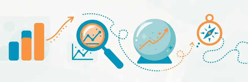
Descriptive analytics summarizes the past. It takes raw data and produces reports, dashboards, totals, averages, and charts that tell you what occurred. This is the most common type of analytics in the world, and it is where every analysis should begin — you cannot explain or predict what you have not first described.
Typical questions: What were our sales last quarter? How many patients visited the clinic in June? What is the average exam score in each department? Which product is the best seller?
Techniques: Counts, sums, averages, percentages, grouping, sorting, filtering, pivot tables, dashboards, standard reports.
Example: A university registrar pulls enrollment data and reports: "In 2026, 4,200 students enrolled; 58% were undergraduates; the Computer Science department grew 12% while Humanities shrank 3%." No causes are claimed, no future is predicted — just a faithful picture of what happened.
Strengths: Simple, fast, easy to verify, and immediately useful. Most management decisions only need good descriptive analytics. Limitations: It tells you nothing about why something happened or what will happen next.
Diagnostic analytics digs into the past to find causes. When a descriptive report shows something surprising — sales dropped, scores fell, infections rose — diagnostic analytics asks what drove it. It is the detective work of the analytics world.
Typical questions: Why did sales drop in March? Why do students from one school perform worse in mathematics? What caused the spike in website errors last Tuesday?
Techniques: Drill-down (breaking a total into parts), correlation analysis, comparison of groups, root-cause analysis, anomaly investigation, A/B comparisons.
Example: The registrar sees Humanities enrollment shrank 3%. Diagnostic analysis breaks the number down: the drop is concentrated in two programs, both of which raised their admission requirements last year, while a competitor university launched a scholarship scheme in the same city. Three candidate causes emerge — each testable.
Strengths: Turns surprises into understanding; prevents fixing the wrong problem. Limitations: Correlation is not causation (Chapter 7 explains this deeply). Diagnostic analytics suggests causes; proving them usually needs experiments.
Predictive analytics uses past data to estimate the future. It finds patterns in historical data and projects them forward: which customers will leave, which patients are at risk, how much stock will be needed next month. This is where statistics meets machine learning, and it is the type most associated with "data science" in the news.
Typical questions: Which students are at risk of dropping out? How many beds will the hospital need next winter? What will next quarter's sales be? Which loan applicants are likely to default?
Techniques: Regression, time-series forecasting, classification models (logistic regression, decision trees, random forests), and other machine learning methods.
Example: Using five years of student records (attendance, past grades, fee payment delays), a university builds a model that flags students with a high probability of dropping out in the first semester — so counselors can intervene early.
Strengths: Lets you act before events happen; often the highest-value type of analytics. Limitations: Predictions are probabilities, not certainties. A model trained on past data fails when the world changes (a pandemic, a new policy). Predictions also need enough good historical data — garbage in, garbage out.
Prescriptive analytics goes one step further: given what happened, why, and what is likely to happen, it recommends the best action. It combines predictions with optimization and decision rules.
Typical questions: How should we schedule nurses to minimize waiting time at lowest cost? Which combination of courses should we offer to maximize enrollment? What price maximizes profit given predicted demand?
Techniques: Optimization (linear programming), simulation ("what-if" analysis), decision rules, recommendation systems.
Example: The hospital predicts next winter's patient load (predictive), then runs an optimization model that recommends exact nurse rosters per ward per week, balancing legal working hours, staff preferences, and expected demand (prescriptive).
Strengths: Directly produces decisions; the closest analytics gets to automation. Limitations: The hardest and most expensive type; recommendations are only as good as the predictions and the assumptions behind them. Needs careful human oversight.
| Descriptive | Diagnostic | Predictive | Prescriptive | |
|---|---|---|---|---|
| Question | What happened? | Why did it happen? | What will happen? | What should we do? |
| Time focus | Past | Past | Future | Future |
| Difficulty | Low | Medium | High | Very high |
| Typical tools | Reports, dashboards, Excel | Drill-down, correlations | Regression, ML models | Optimization, simulation |
| Value | Visibility | Understanding | Foresight | Action |
Suppose you manage admissions marketing for a small college. Your applications fell 15% this year.
Notice the order matters. Skipping descriptive and jumping to prediction is one of the most common beginner mistakes — and one of the most expensive.
Seeing the four types in a completely different setting cements the pattern. A hospital director notices the emergency room (ER) is overcrowded.
Again, each step depends on the last. The prescriptive recommendation would be nonsense without the diagnostic finding (the real bottleneck) and the predictive forecast (how bad it gets).
| Mistake | Why it hurts | What to do instead |
|---|---|---|
| Predicting before describing | You model noise; nobody trusts the output | Spend real time on descriptive dashboards first |
| Confusing prediction with explanation | A model can predict well for the wrong reasons | Use diagnostic analysis for "why"; predictive for "what next" |
| Prescribing from weak predictions | Optimizing on bad forecasts produces confident bad decisions | Validate predictions on unseen data before optimizing |
| Using only descriptive forever | You see problems but never anticipate or solve them systematically | Graduate to diagnostic whenever a number surprises you |
| Letting the tool choose the type | "We bought ML software, so everything becomes a prediction project" | Let the question choose the type, not the software |
A practical rule: about 70% of real analytics work is descriptive and diagnostic. Predictive and prescriptive get the headlines, but the foundation is faithful description and careful diagnosis. Master those and the advanced types become dramatically easier.
Organizations (and researchers) progress through maturity levels. Knowing your level tells you what to build next:
| Level | Name | What it looks like | Example |
|---|---|---|---|
| 1 | Descriptive basics | Manual reports, spreadsheets, gut feel dominates | Monthly sales typed into Excel |
| 2 | Diagnostic habit | Someone routinely asks "why?" and digs in | Investigating every sales dip by segment |
| 3 | Proactive prediction | Forecasts guide planning; models in production | Demand forecasting drives stock orders |
| 4 | Prescriptive action | Optimization recommends decisions; experiments are routine | Rosters auto-optimized; A/B tests standard |
| 5 | Embedded & learning | Analytics is automatic; systems learn and adapt | Real-time personalization, continuous retraining |
How to assess yourself: which level describes your regular practice, not your aspirations? Most small organizations sit at level 1–2; most student researchers operate at 1–2 as well (descriptive + some diagnostic). The key insight: you cannot skip levels. A level-1 team that buys predictive software gets expensive shelfware — they lack the data quality, diagnostic habits, and decision processes that make prediction useful. Climb one level at a time: get descriptive reporting rock-solid and trusted, build the diagnostic habit, then invest in prediction.
For a researcher, maturity translates to: level 1 = you can summarize data; level 2 = you can explain findings; level 3 = you can forecast; level 4 = you can recommend and test interventions. A master's thesis at level 2, done honestly, beats a level-3 thesis with shaky foundations.
For your research: Most student theses and papers live in the descriptive and diagnostic zones: "we collected data, here is what we found, and here is what we think explains it." That is a perfectly valid contribution. If your paper claims prediction ("our model forecasts…"), reviewers will demand proper evaluation on unseen data and honest error reporting (Chapter 7 and Chapter 11). Choose the analytics type your data and methods can actually support — overclaiming is the fastest way to get a paper rejected.
Key takeaways: - The four types answer: what happened (descriptive), why (diagnostic), what will happen (predictive), what to do (prescriptive). - Always start with descriptive; each type builds on the previous one. - Descriptive is the most common and often the most useful; prescriptive is the most powerful but hardest. - Match your claims to your analytics type — especially in published research.
Beginners often open a dataset and start calculating immediately. Professionals do not. Professionals follow a workflow: a disciplined sequence of steps that takes them from a vague question to a trustworthy, usable answer. Following a workflow feels slower at first, but it prevents the two great failures of analytics — answering the wrong question brilliantly, and answering the right question with untrustworthy methods.
The most widely used analytics workflow is CRISP-DM (Cross-Industry Standard Process for Data Mining), published in 2000 and still the backbone of most real projects. It has six phases, and — critically — it is drawn as a cycle, not a straight line. You will loop back constantly.
Phase 1 — Business (or problem) understanding. Before touching data, understand the decision the analysis must support. Who decides what, by when, and what will they do differently based on your answer? A good analyst converts a vague request ("analyze our sales") into a precise question ("which of our three marketing channels produced the most profitable customers acquired in the last 12 months, so we can set next year's budget?"). This phase also defines success criteria: how will we know the analysis worked?
Phase 2 — Data understanding. Collect the data you think you need, then look at it. How many rows? What does each column mean? Where did it come from? What is obviously wrong (impossible dates, negative ages)? This phase produces a data description report and a first quality assessment. Most projects discover here that the data they wanted does not exist in the form they wanted — and loop back to Phase 1 to adjust the question.
Phase 3 — Data preparation. Cleaning, merging, transforming, and shaping data into an "analysis-ready" table. This is routinely 60–80% of the total project effort. Chapter 5 is entirely about this phase.
Phase 4 — Modeling (analysis). Apply analytical techniques — from simple summaries to statistical tests to machine learning models — to answer the question. Start simple: a good analyst tries averages and group comparisons before anything fancy, and only adds complexity when simple methods fail.
Phase 5 — Evaluation. Check whether the results actually answer the original question and whether they can be trusted. Are the findings statistically sound? Do they make sense to a domain expert? Would they hold up on new data? If not, loop back — usually to Phase 3 (better preparation) or Phase 1 (the question was wrong).
Phase 6 — Deployment. Put the answer to work: a report, a dashboard, a recommendation, a decision. An analysis that nobody uses was entertainment, not analytics. Deployment also includes a plan to monitor the result — predictions decay, dashboards go stale, and the world changes.
For smaller projects, many analysts use OSEMN (pronounced "awesome"): Obtain data, Scrub it, Explore it, Model it, iNterpret results. It is the same idea in five memorable steps and works well for student projects.
| CRISP-DM phase | OSEMN step | Main activity |
|---|---|---|
| Business understanding | (implicit in the question) | Define the decision and success criteria |
| Data understanding | Obtain | Collect data, inspect it, assess quality |
| Data preparation | Scrub | Clean, merge, transform |
| Modeling | Explore → Model | Summarize, visualize, then model formally |
| Evaluation | iNterpret | Validate results, check they answer the question |
| Deployment | (share results) | Report, dashboard, decision, monitoring |
Let us walk through a full cycle using our campus canteen example, so you see how the phases connect.
Phase 1 — Question. The canteen manager says "sales are unpredictable." You convert this to: "Can we predict next week's daily sales within 10% accuracy, so we can order the right amount of stock and reduce waste?" Success criterion: forecast error below 10% on a test week. Decision: the weekly stock order.
Phase 2 — Data understanding. You obtain: (a) daily sales totals for the last 6 months from the register, (b) the academic calendar (exam weeks, holidays), (c) weather data (free from the meteorological department). First look: 12 days are missing (register was broken), two days show absurdly high sales (a data entry error — someone typed an extra zero), and "sales" sometimes includes catering orders and sometimes does not.
Phase 3 — Preparation. You fix the two typos, mark the 12 missing days as missing (not zero — Chapter 5 explains why this matters), separate catering orders into their own column, and build one clean table: one row per day, with columns for date, day of week, sales, exam-week flag, holiday flag, temperature, rainfall.
Phase 4 — Modeling. You start simple: average sales by day of week. Friday averages 9,200; Monday 4,100. Then you fit a simple regression predicting sales from day-of-week, exam-week flag, and temperature. It explains most of the variation.
Phase 5 — Evaluation. You test the model on the most recent 4 weeks (data it never saw): average error is 8% — under your 10% target. But you notice it fails badly on the week of the annual cultural festival, which was not in the training data. You document this limitation honestly and add a "special event" flag for the future.
Phase 6 — Deployment. You build a one-page weekly forecast sheet the manager fills in every Sunday (day of week + exam? + expected temperature → predicted sales → suggested stock order). You agree to review accuracy monthly. Waste drops 22% in the first two months.
Knowing the phases is not enough — you must recognize the ways projects derail:
For a typical 6-week student or small-business project:
| Phase | Share of effort | What "done" looks like |
|---|---|---|
| 1. Business understanding | 10% | Written question, decision, success criterion, signed off by stakeholder |
| 2. Data understanding | 10% | Data inventory, quality report, "can this answer the question?" verdict |
| 3. Data preparation | 40% | Clean analysis table + written cleaning log |
| 4. Modeling / analysis | 20% | Answers to the question with validated results |
| 5. Evaluation | 10% | Results checked against success criteria; limitations listed |
| 6. Deployment | 10% | Report/dashboard delivered; monitoring plan agreed |
Two surprises for beginners: preparation dominates (budget for it or it will ambush you), and evaluation/deployment are not optional extras — a project that skips them is unfinished. For a thesis, multiply everything by 4–6 and add literature review time alongside Phase 1.
CRISP-DM can feel heavy for small, fast projects. The agile adaptation: run the workflow in one-week sprints, each delivering something usable:
Why sprints work: stakeholders see progress weekly (no 6-week silence ending in a surprise), problems surface early (bad data discovered in week 1, not week 5), and scope stays honest — if Sprint 1 reveals the data cannot answer the question, you replan after one week, not six. Rules: each sprint ends with something shown to the stakeholder (a chart, a table, a finding — never "still cleaning"); time-box ruthlessly; and keep the lab notebook (Chapter 3's habit #2) as the sprint log. For thesis work, stretch sprints to 2–3 weeks and add a literature-review thread running in parallel.
For your research: CRISP-DM maps almost perfectly onto a thesis or paper structure. Business understanding → Introduction and problem statement. Data understanding and preparation → Methodology (data collection and preprocessing). Modeling → Methodology (analysis) and Results. Evaluation → Discussion (limitations, validity). Deployment → Conclusion and recommendations. If you run your research project through these six phases and document each one, you will find the paper almost writes itself — because a good Methods section is a workflow description.
Key takeaways: - Follow a workflow (CRISP-DM's six phases or OSEMN's five steps) instead of calculating blindly. - The workflow is a cycle: expect to loop back, especially from data understanding to the original question. - Define the decision and success criteria in Phase 1, before touching data. - Data preparation is usually most of the work; deployment (actually using the answer) is the point. - Keep a lab notebook of every decision — it becomes your Methods section.
Every analysis is limited by its data. The most sophisticated model in the world cannot fix data that was collected carelessly, from the wrong people, or in a way that silently biases the answer. This chapter teaches you where data comes from, how to collect it yourself, and how to choose who or what to measure.
Primary data is data you collect yourself for your specific question: your survey, your experiment, your sensor readings. Advantage: it matches your question exactly. Disadvantage: it costs time and money, and you bear full responsibility for its quality.
Secondary data is data someone else collected that you reuse: government statistics, company databases, published datasets, open data portals. Advantage: cheap, fast, often large. Disadvantage: it was collected for someone else's purpose — definitions, time periods, and coverage may not match yours. Always read the documentation ("data dictionary") before trusting secondary data.
Most student research uses a mix: secondary data for background and context, primary data for the actual research question.
| Structure | What it looks like | Examples | How you analyze it |
|---|---|---|---|
| Structured | Neat rows and columns, fixed schema | Spreadsheets, SQL databases, CSV files | Excel, SQL, pandas — the easiest |
| Semi-structured | Has organization but no fixed schema | JSON, XML, log files, emails | Parse into structured form first |
| Unstructured | No predefined organization | Text documents, images, audio, video | Needs special techniques (text mining, image processing) |
Beginners should start with structured data. If your research involves text (interview transcripts, social media posts), you will first convert it to structured form — for example, counting how often each theme appears — before analyzing it.
This classification matters because it determines which statistics you are allowed to use (Chapter 7):
1. Surveys and questionnaires. The workhorse of social science and business research. A well-designed questionnaire is short, asks one thing per question, avoids leading wording ("Don't you agree that our service is excellent?" is a leading question), and is pilot-tested on 5–10 people before full launch. Response scales like 1–5 (Likert scales) are standard.
2. Interviews and focus groups. Rich, detailed, but small-sample and hard to quantify. Best for exploring why something happens (diagnostic analytics) before designing a survey.
3. Experiments. You change one thing and measure the effect while holding everything else constant — the gold standard for proving causation. Example: randomly show half your website visitors version A and half version B, then compare sign-up rates (this is called an A/B test).
4. Observations. Watching and recording behavior directly: footfall counts in a shop, classroom behavior checklists, traffic counts. Simple but labor-intensive; define exactly what counts as an observation before you start.
5. Sensors and automated logs. Temperature sensors, GPS trackers, web server logs, fitness bands. Huge volumes, no human effort per record — but you must validate that the sensor measures what you think it does (a phone's step counter is not a medical device).
6. Web scraping and APIs. Collecting data from websites (scraping) or official data feeds (APIs). Powerful for prices, listings, social media, and public records — but check the site's terms of service and respect rate limits; scraping aggressively can get your access blocked and may violate terms.
7. Existing records and open data. Hospital registers, school records, company databases, and public portals (national statistics bureaus, the World Bank Open Data, data.gov portals). Always verify definitions: one hospital's "admission" may be another's "visit."
You rarely measure an entire population (everyone you care about). Instead you measure a sample and generalize. Whether that generalization is valid depends entirely on how you sampled:
| Method | How it works | When to use it | Watch out for |
|---|---|---|---|
| Simple random | Everyone has an equal chance (lottery) | Gold standard when you have a full list | Needs a complete population list |
| Stratified random | Divide population into groups (strata), sample randomly within each | When groups differ a lot (e.g., sample each department) | You must know the strata in advance |
| Cluster | Randomly pick whole groups (e.g., 5 schools out of 50), measure everyone in them | When the population is geographically spread | Clusters may differ from each other |
| Systematic | Pick every k-th person from a list | Simple and even coverage | Dangerous if the list has a hidden pattern |
| Convenience | Whoever is easy to reach | Pilot studies only | Almost always biased — never generalize from it alone |
Sample size matters too: too small and real effects hide in noise; too large and you waste resources. As a rule of thumb for student surveys, 100–400 respondents is typical; for experiments comparing two groups, at least 30 per group is a common minimum. (Formal "power analysis" for exact sizes is covered in research methods courses.)
Suppose your research question is: "What factors affect on-time assignment submission among undergraduate students?"
Three checks to build into collection itself: validity (are you measuring what you claim to measure? — a "stress" questionnaire that actually measures tiredness is invalid), reliability (would you get the same answer if you measured again? — a bathroom scale that gives a different weight every minute is unreliable), and ethics (informed consent, anonymity, and permission — Chapter 11 covers research ethics in detail).
Since surveys are the most common primary method for student researchers, here is a mini-masterclass:
Rule 1 — One idea per question. Bad: "Do you find the lectures clear and the assignments fair?" (Which one am I rating?) Good: split into two questions.
Rule 2 — No leading wording. Bad: "Don't you agree that the new timetable is better?" Good: "How would you rate the new timetable compared to the old one?" with a balanced scale (much worse … much better).
Rule 3 — Exhaustive, exclusive options. If you ask "How do you commute?" offer: walking, bicycle, motorbike, car, public bus, ride-hailing, other — and make sure options do not overlap. Always include "other/prefer not to say" where sensitive.
Rule 4 — Match the question type to the analysis. Common types:
| Question type | Example | Gives you | Analysis |
|---|---|---|---|
| Yes/No | "Did you attend orientation?" | Nominal | Counts, percentages |
| Multiple choice (one) | "Your program?" | Nominal | Cross-tabs |
| Rating scale (1–5) | "Rate library facilities" | Ordinal | Medians, group comparisons |
| Ranking | "Rank these 4 issues" | Ordinal | Rank summaries |
| Numeric open | "Hours studied per week?" | Ratio | Means, correlations, regression |
| Text open | "Any suggestions?" | Text | Thematic coding (small samples) |
Rule 5 — Pilot test, then cut. Every questionnaire is too long in its first draft. Pilot with 5–10 people, time them, ask what confused them, and delete every question that does not serve your research question. A 10-minute survey gets honest answers; a 30-minute one gets random clicking.
Before building analysis on someone else's data, verify:
A dataset that fails checks 2 or 3 is not "free data" — it is a trap. Document your verdict in one paragraph; reviewers will ask exactly these questions.
You will constantly hear "big data." It is not just "a lot of data" — it is data with extreme characteristics, summarized as the 5 Vs:
| V | Meaning | Example |
|---|---|---|
| Volume | Enormous scale (terabytes+) | A telecom's call records; CCTV footage |
| Velocity | Generated and needed in real time | Stock prices, ride-hailing locations |
| Variety | Many mixed formats | Text + images + sensor readings together |
| Veracity | Uncertain quality and truthfulness | Social media posts, crowd-sourced data |
| Value | The payoff must justify the cost | (The V that matters most — big data is worthless without it) |
Do you need big-data tools? Honestly, probably not yet. Most student and small-business analytics fits in Excel or pandas on a laptop — datasets under a few million rows are "small data" wearing confidence. The big-data ecosystem (Hadoop, Spark, cloud warehouses) matters when data truly exceeds one machine. The trap: adopting big-data tools for small-data problems adds complexity without benefit. Start simple; scale when measurement proves you must.
New sources worth knowing: IoT sensors (Chapter 1's agriculture example — soil moisture probes sending hourly readings), satellite imagery (free via programs like Copernicus), mobile phone mobility data, and open government portals. For researchers, these are goldmines: novel data sources are themselves a contribution ("no prior study has used X data for this question").
For your research: Reviewers judge your data collection before your analysis. A paper with modest analysis on well-collected data beats a paper with fancy analysis on sloppy data every time. Describe your population, sampling method, sample size, instrument, and pilot testing explicitly — if any of these are missing, reviewers will ask, and "convenience sample of 20 friends" is the fastest route to rejection.
Key takeaways: - Primary data is collected by you for your question; secondary data is reused from others — verify its definitions before trusting it. - Know your data's structure (structured/semi/unstructured) and measurement scale (nominal/ordinal/interval/ratio) — they decide which methods are valid. - Choose collection methods (surveys, experiments, sensors, APIs, records) that fit your question, and sample properly — random and stratified beat convenience sampling. - Build validity, reliability, and ethics into collection itself; document everything for your Methods section.
Here is the open secret of analytics: real-world data is dirty, and cleaning it is most of the job. Surveys have typos, sensors fail, systems record the same customer three different ways, and spreadsheets passed between people accumulate creative formatting. Analysts routinely spend 60–80% of a project on preparation. This chapter teaches you to do it systematically — and to document it, because every cleaning decision is a judgment call that affects your results.
1. Missing values. Blank cells, "N/A", "unknown", or — worst — blanks that mean something (a blank "returned item" field might mean "not returned" or "not recorded"). Never treat all blanks the same without checking.
2. Duplicates. The same record appearing twice: a customer registered with two email addresses, a survey submitted twice, a sensor logging the same reading in two tables. Duplicates inflate counts and distort averages.
3. Inconsistent formats. The same thing written many ways: "Karachi", "KARACHI", "karachi ", "Khi"; dates as 05/10/2026, 5-Oct-26, 2026-10-05; phone numbers with and without country codes. Computers treat these as different values.
4. Outliers and impossible values. A 250-year-old patient, negative sales, a temperature of 900°C. Some are errors (fix or remove); some are real but extreme (keep, but handle carefully — Chapter 7).
5. Wrong data types. Numbers stored as text ("1,200" with a comma won't sum in Excel), dates stored as text, categories with 47 spellings of "yes" (yes, Yes, YES, y, Y, 1, True).
6. Structural problems. Data spread across many files that must be merged, columns that mix two facts ("Name: Ali (Manager)"), or tables where each month is a separate column instead of each row being an observation (analysts call the fix "tidying" the data).
This deserves special attention because the wrong choice silently corrupts results. Suppose a student survey has missing "monthly income" answers:
| Strategy | What you do | When it is acceptable |
|---|---|---|
| Delete the row | Drop respondents with missing income | Only if few are missing (<5%) and they seem random |
| Delete the column | Drop the income question entirely | If most values are missing (>40–50%) |
| Fill with the average/median | Replace blanks with the mean or median | Quick and common; but it shrinks real variation — use the median for skewed data |
| Fill with a model | Predict the missing value from other columns | Best quality, most effort; standard in serious research |
| Keep as its own category | Treat "not answered" as meaningful | When refusal itself is informative (e.g., income questions) |
Critical rule: never fill missing values with zero unless zero is genuinely what "missing" means. A missing exam score is not a zero — filling it with zero punishes the student in your averages and is simply wrong.
You receive this customer table from a shop's billing system:
| Customer | Phone | City | Purchase |
|---|---|---|---|
| ali | 0300-1234567 | karachi | 1200 |
| Ali Raza | 923001234567 | Karachi | 1,200 |
| ALI RAZA | 03001234567 | Khi | 1200 |
| sara | 0321-7654321 | lahore | 850 |
| Sara Khan | 03217654321 | Lahore | N/A |
| Bilal | 0333-1112223 | islamabad | -50 |
Step 1 — Profile the data. Count rows (6), check each column's type, list unique values per column. Immediately you see: 3 rows are probably the same person (Ali), "N/A" in a numeric column, a negative purchase, inconsistent cities and phones.
Step 2 — Standardize text. Convert names and cities to consistent case and spelling: "Ali Raza", "Sara Khan", "Bilal"; cities "Karachi", "Lahore", "Islamabad" (map "Khi" → "Karachi"). Strip spaces.
Step 3 — Standardize phones. Remove dashes, convert to one format (e.g., all starting with country code 92): 923001234567, 923217654321, 923331112223.
Step 4 — Fix the numeric column. "1,200" → 1200 (remove comma, convert text to number). "N/A" → missing value (do not make it 0; Sara's purchase is unknown). "-50" → impossible for a purchase; check with the shop — it turns out to be a refund recorded wrongly. You move it to a separate "refunds" note rather than deleting evidence.
Step 5 — Deduplicate. The three Ali rows are the same person (same phone after standardization). Merge into one row, keeping the most complete information. Document: "Merged 3 duplicate records for Ali Raza based on matching standardized phone number."
Step 6 — Validate. Final checks: no negatives, no impossible values, types correct, row count sensible (6 → 4 unique customers). Write a one-paragraph cleaning log: what you found, what you changed, what you assumed.
In Excel: use Remove Duplicates, Text to Columns, TRIM() and PROPER() functions, Find & Replace, and Data Validation to prevent future messes. In Python/pandas: df.isnull().sum() finds missing values, df.drop_duplicates() removes duplicates, df['col'].str.lower().str.strip() standardizes text, and pd.to_numeric(..., errors='coerce') converts stubborn columns. In SQL: DISTINCT, TRIM(), UPPER(), and CASE WHEN expressions do the same work on database tables. Chapter 9 covers these tools in depth.
Real projects rarely have one tidy file — you merge several. The key idea is the join key: a column identifying the same entity in both tables (student_id, phone number, date). The four join types:
| Join | Keeps | Example use |
|---|---|---|
| Inner | Only rows with matches in both tables | Students who appear in both the survey and the register |
| Left | All rows from the left table, matched data where available | All registered students + their survey answers if they responded |
| Right | All rows from the right table (mirror of left) | Rarely used; usually just flip the tables and use left |
| Full outer | All rows from both tables | Combining two incomplete lists of customers |
Walkthrough: You have students (student_id, name, program) and survey (student_id, satisfaction). A left join from students to survey keeps all 500 students, adding satisfaction scores where they exist and blanks where students did not respond — perfect for computing response rates honestly. An inner join would silently drop the 150 non-respondents, hiding the fact that your "average satisfaction" now represents only the keen responders. The join you choose changes your conclusions — always check row counts before and after merging, and document which join you used and why.
Three merge pitfalls: (1) join keys with inconsistent formats ("STU-001" vs "stu-001 " — standardize first, as this chapter taught); (2) duplicate keys causing row multiplication (one student with two survey rows doubles their weight — deduplicate keys first); (3) silently dropping rows with inner joins (verify counts: left table had 500 rows, result should have ≥500 for a left join).
Build these checks into a script or spreadsheet so every new data delivery is tested automatically:
| Check | Rule example | Catches |
|---|---|---|
| Range | 0 ≤ age ≤ 120 | Typos like 250-year-olds |
| Format | Phone matches 92XXXXXXXXXX | Mixed phone formats |
| Uniqueness | student_id has no duplicates | Double-counted records |
| Completeness | <5% missing in key columns | Broken collection |
| Consistency | order_date ≤ delivery_date | Illogical combinations |
| Referential | every sale's customer_id exists in customers | Orphan records after merges |
Run validations before analysis, every time. A 10-line validation script has saved more analyses than any fancy model.
A department shares 412 responses to an end-of-semester feedback survey. Your cleaning log, as written:
Profiling: 412 rows × 18 columns. satisfaction (1–5 scale) has 31 blanks (7.5%). hours_studied contains "10", "ten", "10-12", "?", and blanks. program has 9 spellings of "Computer Science" ("CS", "cs", "C.S.", "Computer science", …). Submission timestamps show 14 responses within the same 2 minutes from one lab's computers — possible duplicates or ballot-stuffing.
Decisions: (1) Satisfaction blanks: kept as missing; checked they spread evenly across programs (no pattern → safe to analyze complete cases, n = 381, and report the 7.5% missing rate). (2) hours_studied: "ten" → 10; "10-12" → 11 (midpoint, documented); "?" and blanks → missing (not 0 — a blank is not zero study). (3) Programs standardized to 4 official names via a mapping table (kept the mapping in the appendix). (4) The 14 rapid-fire responses: timestamps + identical answer patterns suggest one student submitting repeatedly — kept only the first per computer, dropping 11 rows, and disclosed it.
Validation: final n = 401; satisfaction range 1–5 confirmed; no program outside the official 4; missing-rate report attached.
Result: a 6-line cleaning log and a defensible dataset. Total time: 3 hours. Without it, the "average satisfaction 4.2" you would have reported included duplicate ballots and text-as-numbers errors. This is what professional cleaning looks like — unglamorous, documented, and the reason your results survive scrutiny.
Aggressive cleaning can destroy information. Three situations call for restraint:
The guiding question: "If a reviewer asked why I changed this value, would my answer survive?" If yes, clean boldly. If no, leave it and disclose it. Cleaning is judgment, and judgment documented is judgment defended.
For your research: Your cleaning log is part of your methodology. Reviewers increasingly ask for it, and journals in many fields now encourage sharing the cleaning script alongside the paper (reproducibility — see Chapter 11). A sentence like "12 of 400 responses (3%) were removed for incomplete answers; missing income values (n = 18) were filled with the median" tells a reviewer you were careful. A paper with no mention of cleaning makes reviewers assume the worst.
Key takeaways: - Real data is dirty; cleaning is 60–80% of real analytics work — budget for it. - The six classic problems: missing values, duplicates, inconsistent formats, outliers, wrong types, structural messes. - Never fill missing values with zero by default; choose a strategy per column and document it. - Follow a repeatable process: profile → standardize → fix types → deduplicate → validate → write a cleaning log. - Investigate outliers before deleting them; some are errors, some are the most interesting data you have.
Exploratory Data Analysis — EDA — is the phase where you get to know your data before you formally analyze it. Coined and popularized by John Tukey in 1977, EDA is detective work: you summarize, plot, and poke at the data with an open mind, looking for patterns, surprises, and problems. EDA happens after cleaning and before formal modeling, and it serves three purposes: it reveals what is in the data, it catches problems cleaning missed, and it suggests which formal analyses are worth running.
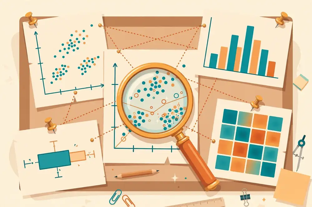
EDA is guided by curiosity, not by a hypothesis. Formal statistics asks "is this effect real?" EDA asks "what is going on here?" The two complement each other: EDA generates ideas efficiently, and formal tests then check whether those ideas hold up. A famous warning applies: patterns found during exploration are suggestions, not conclusions — if you discover a pattern by exploring and then "test" it on the same data, the test is circular. Note interesting findings during EDA, then confirm them on fresh data or with proper tests (Chapter 7).
Start by examining each variable alone.
For numeric variables, compute the "five-number summary" plus friends: minimum, first quartile (25th percentile), median (50th percentile), third quartile (75th percentile), maximum — plus the mean and standard deviation. Then plot: - Histogram: bars showing how values distribute. Reveals the shape — bell-shaped (normal), skewed (tail to one side), or bimodal (two humps, often meaning two hidden groups). - Box plot: a compact picture of median, quartiles, and outliers. Excellent for comparing distributions across groups side by side.
For categorical variables, make a frequency table (counts and percentages per category) and plot a bar chart. Watch for: categories with tiny counts (may need merging), and surprising imbalances (e.g., 90% of survey respondents are from one city — a sampling red flag from Chapter 4).
This is where EDA gets exciting — relationships are the raw material of insight.
| Variable types | What to compute | What to plot | What you are looking for |
|---|---|---|---|
| Numeric vs. numeric | Correlation coefficient | Scatter plot | Direction (up/down), strength, shape (linear/curved), outliers |
| Categorical vs. numeric | Group means/medians | Grouped box plots or bar chart of means | Differences between groups |
| Categorical vs. categorical | Cross-tabulation (counts per combination) | Grouped/stacked bar chart | Associations between categories |
Reading a scatter plot is a core analyst skill. Ask four questions: (1) Direction — as X rises, does Y tend to rise (positive) or fall (negative)? (2) Strength — are points tightly clustered or a formless cloud? (3) Shape — straight line, curve, or something stranger? (4) Outliers — points far from the rest that may be errors or discoveries.
Real life has more than two variables. Techniques: - Correlation matrix / heatmap: a table of every pair's correlation, color-coded. Instantly shows which variables move together. (Remember: correlation is not causation — Chapter 7.) - Colored/scatter with groups: color scatter-plot points by a third variable (e.g., points colored by city) to see if a relationship differs across groups. - Small multiples: the same chart repeated once per group (e.g., one histogram per department) — one of the most powerful and underused techniques.
You have a cleaned dataset: 500 students, columns = study_hours_per_week, attendance_pct, past_gpa, family_income, final_exam_score.
Step 1 — Univariate pass. Summary stats show: final_exam_score mean = 68, median = 70, min = 12, max = 98. The histogram is roughly bell-shaped with a small bump near 35 — worth noting. study_hours has a right skew (most students study 2–6 hours; a few report 25+). attendance_pct has impossible-looking values at exactly 0 for 8 students — you check and find these are students who withdrew; you flag them rather than silently including them.
Step 2 — Bivariate pass. Scatter plot of study_hours vs. final_exam_score: a clear upward trend, but with wide spread — studying more helps, but does not guarantee a high score. Grouped box plots of final_exam_score by attendance bands (low/medium/high): medians rise steeply with attendance. Cross-tab of past_gpa category vs. pass/fail: students with past GPA below 2.0 fail at 5× the rate.
Step 3 — Multivariate pass. Correlation heatmap: attendance correlates with score (r = 0.62), study hours with score (r = 0.45), and attendance with study hours (r = 0.38) — the last one matters, because it means the "effect" of study hours partly overlaps with attendance. Coloring the scatter plot by past_gpa band reveals the study-hours trend is steepest for mid-GPA students.
Step 4 — Write EDA notes (one page): key distributions, the three strongest relationships, data problems found, and questions for formal analysis: "Does attendance predict scores after accounting for past GPA? Is the low-score bump a distinct group?" These questions go to Chapter 7's methods.
When you first receive analysis-ready data, run this routine before any formal analysis:
Thirty disciplined minutes prevents thirty hours of modeling the wrong thing. Experienced analysts do this reflexively; beginners should do it as a written checklist until it becomes habit.
| Misreading | Example | Correction |
|---|---|---|
| Mistaking a truncated axis for a huge effect | Bar chart of satisfaction 4.1 vs 4.3 looks doubled | Check the axis starts at zero (Ch 8) |
| Reading causation into a scatter plot | "Ice cream causes drowning" | Correlation only; think of third variables (Ch 7) |
| Ignoring the sample size behind a point | A 100% success rate from 2 cases | Ask "n = ?" for every subgroup |
| Treating a bimodal histogram as one group | Averaging two humps into a meaningless middle | Split the groups and analyze separately |
| Over-interpreting wiggles in small data | "Sales dip every third Tuesday!" (n = 4 Tuesdays) | Small samples produce illusions; look for replication |
The defense against all five is the same: slow down, check the axes and the n, and ask "what else could explain this?" before believing your eyes.
1. Transforms for skewed data. Income, prices, and waiting times skew right (a few huge values). Averages and plots get dominated by the tail. The fix analysts reach for first: the log transform — plot log(income) instead of income. The skew compresses, patterns emerge, and comparisons become fair. Rule: if your histogram has a long right tail and your analysis keeps tripping on outliers, try the log scale before deleting anything. (Report results in original units — "the median is Rs 45,000" — and mention the transform in methods.)
2. Standardization for fair comparison. Comparing exam scores across departments with different grading scales? Convert to z-scores: z = (x − mean) / SD. A z-score of +1.5 means "1.5 standard deviations above this department's mean" — comparable across any scale. Similarly, index numbers (set a baseline = 100) let you compare growth: "enrollment indexed to 2020 = 100" shows each department's trajectory on one chart regardless of size. These small normalizations are the difference between a misleading comparison and an honest one — and they take one line of code.
Putting it together — mini example: comparing graduate salaries across 6 programs, raw averages crown the tiny elite program (n = 12, one outlier earns millions). Log-transformed box plots + medians tell the true story: three programs cluster together, and the "winner" was an outlier artifact. EDA earns its keep in moments like this.
Not all variables are numeric or categorical — two special types deserve their EDA routines:
Dates and times. Never treat dates as labels. Extract their components — year, month, weekday, hour — and plot against them: sales by month reveals seasonality; website traffic by hour reveals usage rhythms; events over years reveal trends. Always plot time series as lines in chronological order (Chapter 8) and look for trend (long-term direction), seasonality (repeating cycles), and breaks (sudden level shifts — a policy change, a system migration). A break you cannot explain is a data-quality suspect until proven otherwise.
Text. For open-ended responses or short documents, start simple: word/phrase frequency tables and bar charts of the top 20 terms (after removing filler words like "the"). A sudden spike in the word "refund" in support tickets is a finding. For deeper work, group responses into themes manually (thematic coding — read 100 responses, define 6–8 themes, tag each response) before any counting. Beginners often skip text EDA because it feels unscientific; in reality, the themes you discover here become the categories your formal analysis uses.
For your research: EDA is where research ideas are born, and reviewers can tell whether you did it. A Results section that jumps straight to p-values with no descriptive tables or plots looks suspicious — it suggests the analyst never looked at the data. Make EDA visible in your paper: a table of descriptive statistics and two or three well-chosen plots in the Results section show the reader (and reviewer) that your formal tests rest on understood data. Many published papers' most-cited figure is a simple, honest EDA plot.
Key takeaways: - EDA is structured curiosity: summarize and plot before formal testing, to discover patterns and catch problems. - Work outward: univariate (one variable) → bivariate (relationships) → multivariate (many variables together). - Master the core plots: histogram, box plot, bar chart, scatter plot, correlation heatmap, small multiples. - Treat EDA findings as suggestions to be confirmed, not conclusions — testing a discovered pattern on the same data is circular. - Document EDA in your paper's Results: descriptives and plots first, formal tests second.
Statistics is the grammar of analytics — the set of rules that lets you say precise, honest things about data. You do not need advanced mathematics, but you do need the core ideas in this chapter: they are what separate "the average is 70" from a trustworthy, publishable finding. Every concept here is explained in plain language first, with the formula second and an example third.
Measures of center tell you the "typical" value: - Mean (average): sum of values ÷ count. Formula: x̄ = Σx / n. Sensitive to outliers — one billionaire in a room makes the "average" wealth enormous. - Median: the middle value when sorted. Resistant to outliers — the billionaire barely moves it. - Mode: the most frequent value. The only center that works for nominal data (e.g., the most common city).
Rule of thumb: report the median (with quartiles) when data is skewed or has outliers — incomes, house prices, waiting times. Report the mean (with standard deviation) when data is roughly symmetric.
Measures of spread tell you how much values vary — and variation is often the real story: - Range: max − min. Simple but driven by extremes. - Interquartile range (IQR): Q3 − Q1 — the spread of the middle 50%. Robust and underused. - Variance: average squared distance from the mean: s² = Σ(x − x̄)² / (n − 1). - Standard deviation (SD): square root of variance, s — in the same units as the data, so it is the spread measure you will quote most. Roughly: ±1 SD covers ~68% of bell-shaped data, ±2 SD covers ~95%.
Worked example. Five delivery times (minutes): 20, 22, 25, 23, 60. Mean = 30, median = 23, SD ≈ 16.7. The mean (30) describes no actual delivery well — the 60 is an outlier (a breakdown). Reporting "median 23 minutes (IQR 22–25), with one 60-minute outlier due to vehicle breakdown" is honest; reporting "average 30 minutes" alone is misleading.
Probability is the language of uncertainty: a number from 0 (impossible) to 1 (certain). Two rules carry you far: probabilities of all possible outcomes sum to 1, and the probability of independent events both happening is their product.
The normal (bell-shaped) distribution is statistics' most famous shape: symmetric, with most values near the mean. Many natural measurements (heights, exam scores, measurement errors) are approximately normal. Its importance: many statistical methods assume approximate normality, and the Central Limit Theorem guarantees that averages of even non-normal data become approximately normal as samples grow — which is why we can trust confidence intervals and tests on means.
Other shapes to recognize: skewed (tail to one side — incomes skew right), uniform (all values equally likely), and bimodal (two humps — often two hidden groups, as Chapter 6 noted).
Measure 50 students' heights, compute the mean; measure a different 50, get a slightly different mean. That wobble is sampling variation, and its size is measured by the standard error (SE): SE = s / √n. Bigger samples → smaller SE → steadier estimates. This single formula explains why large studies are more trustworthy and why you should distrust dramatic claims from tiny samples.
From SE comes the confidence interval (CI) — a range that likely contains the true value: 95% CI ≈ x̄ ± 2×SE. Example: "Mean satisfaction is 3.8, 95% CI [3.6, 4.0]" means: if we repeated this survey many times, about 95% of such intervals would capture the true mean. A CI is far more informative than a single number because it shows precision.
Hypothesis testing answers: could this pattern just be luck? The logic, step by step:
What a p-value is NOT: it is not the probability that H₀ is true, not the probability your result is wrong, and not a measure of importance. A tiny p-value with a trivial effect ("Method B scores 0.2 points higher, p = 0.001, n = 50,000") is statistically significant but practically meaningless. Always report the effect size (how big is the difference?) alongside the p-value.
Common tests (choose by data type — this connects to Chapter 4's measurement scales):
| Situation | Test | Example |
|---|---|---|
| Compare two group means | t-test | Scores of class A vs. class B |
| Compare 3+ group means | ANOVA | Scores across four departments |
| Categorical association | Chi-square test | Gender vs. preference (yes/no) |
| Relationship, two numeric | Correlation test / regression | Study hours vs. exam score |
Two errors to know: Type I (false alarm — claiming an effect that is not real; controlled by the 0.05 level) and Type II (miss — failing to detect a real effect; reduced by larger samples).
The correlation coefficient (r) measures linear association from −1 to +1: +1 is a perfect uphill line, −1 a perfect downhill line, 0 no linear relationship. Rough guide: |r| < 0.3 weak, 0.3–0.7 moderate, > 0.7 strong.
But correlation does not imply causation, for three classic reasons: 1. Reverse causation: ice-cream sales correlate with drowning — not because ice cream causes drowning, but because summer causes both. 2. Common cause: the example above — a third variable drives both. 3. Coincidence: with enough variables, some will correlate by pure chance (this is why Chapter 3 warned against data dredging).
To claim causation you need more: a plausible mechanism, the cause preceding the effect, and ideally an experiment with random assignment (Chapter 4) that rules out alternatives.
Simple linear regression fits the best line through a scatter plot: ŷ = a + bx, where b (the slope) says "each extra unit of X is associated with b extra units of Y." Example: exam_score = 45 + 3.2 × study_hours → each extra study hour is associated with 3.2 extra marks. R² (0 to 1) says what fraction of Y's variation the line explains — R² = 0.36 means study hours explain 36% of score variation (the rest is everything else).
Multiple regression adds more predictors (attendance, past GPA…), letting each variable's effect be estimated holding the others constant — which is how you answer Chapter 6's question "does attendance predict scores after accounting for past GPA?"
Claim: "Students who attend >80% of classes score higher than those who attend less."
That final sentence — the honest limitation — is what makes statistics trustworthy rather than merely impressive.
Students freeze at this question. Walk down this list:
Assumption check (2 minutes, saves embarrassment): t-tests and ANOVA assume roughly bell-shaped data within groups and similar spread across groups — eyeball this with histograms/box plots from Chapter 6. With large samples (n > 30 per group), these tests are forgiving; with small skewed samples, prefer non-parametric alternatives (Mann-Whitney instead of t-test, Kruskal-Wallis instead of ANOVA) — any statistics software offers them.
Software gives you a table like this for predicting exam_score from study_hours and attendance_pct (n = 500):
| Predictor | Coefficient (b) | p-value | 95% CI |
|---|---|---|---|
| Intercept | 28.5 | <0.001 | [24.1, 32.9] |
| study_hours | 2.1 | <0.001 | [1.6, 2.6] |
| attendance_pct | 0.35 | 0.002 | [0.13, 0.57] |
R² = 0.58.
How to read it, line by line: each extra study hour is associated with +2.1 marks (holding attendance constant); each extra attendance percentage point with +0.35 marks. Both p-values are small — unlikely to be chance. The CIs show precision: the study-hours effect is plausibly 1.6–2.6, not exactly 2.1. R² = 0.58: the two predictors explain 58% of score variation — strong for social data, leaving 42% to everything else (ability, exam difficulty, luck).
How to write it in a paper: "Study hours (b = 2.1, 95% CI [1.6, 2.6], p < 0.001) and attendance (b = 0.35, 95% CI [0.13, 0.57], p = 0.002) were each independently associated with higher exam scores; together they explained 58% of the variation (R² = 0.58)." Note the language: associated with, not caused — this is observational data (Chapter 11).
In the 2010s, science faced an embarrassment: famous findings in psychology, medicine, and economics failed to replicate — repeated experiments did not reproduce the original results. Investigations found a culprit every analyst must understand: p-hacking (also called data dredging) — trying many analyses and reporting only the one with p < 0.05.
How p-hacking happens innocently: you test 20 subgroup comparisons; one comes out "significant" by pure chance (with a 5% false-alarm rate, 20 tests almost guarantee one false hit); you report that one as the finding. Or you collect data, peek at results, collect a bit more until p dips below 0.05, then stop. Each step feels reasonable; the result is a mirage.
The multiple-comparisons problem, quantified: run 20 independent tests at the 0.05 level and the chance of at least one false alarm is 1 − 0.95²⁰ ≈ 64%. The classic fix is the Bonferroni correction: divide your threshold by the number of tests (20 tests → require p < 0.0025). It is conservative, but it keeps you honest.
Your defenses (notice how the whole book converges here): preregister your analysis plan (Chapter 11) so you cannot shop for significance; decide tests from the question, not the data (Chapter 3); report all analyses attempted, not just significant ones; prefer confidence intervals and effect sizes over p-value thresholds (this chapter); and replicate on fresh data when it matters. The replication crisis was not a failure of statistics — it was a failure of workflow discipline. Your workflow is your integrity.
For your research: Statistics is where papers are won and lost in peer review. Three reviewer magnets: (1) using the wrong test for your data type — check the table above; (2) reporting p-values without effect sizes or confidence intervals; (3) causal language ("increases," "improves," "leads to") for merely correlational findings — use "is associated with" unless you ran an experiment. Get these three right and your quantitative Results section will survive most reviews.
Key takeaways: - Describe center (mean/median/mode) and spread (SD/IQR) — never a center alone; prefer medians for skewed data. - Standard error shrinks with √n; confidence intervals show precision, not just the estimate. - Hypothesis testing asks "could this be luck?"; p < 0.05 is convention, not magic — always report effect sizes. - Correlation (−1 to +1) is not causation; causal claims need experiments or strong designs. - Regression quantifies relationships (slope) and explanatory power (R²); multiple regression holds other factors constant.
A good chart can make a finding obvious in seconds; a bad one can hide the truth or actively mislead. Visualization is not decoration — it is analysis made visible, and for most audiences it is the only part of your analysis they will actually absorb. This chapter teaches you to choose the right chart, design it honestly, and avoid the traps that make charts lie.
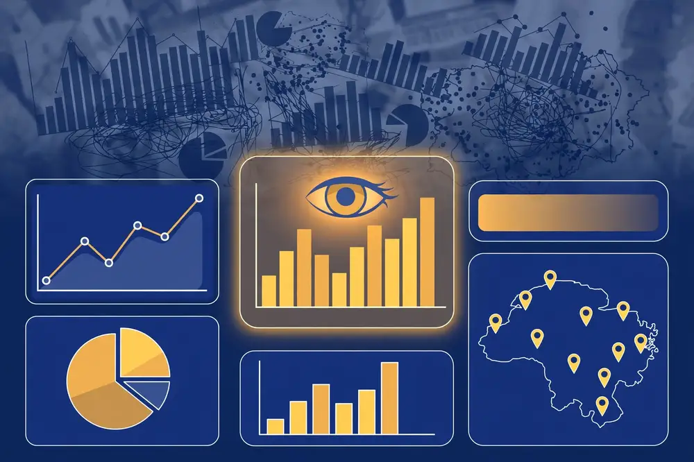
Human vision is extraordinarily fast at certain judgments — spotting differences in position, length, and color — and slow at others, like comparing angles or areas. These fast judgments are called preattentive attributes: your eye finds the one red bar among gray ones before conscious thought. Good visualization puts the important differences into preattentive channels (position, length, color intensity) and keeps decoration out. This is why a simple bar chart beats a 3D exploding pie chart every time: bars use length (fast, accurate); pie slices use angle and area (slow, inaccurate).
| Your question | Use this | Avoid this |
|---|---|---|
| How do categories compare? | Bar chart (horizontal if labels are long) | Pie chart with 8+ slices |
| What is the trend over time? | Line chart | Bar chart for long time series |
| What share does each part hold? | Pie/donut (max 5–6 slices) or stacked bar | 3D pie; slices under ~5% |
| How are values distributed? | Histogram or box plot | Pie chart (never for distributions) |
| Is X related to Y? | Scatter plot | Line chart connecting unrelated points |
| Where are things located? | Map (choropleth/bubbles) | Maps for non-geographic data |
| How does a whole break into parts over time? | Stacked area/bar | Too many stacked layers (unreadable) |
| Exact values matter most | Table | A chart when readers need the numbers |
Two special mentions: the bar chart is the workhorse of analytics — when in doubt, use it. The line chart implies continuity, so only use it when the x-axis is genuinely ordered and continuous (time, dosage) — never for categories like cities.
As an analyst, you must neither create these nor be fooled by them. When a chart in a report or paper looks dramatic, check the axis first.
A dashboard is a single-screen summary for monitoring — think a car dashboard: a few key indicators, current status, alerts. Design rules: put the 3–5 most important KPIs (key performance indicators) at top-left (where eyes land first), keep every element visible without scrolling, use consistent scales and colors across charts, and include the date of the data ("Data as of 7 Oct 2026") — a dashboard without a timestamp is a rumor. Dashboards answer "how are we doing?"; detailed reports answer "why?" — do not cram one into the other.
Before: A 3D exploding pie chart titled "Sales" with 9 slices, rainbow colors, percentages in tiny font, no time period stated.
Diagnosis: Too many slices (angles unreadable), 3D distorts sizes, exploding slice manipulates emphasis, rainbow colors carry no meaning, no message, no timeframe.
After: A horizontal bar chart titled "Beverages drove 42% of canteen sales, Jan–Jun 2026," bars sorted descending, the top bar in teal and the rest in gray, values labeled at bar ends, axis starting at zero, source noted below.
Same data, ten seconds to understand instead of a minute of squinting. That is the entire job of visualization.
Color is the most misused visual channel. These rules keep it working for you:
Imagine a one-screen weekly dashboard for our canteen manager. Top strip: 4 KPI cards — this week's customers, vs. last week (↑/↓ with %), food waste %, stock-out incidents. Each card: big number, small comparison, tiny trend sparkline. Below-left (the prime position): bar chart of daily customers this week vs. last week — the operational heart. Below-right: line chart of waste % over 12 weeks — the trend that matters. Bottom strip: table of the 5 items closest to stock-out, with a red accent only on items below safety stock. Footer: "Data as of Sunday 11 PM · Register + stock system."
Why this works: 5-second scan gives the verdict (KPIs), 30-second scan gives the story (charts), details wait below (table). Nothing scrolls, nothing blinks, every element earns its pixels. Build your first dashboard on paper before touching software — if the paper sketch is cluttered, the software version will be worse.
Two final responsibilities: accessibility — sufficient contrast, no color-only encoding, readable font sizes, alt-text describing each chart's message for screen readers; and ethics — a chart that misleads (Chapter 8's hall of shame) is not a design flaw but a professional failure. When your visualization influences budgets, staffing, or policy, honesty in design is honesty in practice.
Professionals do not open chart software first — they storyboard: sketch each visual as a thumbnail on paper, in presentation order, with its message title. For our canteen briefing, the storyboard is 4 thumbnails:
Why storyboard: it forces the one-message-per-visual discipline (Chapter 10) before you invest hours in software; it reveals ordering problems ("this chart needs context from a chart I haven't shown yet"); and it makes feedback cheap — redrawing a thumbnail takes seconds, rebuilding a dashboard takes hours. Rule: no visual gets built until its thumbnail has a message title. If you cannot write the title, you do not understand the finding yet — go back to analysis.
Charts get the glory, but tables carry exact values — and most analyst tables are terrible: heavy gridlines, centered numbers (unreadable), and no hierarchy. Stephen Few's table rules, condensed:
When to choose a table over a chart: when readers need exact values (financial figures, rankings with close scores), when there are many categories with long labels, or as the appendix companion to every chart ("see Table A-2 for exact values"). The mark of a mature analyst is knowing that sometimes the best visualization is a well-designed table.
For your research: Figures are the most-read part of any paper — many readers look at the figures before deciding whether to read the text. Journals have strict figure rules (fonts, resolution, color), so check your target journal's author guidelines early. Every figure needs: a numbered caption that states the finding (not just the topic), labeled axes with units, and a note on sample size. A paper with three honest, well-designed figures communicates more than one with ten cluttered ones.
Key takeaways: - Visualization exploits fast visual judgments (position, length, color) — put key differences there, remove decoration (data-ink ratio). - Match chart to question using the chart chooser; the bar chart is the default workhorse. - Bar charts start at zero; label directly; sort meaningfully; one chart, one message with a message title. - Learn the hall of shame (truncated axes, 3D, cherry-picked ranges) so you neither create nor trust misleading charts. - Dashboards monitor a few KPIs on one screen, always with a data timestamp.
You now know the concepts; this chapter is about the instruments. Four tools cover roughly 95% of real analytics work: Excel (spreadsheets), SQL (databases), Python (programming), and BI platforms (dashboards). Each has a natural habitat. The goal is not to master all four today — it is to reach a working level in the right one for your current task and to know when to switch.
| Excel / Sheets | SQL | Python (pandas) | BI (Power BI / Tableau) | |
|---|---|---|---|---|
| Best for | Quick analysis, small data (<1M rows), sharing | Pulling/filtering data from databases | Cleaning, analysis, automation, large data | Interactive dashboards & reports |
| Learning curve | Gentle | Moderate | Steeper | Moderate |
| Reproducibility | Low (manual steps) | High (saved queries) | Very high (scripts) | Medium |
| Cost | Often already available | Free with database | Free & open source | Free tiers exist |
| Weakness | Breaks on big/messy data; error-prone | Not for statistics or plotting | Needs coding comfort | Less flexible for custom analysis |
How to choose: data lives in a database → SQL first. Quick one-off table under ~100k rows → Excel. Repeating the same analysis monthly → Python (automate it). Boss wants a live dashboard → BI platform. Research paper with statistics → Python (or R/SPSS).
Almost every analyst starts here, and Excel remains genuinely powerful:
SUM(), AVERAGE(), MEDIAN(), STDEV(), COUNTIF() / SUMIF() (conditional counting — the backbone of quick summaries), VLOOKUP()/XLOOKUP() (merging tables), IF() (logic), TRIM() and PROPER() (cleaning text).Example: To answer "average sales by city and month" from 20,000 rows: Insert → PivotTable → rows: Month, columns: City, values: Average of Sales. Done in under a minute, no code.
When data lives in a database (and serious data usually does), SQL (Structured Query Language) is how you retrieve it. Five clauses do most of the work:
SELECT city, AVG(sales) AS avg_sales, COUNT(*) AS n_orders
FROM orders
WHERE order_date >= '2026-01-01'
GROUP BY city
HAVING COUNT(*) > 100
ORDER BY avg_sales DESC;
Reading it top to bottom: pick the orders table; keep this year's rows (WHERE); group by city (GROUP BY); compute average sales and order counts per city (SELECT with aggregates); drop cities with ≤100 orders (HAVING); sort best first (ORDER BY). Add JOIN to combine tables (e.g., orders + customers on customer_id) and you can answer most business questions ever asked.
Why analysts love SQL: the database does the heavy lifting on millions of rows, and a saved query re-runs identically forever — reproducibility that Excel copy-paste cannot match.
Python with the pandas library is the standard for serious, repeatable analysis. A script documents every step (your Chapter 5 cleaning log writes itself), handles millions of rows, and does statistics, machine learning, and publication-quality plots in one place.
import pandas as pd

df = pd.read_csv("sales.csv")              # load
df["city"] = df["city"].str.lower().str.strip()   # clean text
df = df.drop_duplicates()                  # deduplicate
print(df.isnull().sum())                   # missing-value report
print(df.groupby("city")["sales"].agg(["mean", "median", "count"]))
df.plot(kind="bar", x="month", y="sales")   # quick chart
Ten lines that load, clean, summarize, and plot — and re-run exactly the same way next month. Key companions: NumPy (fast numerics), Matplotlib/Seaborn (plots), scikit-learn (machine learning), Jupyter notebooks (mix code, output, and notes — ideal for learning and for sharing with supervisors).
Getting started path (2–4 weeks): install Python (via Anaconda or python.org) → learn basic syntax (variables, lists, loops) → learn pandas (read CSV, select columns, filter rows, groupby) → reproduce one Excel analysis in pandas. That last step — redoing something you already understand — is the fastest way to learn.
BI (Business Intelligence) platforms turn data into interactive dashboards that refresh automatically: click a city and every chart filters; drill from year → quarter → month. Microsoft Power BI (strong free desktop version, natural if you know Excel) and Tableau (pioneering visual design, free Public version) dominate. Both connect to Excel, SQL databases, and cloud sources; both use drag-and-drop plus a formula language (DAX in Power BI) for custom measures.
When BI wins: recurring reporting to non-technical audiences — a dean's enrollment dashboard, a hospital's weekly KPI screen. When it loses: one-off deep analysis (use Python), or data that needs heavy cleaning first (clean in Python/SQL, then visualize in BI).
Question: "Which product category had the highest average order value in 2026?"
SELECT category, AVG(order_value) FROM orders WHERE YEAR(order_date)=2026 GROUP BY category ORDER BY 2 DESC; (1 minute, works on 100M rows)df[df.year==2026].groupby("category")["order_value"].mean().sort_values(ascending=False) (1 minute, and the script is saved for next quarter)Same answer, three instruments. Professionals pick by context: one-off → Excel; huge data → SQL; repeated → Python; shared dashboard → BI.
Chapter 5 introduced joins conceptually; here is the hands-on version, because joins are the single most-used SQL skill. Tables: customers(customer_id, name, city) and orders(order_id, customer_id, amount).
-- Total spending per customer, including customers who never ordered:
SELECT c.name, c.city, COALESCE(SUM(o.amount), 0) AS total_spent
FROM customers c
LEFT JOIN orders o ON c.customer_id = o.customer_id
GROUP BY c.name, c.city
ORDER BY total_spent DESC;
Reading it: start from all customers (FROM customers c — c is just a nickname); attach each customer's orders (LEFT JOIN ... ON matching IDs); the LEFT keeps customers with no orders (their sums are NULL, converted to 0 by COALESCE); then total per customer and sort. Change LEFT to INNER and customers without orders silently vanish — fine for "average order value," wrong for "which customers never buy."
Mental model: draw two overlapping circles (a Venn diagram). INNER = only the overlap. LEFT = whole left circle. FULL OUTER = both circles entirely. When a join surprises you, 90% of the time the cause is duplicate keys (Chapter 5) — check key uniqueness first.
| Week | Focus | Daily 30 min | Milestone |
|---|---|---|---|
| 1 | Excel | PivotTables on a practice dataset; SUMIF/COUNTIF/XLOOKUP drills | Answer 5 business questions from one spreadsheet |
| 2 | SQL | SELECT/WHERE/GROUP BY/ORDER BY on an online practice database | Write the "avg order value by category" query unaided |
| 3 | SQL joins + Python setup | JOIN exercises; install Python, run first pandas script | Merge two tables; load a CSV in pandas |
| 4 | pandas EDA | Reproduce your Week 1 Excel analysis in pandas | Same answers, in a re-runnable script |
Where to practice free: Excel/Sheets with any CSV; SQL on SQLite (built into Python) or free browser-based SQL trainers; Python via Anaconda or Google Colab (no installation). The golden rule: always practice on a question you already answered in another tool — familiarity with the answer lets you focus on the tool.
Three warning signs you have outgrown spreadsheets for a task: (1) you repeat the same 20 clicks monthly — automate it; (2) the file exceeds ~500k rows or crashes — move to SQL/Python; (3) someone asks "how did you get this number?" and you cannot retrace your steps — you need scripts. Graduating is not abandoning Excel — it is using each tool where it wins.
For academic work, three ecosystems dominate. None is "best" — each fits different researchers:
| Python (pandas) | R | SPSS | |
|---|---|---|---|
| Cost | Free | Free | Expensive licenses (often via university) |
| Learning curve | Moderate (general programming) | Moderate (statistics-first language) | Gentle (point-and-click menus) |
| Statistics depth | Good (statsmodels, scikit-learn) | Excellent (built for statistics) | Good (classic tests, limited modern ML) |
| Reproducibility | Excellent (scripts) | Excellent (scripts) | Weak via menus; okay via syntax |
| Community/examples | Huge, industry + academia | Huge, academia especially | Smaller, mostly textbooks |
| Best for | General analytics + ML + automation | Statistical research, publication plots | Beginners, taught courses, quick classic tests |
Practical advice: if your department teaches SPSS, start there for your first project — finishing matters more than tooling purity — but save the syntax (SPSS can log menu actions as syntax) for reproducibility. If you aim at data-science-flavored research or industry collaboration, invest in Python. If your field's literature is R-based (common in biostatistics, ecology, social sciences), R lets you reuse published code directly. The transferable skill is not the tool — it is the workflow (Chapters 3–8). Analysts switch tools across their careers; the thinking stays.
Your analysis will evolve: v1, v1-final, v1-final-REALLY-final. Git (usually via GitHub) ends this chaos. For analysts, Git provides three superpowers:
Minimum viable Git for analysts: learn five commands — clone, add, commit -m "message", push, pull — and commit at the end of each work session with a real message (not "update"). Keep data files out of Git if they are large or sensitive (use Git LFS or institutional storage; never commit identifiable human-subject data to a public repository). One afternoon learning Git pays back across your entire research career — and a GitHub link in your paper is a reproducibility signal reviewers love (Chapter 11).
For your research: Tool choice affects credibility. Reviewers increasingly expect reproducible analysis — code and data shared so others can verify your results. Excel-only analysis is hard to reproduce (which cells did you change?). A Python script or SQL query in a public repository (e.g., GitHub) with your dataset lets anyone re-run your work — a strong signal of rigor. Even if your analysis is simple, publishing the script costs little and earns real trust. (See Chapter 11 on reproducibility.)
Key takeaways: - Four tools, four habitats: Excel (quick/small), SQL (databases), Python/pandas (repeatable/deep), BI (dashboards). - Learn PivotTables in Excel, the five SQL clauses (SELECT/WHERE/GROUP BY/HAVING/ORDER BY), and pandas basics — these cover most real tasks. - Automate repeated analyses with scripts (Python/SQL), not manual spreadsheet steps. - For research, prefer scripted tools — reproducibility is a credibility multiplier.
The best analysis in the world is worthless if nobody understands it — or worse, if it is misunderstood. Communication is not an afterthought to analytics; it is the final phase of the workflow (CRISP-DM's deployment), and many analysts say it is the hardest skill to learn. This chapter teaches you to turn findings into stories, reports, and presentations that drive decisions.
Before writing a single slide, answer three questions: Who decides? (a dean, a manager, a funder — not "everyone"), what decision will they make with this? (approve a budget, change a policy, fund a project), and how much time do you have? (a 3-minute briefing needs a different shape than a 20-page report). Every choice below flows from these answers.
The cardinal sin is the curse of knowledge: forgetting what it is like not to know your methods. Your audience does not care about your p-values, your cleaning struggles, or your clever SQL — they care what it means and what to do. Put methods in an appendix, not the opening.
Analyst Cole Nussbaumer Knaflic's framework (Storytelling with Data, 2015) is the industry standard. A data story has the same arc as any story:
Notice the order: context first, then the problem, then one clear recommendation. Details and methods come after — or in an appendix. A useful test: can a busy person grasp your message from the title and first visual alone? If not, restructure.
BLUF — Bottom Line Up Front. Busy decision-makers read the first paragraph and skim the rest. So the first paragraph must contain the entire message: the finding, its implication, and the recommended action — in 4–6 sentences. Everything after that is supporting evidence for those who want it. Write the summary last (after you know the answer) but place it first.
Template: "We analyzed [data] to answer [question]. We found [key finding with numbers]. This means [implication]. We recommend [action], which we estimate will [expected benefit]. Details and methods follow."
Written report structure: 1. Executive summary (BLUF — one page max) 2. Background and question (why this analysis exists) 3. Key findings (each finding = one clear visual + 2–3 sentences; lead with the most important) 4. Recommendation(s) with expected impact and risks 5. Methodology and data (short — full detail in appendix) 6. Appendix: cleaning log, detailed tables, technical notes
Presentation structure (10–15 slides max): - Slide 1: title with the message, not the topic ("Scholarships will recover enrollment in two cities" beats "Enrollment analysis") - Slides 2–3: context and question - Slides 4–8: findings — one message per slide, one clear visual per slide (Chapter 8) - Slide 9: recommendation with costs and expected impact - Slide 10: risks, limitations, next steps - Appendix slides: methods for the one person who asks
Slide discipline: no slide should need you to explain what it shows. If you find yourself saying "as you can see here…" while pointing frantically, the slide failed — redesign it.
You analyzed canteen sales (Chapters 3–6). The manager gives you 5 minutes.
Your one-pager: - Headline: "Extending Friday hours to 10 PM would add ~Rs 38,000/month profit." - Three bullets: (1) Friday 7–10 PM averages 340 customers vs. 90 on other weeknights (bar chart). (2) The Friday crowd is 80% computer-science students after their late lab (survey, n = 120). (3) Extra staffing + stock costs ~Rs 22,000/month against ~Rs 60,000 extra sales. - Recommendation: trial for one month, review sales vs. forecast. - Footnote: data Jan–Jun 2026, register + survey; festival weeks excluded.
Five minutes, one decision, everything the manager needs — and nothing they do not.
Your main report stays short because the appendix carries the weight. A good appendix contains: (1) data sources — what, from where, what time period, how obtained; (2) cleaning log — every fix from Chapter 5, summarized; (3) methods — which tests/models, why chosen, assumption checks; (4) detailed tables — full numbers behind the charts; (5) limitations — what the analysis cannot show. Number appendix pages (A-1, A-2…) and reference them from the main text ("see Appendix A-3 for the full regression table"). One person in twenty will read it — usually the expert whose approval you need most.
Not every audience wants your finding to be true. Tactics that work:
More analyses die in inboxes than in boardrooms. Structure every results email the same way:
Subject: [Decision needed] Friday hours extension — trial recommended
TL;DR (3 lines): Friday 7–10 PM draws 340 customers vs. 90 other weeknights. Extending hours costs ~Rs 22k/month, adds ~Rs 60k sales. Recommend a 1-month trial.
Chart: (one image, message title) Details: 3–4 bullets max. Appendix attached for methods. Next step: approve trial by Friday?
The pattern is always: decision in the subject, bottom line first, one visual, details on demand, explicit next step. Write every results email this way for a month and watch your analyses actually get used.
Storytelling is powerful — which is exactly why it needs guardrails. Three traps catch even well-meaning analysts:
1. Cherry-picking the timeframe. Sales "grew 30% this quarter!" — because last quarter included a shutdown. The honest version shows the full series and marks the anomaly. Defense: default to showing the longest relevant timeframe; any zoom-in must be labeled as such.
2. The Texas sharpshooter. A Texan fires randomly at a barn, then paints a target around the tightest cluster and claims marksmanship. The analytics version: slicing data dozens of ways, then presenting the one dramatic segment as "the finding" (this is p-hacking's storytelling cousin — Chapter 7). Defense: preregistered questions first (Chapter 11); report how many cuts you tried.
3. Survivorship in success stories. "Our training program graduates earn 40% more!" — ignoring that struggling trainees dropped out before graduating. Defense: analyze all starters (intention-to-treat), not just finishers; say who is excluded, on every chart.
The one-sentence ethic: show the analysis you would want to see if the finding went against you. If your story survives that test, tell it boldly — persuasion in service of a verified finding is not manipulation, it is communication done right.
Every number you report has uncertainty — hiding it is the most common sin in analytics communication. Make uncertainty visible:
The paradox: analysts fear that showing uncertainty weakens their message. The opposite is true — decision-makers deal with uncertainty daily, and the analyst who quantifies it becomes the trusted advisor, while the analyst who hides it becomes the person whose "certain" predictions kept being wrong. Confidence gets attention; calibrated honesty keeps it.
The same analysis needs different packaging for different rooms:
| Element | Non-technical stakeholders | Technical peers / reviewers |
|---|---|---|
| Lead with | Recommendation and business impact | Question, method, and validation |
| Visuals | One message per chart; minimal jargon | Full detail; axes, n, CIs labeled |
| Numbers | Rounded; translated ("about 1 in 5") | Exact; with uncertainty intervals |
| Methods | One sentence ("we compared two groups over 6 months") | Full specification (test, assumptions, software) |
| Limitations | Plain language ("this doesn't cover festival weeks") | Formal (validity threats, generalizability bounds) |
| Length | One page / 10 minutes | Full report + appendix |
Build both from one source. Write the technical version first (it forces rigor), then derive the stakeholder version by translating — never the reverse. The most common failure mode is presenting the technical version to executives (eyes glaze over) or the simplified version to reviewers (torn apart). Ask before any presentation: "who is in the room, and what decision do they own?" — Chapter 10's golden rule, applied twice.
For your research: Academic communication has its own strict form — the journal paper (IMRaD: Introduction, Methods, Results, and Discussion; see Chapter 11) and the conference presentation. The same principles apply: know your audience (reviewers check rigor; conference audiences want the idea), lead with the contribution, one message per figure, methods detailed enough to reproduce. And the same honesty rules: report limitations plainly. Reviewers punish hidden weaknesses far more than admitted ones.
Key takeaways: - Know your audience, their decision, and your time budget before communicating anything. - Use the story arc (context → tension → recommendation) and BLUF (bottom line up front) for busy decision-makers. - One message per slide/visual; message titles, not topic titles; methods in the appendix. - Pair every problem with options; validate findings three ways; "I don't know, here's what we'd need" beats bluffing. - In research writing, the same rules hold: lead with the contribution, make figures self-explanatory, admit limitations.
Everything so far applies to business analytics. This chapter turns the lens on your world: using analytics inside academic research that leads to a thesis or a published paper. The workflow is the same (Chapter 3); the standards are higher, because your claims will be checked by reviewers whose job is to doubt you.
A business asks "what should we do?" A researcher asks "what is true?" — and must phrase it so the answer can be tested. Good research questions are:
Variables: the dependent variable is what you explain (exam score); independent variables are candidate explanations (attendance, study hours). Control variables (past GPA, program) are alternative explanations you account for so they do not contaminate your conclusion — this is the "holding constant" idea from multiple regression (Chapter 7).
| Design | What you do | Strength | Limitation |
|---|---|---|---|
| Descriptive | Measure and summarize a phenomenon | Maps new territory; simple | No causal claims |
| Correlational | Measure variables, test associations | Shows relationships in real settings | Cannot prove causation |
| Experimental | Manipulate one variable, randomize, compare | Can prove causation | Often artificial; ethical limits |
| Quasi-experimental | Compare groups without randomization (e.g., before/after a policy) | Real-world causal hints | Hidden differences between groups |
| Longitudinal | Measure the same subjects over time | Shows change and order of events | Expensive; participants drop out |
Choose honestly: most student research is descriptive or correlational — and that is fine. Claiming an experimental result from a correlational design is the most common fatal flaw in student papers. Match your language to your design (Chapter 7's "associated with" vs. "causes").
Reviewers interrogate four kinds of validity:
You do not need perfection — you need awareness: name the threats to validity in your Discussion section and explain what you did about each. Reviewers forgive limitations; they do not forgive obliviousness.
A growing movement demands that published findings be reproducible: another researcher with your data and code should get your results. Practical steps:
| Paper section | Analytics workflow phase | What goes in it |
|---|---|---|
| Introduction | Business understanding | Problem, research question, gap in literature, contribution |
| Methods | Data understanding + preparation + modeling | Population, sampling, instruments, cleaning steps, statistical tests — detailed enough to reproduce |
| Results | Modeling outputs | Descriptives and EDA first, then formal tests; tables and figures with captions |
| Discussion | Evaluation | What the results mean, comparison with literature, limitations, validity threats |
| Conclusion | Deployment | Answer to the research question, implications, future work |
Research question: "Is social media usage associated with sleep quality among university students?"
This is a complete, honest, publishable student study — built entirely from this book's chapters.
A literature review is not a book report — it is a gap-hunting expedition. For every paper you read, fill one row:
| Author (Year) | Question | Data & method | Key finding | Limitation / gap |
|---|---|---|---|---|
| Ahmed (2023) | Phone use vs. grades? | n=200, survey, correlation | r = −0.31 | Single university, self-reported hours |
| Khan (2024) | Social media vs. sleep? | n=450, PSQI scale, regression | +1 hr → −0.4 sleep quality | Western sample only |
After 15–20 rows, patterns emerge: everyone studies Western undergraduates (gap: your region), everyone uses self-reports (gap: add objective screen-time logs), nobody controls for academic load (gap: your control variables). Your contribution is the gap column. Write the review as: "what is known → what is missing → what this study adds." Reviewers check whether your gap is real — the table proves you did the work.
Beginners ask for a magic number; the honest answer is "it depends on the effect size and the noise," but these rules of thumb keep you safe:
Formal power analysis (computing exact n from expected effect size) is the gold standard — free tools like G*Power do it, and your supervisor can guide you. Mentioning "a priori power analysis indicated n = 320" in your Methods signals serious rigor to reviewers.
Rejection and "revise and resubmit" are normal — even good papers get them. Handle reviews like data:
A paper that survives review is stronger than the one you submitted. The review process is adversarial collaboration, not judgment.
Journals vs. conferences: journals publish long, fully-reviewed articles (review takes months); conferences publish shorter papers presented in person, common in computer science and engineering. For most student researchers, a peer-reviewed journal is the target. Indexing matters: being listed in Scopus, Web of Science, or IEEE Xplore signals that a venue meets quality standards — universities and employers check this. Ask your supervisor which indexes count at your institution.
Conference vs. journal decision table:
| Factor | Journal | Conference |
|---|---|---|
| Paper length | Long (8–15+ pages) | Short (4–8 pages) |
| Review time | 3–12 months | 2–4 months |
| Feedback depth | Extensive, multiple rounds | Lighter, usually one round |
| Prestige in CS/engineering | High | Often equal to journals |
| Best for | Complete, mature studies | Fast-moving, early results |
Warning: predatory journals. These charge publication fees while providing fake or no peer review — they exist to exploit researchers under "publish or perish" pressure. Red flags: unsolicited flattering emails inviting submission; promises of publication in days; no clear editorial board (or famous names listed without consent); fees revealed only after "acceptance"; names mimicking famous journals ("International Journal of Advanced Computer Sceince"). Checks: verify indexing claims directly on Scopus/Web of Science (not the journal's website); consult your supervisor and your university's approved journal list; be skeptical of any venue you found through spam email. One predatory publication can damage your CV more than no publication — publishing honestly and slowly beats publishing fast and fakely, every time.
For your research: Before collecting a single data point, write a 2-page research proposal covering: question, variables and definitions, design, population and sampling, instruments, analysis plan, ethics, and timeline. Show it to your supervisor. This one document prevents most disasters — wrong design, unmeasurable variables, missing ethics approval — while they are still cheap to fix. Every chapter of this book feeds into it.
Key takeaways: - Turn business questions into specific, measurable, feasible research questions with defined variables (dependent, independent, controls). - Match your design (descriptive/correlational/experimental/…) to your claims — never use causal language for correlational findings. - Defend four validities (construct, internal, external, statistical) and name threats honestly in your Discussion. - Ethics (consent, anonymity, institutional approval) and reproducibility (scripts, shared code/data, preregistration) are now baseline expectations. - Map your workflow to IMRaD: Introduction = question, Methods = data + analysis, Results = findings, Discussion = meaning + limits.
This final chapter puts the whole book to work in a single project, start to finish. Treat it as a template: replace the canteen with your own domain, follow the same steps, and you will have a complete analysis — and the skeleton of a paper or report.
Question: The manager of a campus canteen wants to reduce food waste and stock-outs. "Can we predict next week's daily customer count within 10% error, so we can order stock accurately?" (Chapter 3, Phase 1 — a precise question with a success criterion and a decision attached: the weekly stock order.)
Sources collected: - Register logs: daily customer count and revenue, Jan–Jun 2026 (secondary, existing records). - Academic calendar: exam weeks, holidays, orientation week (secondary). - Weather: daily max temperature and rainfall from the meteorological department's free open data (secondary, open data). - Short customer survey (n = 120, primary): why do you visit on Fridays? (validates the "late lab" hypothesis).
First look (data understanding + light EDA): - 181 days expected, 169 present — 12 missing (register breakdowns in February). - Two days show ~10× normal counts — data entry typos (extra zero). - Customer count is right-skewed (a few very busy days); median 210, mean 238. - Histogram of daily counts is bimodal — one hump around 150 (regular days), one around 330 (Fridays). A hidden group, exactly as Chapter 6 taught: split by day of week.
Cleaning log (written as you go): 1. Fixed 2 typo days (verified against revenue figures — revenue was normal, confirming the count was mistyped). 2. 12 missing days: left as missing (not zero — the canteen was open; sales are unknown). Documented dates. 3. Built one tidy table: one row per day; columns: date, day_of_week, customers, revenue, exam_week (yes/no), holiday (yes/no), temp_max, rainfall. 4. Standardized day names; converted revenue text ("Rs 45,200") to numbers. 5. Created a derived column: friday_late_lab (yes/no) from the academic timetable — the survey suggested Friday's late computer-science lab drives the evening rush.
EDA findings: - Box plots of customers by day of week: Friday median 335 vs. Monday median 150 — the dominant pattern. - Scatter plot of temperature vs. customers: weak positive trend (r = 0.18) — hot days bring slightly more cold-drink buyers. - Exam weeks: customer count drops ~25% (students eat at hostels while cramming). - Correlation heatmap confirms no problematic multicollinearity among predictors.
Model (start simple — Chapter 3): multiple regression predicting customers from day_of_week, exam_week, holiday, and temperature. R² = 0.81 — the model explains 81% of variation. Residual check: errors look random (good); the cultural-festival week is a big outlier (noted as a limitation — special events need a flag, added to the deployment plan).
The deliverable is not the regression — it is a one-page weekly sheet: the manager enters next week's day types, exam flags, and forecast temperatures; the sheet outputs predicted customers per day and suggested stock quantities. Plus a 5-minute briefing (Chapter 10's one-pager): headline finding, three bullets, one chart (bar chart of customers by weekday — the single most persuasive visual), recommendation (4-week trial), and risks.
Monitoring plan: compare predictions vs. actuals weekly; if error drifts above 10% for two consecutive weeks, investigate (new timetable? price change?) and retrain. Result after 2 months: food waste down 22%, stock-outs (running out of popular items) down 40%.
| Book chapter | Where it appeared in the project |
|---|---|
| Ch 1 — What analytics is | Framing: from raw register logs to a stocking decision |
| Ch 2 — Four types | Descriptive (weekday patterns) → diagnostic (why Friday?) → predictive (the model); prescriptive left for v2 |
| Ch 3 — Workflow | The six phases, including looping back |
| Ch 4 — Collection | Register (secondary), survey (primary), open weather data; sampling the survey |
| Ch 5 — Cleaning | Typo fixes, missing days, tidy table, written cleaning log |
| Ch 6 — EDA | Bimodal histogram, box plots, scatter plots, heatmap |
| Ch 7 — Statistics | Medians for skewed data, correlation, regression, R², CIs, holdout evaluation |
| Ch 8 — Visualization | One honest bar chart for the manager |
| Ch 9 — Tools | Excel for the weekly sheet; Python/pandas for the analysis script |
| Ch 10 — Communication | One-pager, 5-minute briefing, monitoring plan |
| Ch 11 — Research version | Swap "reduce waste" for a research question and this becomes a publishable study |
Copy this structure for your own project: (1) write the question with a success criterion; (2) list data sources (primary + secondary); (3) profile and clean with a written log; (4) EDA — distributions, relationships, surprises; (5) simplest model that could work, evaluated on unseen data; (6) one-page brief + one chart for your stakeholder. If you can do this end to end, you are no longer a beginner — you are an analyst.
The canteen project is deliberately ordinary — the template works anywhere. Here is how the same six phases look in three other domains:
| Phase | Retail shop (which products to stock?) | Clinic (why are waiting times rising?) | School (which students need help?) |
|---|---|---|---|
| Question | Predict next month's sales per category within 15% | Explain the 40% rise in waiting times since January | Flag at-risk students 6 weeks before exams |
| Data | POS records, supplier lead times, local event calendar | Appointment logs, staffing rosters, triage records | Attendance, grades, LMS logins |
| Cleaning | Fix miscategorized products; separate returns | Standardize doctor names; handle walk-ins vs. appointments | Merge term systems; handle transfer students |
| EDA | Sales by category × day; seasonal spikes | Waiting time by doctor × shift; bottleneck drill-down | Score distributions; attendance vs. grades scatter |
| Model | Category-level forecasting | Diagnostic: staffing mix explains 70% of rise | Simple risk score: attendance + recent grades |
| Deploy | Monthly order sheet for the owner | Roster recommendation for the manager | Counselor alert list, refreshed weekly |
Notice: the workflow never changes — only the nouns. This is why learning the workflow (not just techniques) is the highest-leverage investment in this book.
Our capstone stopped at predictive (forecasting customers). A mature version 2 adds the prescriptive layer (Chapter 2):
Each version-2 step follows the same six phases again — the workflow is fractal. Professionals do not "finish" analytics projects; they iterate them: v1 answers the question simply, v2 answers it better, v3 answers the next question. Start your v1 this week.
Before calling any analytics project done, run this final review — it catches most of what beginners forget:
If every box is ticked, you have done professional-grade analytics — whether the "project" is a course assignment, a workplace report, or a thesis chapter. If boxes are unticked, you know exactly what remains. Print this checklist and tape it where you work; it is the entire book on one page.
For your research: This capstone is a thesis chapter outline. Phase 1 → Introduction; Phases 2–4 → Methodology; Phase 4's outputs → Results; Phase 5 → Discussion; Phase 6 → Conclusion and recommendations. Students who run one clean end-to-end project like this — and write it up honestly — have the core of a publishable paper. Your contribution does not need to be a new algorithm; a careful, reproducible, well-communicated analysis of a real problem is a contribution.
Key takeaways: - Every chapter of this book maps to a phase of one real project — analytics is a single connected workflow, not isolated techniques. - Start simple (weekday averages beat fancy models when the pattern is obvious); evaluate on data the model has never seen. - The deliverable is what the stakeholder uses (a weekly sheet), not what impresses other analysts. - Document everything — the cleaning log, EDA notes, and limitations become your Methods and Discussion sections. - Copy this template for your own domain: question → data → clean → explore → model → evaluate → communicate → monitor.
| Concept | Formula | Plain meaning |
|---|---|---|
| Mean | x̄ = Σx / n | The average; sum divided by count |
| Median | Middle value when sorted | Typical value, resistant to outliers |
| Variance | s² = Σ(x − x̄)² / (n − 1) | Average squared distance from the mean |
| Standard deviation | s = √s² | Typical distance from the mean, in original units |
| Standard error | SE = s / √n | How much the sample mean wobbles; shrinks with bigger n |
| 95% confidence interval | x̄ ± 2 × SE | Range likely to contain the true mean |
| Correlation | r, from −1 to +1 | Strength and direction of a linear relationship |
| Simple regression | ŷ = a + bx | Best-fit line; b = change in Y per unit of X |
| R² | 0 to 1 | Fraction of variation in Y explained by the model |
| Your situation | Start with | Then consider |
|---|---|---|
| "What happened?" — summarize the past | Descriptive: totals, averages, pivot tables, dashboards | Drill-down into interesting segments |
| "Why did it happen?" — find causes | Diagnostic: break totals into parts, compare groups | Correlation analysis; design an experiment to confirm |
| "What will happen?" — look ahead | Descriptive baselines + simple trend/regression | Time-series forecasting, classification models |
| "What should we do?" — choose actions | Predictive model + cost/benefit scenarios | Optimization, simulation, A/B testing |
| Data is messy / you just got it | Profiling + cleaning (Ch 5), then EDA (Ch 6) | — |
| Comparing two groups' averages | t-test (Ch 7) | ANOVA for 3+ groups; regression with controls |
| Two categorical variables | Cross-tab + chi-square test | Segmented bar charts |
| Numeric relationship X → Y | Scatter plot + correlation + simple regression | Multiple regression with control variables |
| Audience is non-technical | One message per visual; story arc; BLUF summary (Ch 10) | Interactive dashboard (Ch 8–9) |
| Goal is a journal paper | IMRaD structure; preregistration; reproducibility (Ch 11) | Ethics approval before data collection |
| Dimension | Descriptive | Diagnostic | Predictive | Prescriptive |
|---|---|---|---|---|
| Core question | What happened? | Why did it happen? | What will happen? | What should we do? |
| Time orientation | Past | Past | Future | Future |
| Typical techniques | Aggregation, pivot tables, dashboards | Drill-down, correlations, group comparisons | Regression, forecasting, ML classification | Optimization, simulation, decision rules |
| Data needed | Historical records | Historical records + segments | Large historical datasets | Predictions + costs/constraints |
| Difficulty | ★☆☆☆ | ★★☆☆ | ★★★☆ | ★★★★ |
| Risk if skipped | Flying blind | Fixing the wrong cause | Reacting instead of preparing | Leaving value on the table |
| Example output | "Sales fell 15% in March" | "…driven by two cities where a competitor opened" | "…we forecast 12% further decline next quarter" | "…launch targeted scholarships in those cities" |
[1] F. Provost and T. Fawcett, Data Science for Business: What You Need to Know about Data Mining and Data-Analytic Thinking. Sebastopol, CA, USA: O'Reilly Media, 2013.
[2] W. McKinney, Python for Data Analysis: Data Wrangling with pandas, NumPy, and IPython, 2nd ed. Sebastopol, CA, USA: O'Reilly Media, 2017.
[3] C. N. Knaflic, Storytelling with Data: A Data Visualization Guide for Business Professionals. Hoboken, NJ, USA: Wiley, 2015.
[4] S. Few, Show Me the Numbers: Designing Tables and Graphs to Enlighten, 2nd ed. Burlingame, CA, USA: Analytics Press, 2012.
[5] T. H. Davenport and J. G. Harris, Competing on Analytics: The New Science of Winning. Boston, MA, USA: Harvard Business School Press, 2007.
[6] J. W. Tukey, Exploratory Data Analysis. Reading, MA, USA: Addison-Wesley, 1977.
[7] E. R. Tufte, The Visual Display of Quantitative Information, 2nd ed. Cheshire, CT, USA: Graphics Press, 2001.
[8] H. Wickham and G. Grolemund, R for Data Science: Import and Tidy Your Data with R. Sebastopol, CA, USA: O'Reilly Media, 2016.
[9] T. H. Davenport and D. J. Patil, "Data scientist: The sexiest job of the 21st century," Harvard Business Review, vol. 90, no. 10, pp. 70–76, Oct. 2012.
[10] P. Chapman, J. Clinton, R. Kerber, T. Khabaza, T. Reinartz, C. Shearer, and R. Wirth, "CRISP-DM 1.0: Step-by-step data mining guide," SPSS Inc., Chicago, IL, USA, Tech. Rep., 2000.
[11] pandas development team, "pandas documentation," pandas.pydata.org. [Online]. Available: https://pandas.pydata.org/docs/
[12] Microsoft, "Microsoft Power BI documentation," Microsoft Learn. [Online]. Available: https://learn.microsoft.com/en-us/power-bi/
End of Book 21. Next: Book 22 — Statistics for Research: Hypothesis Testing and Beyond.